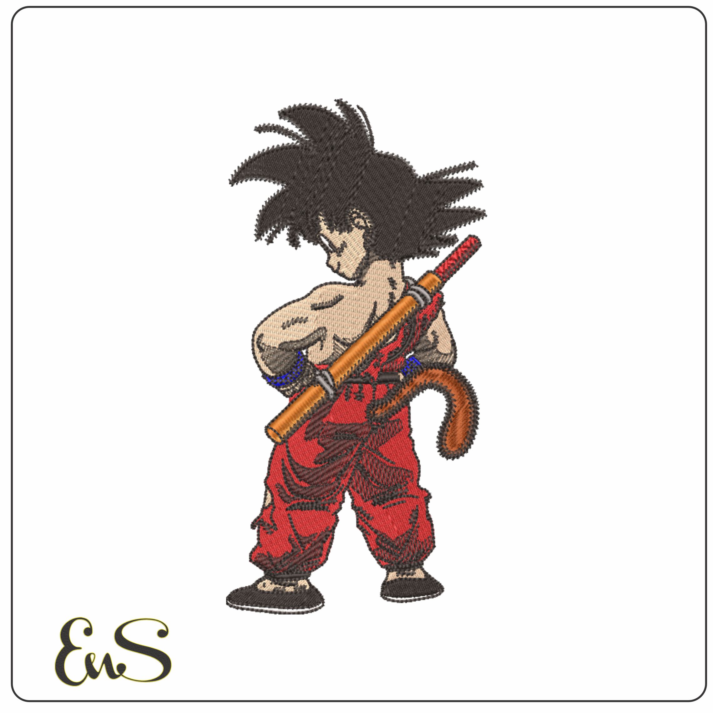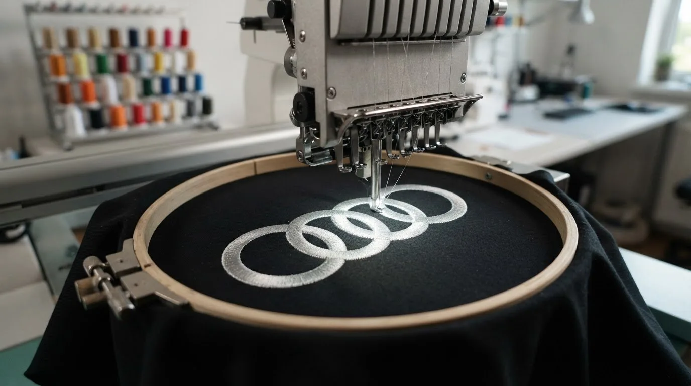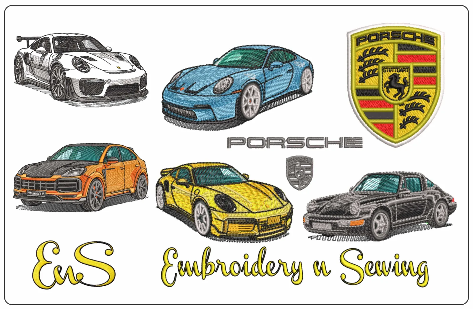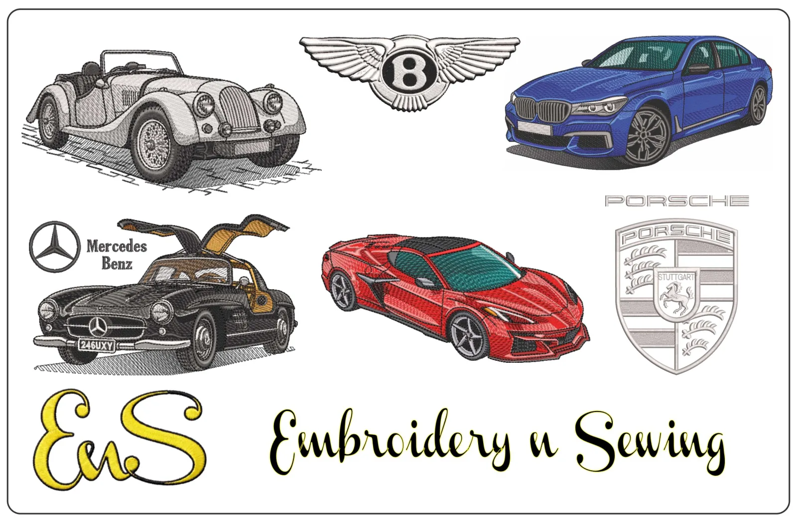
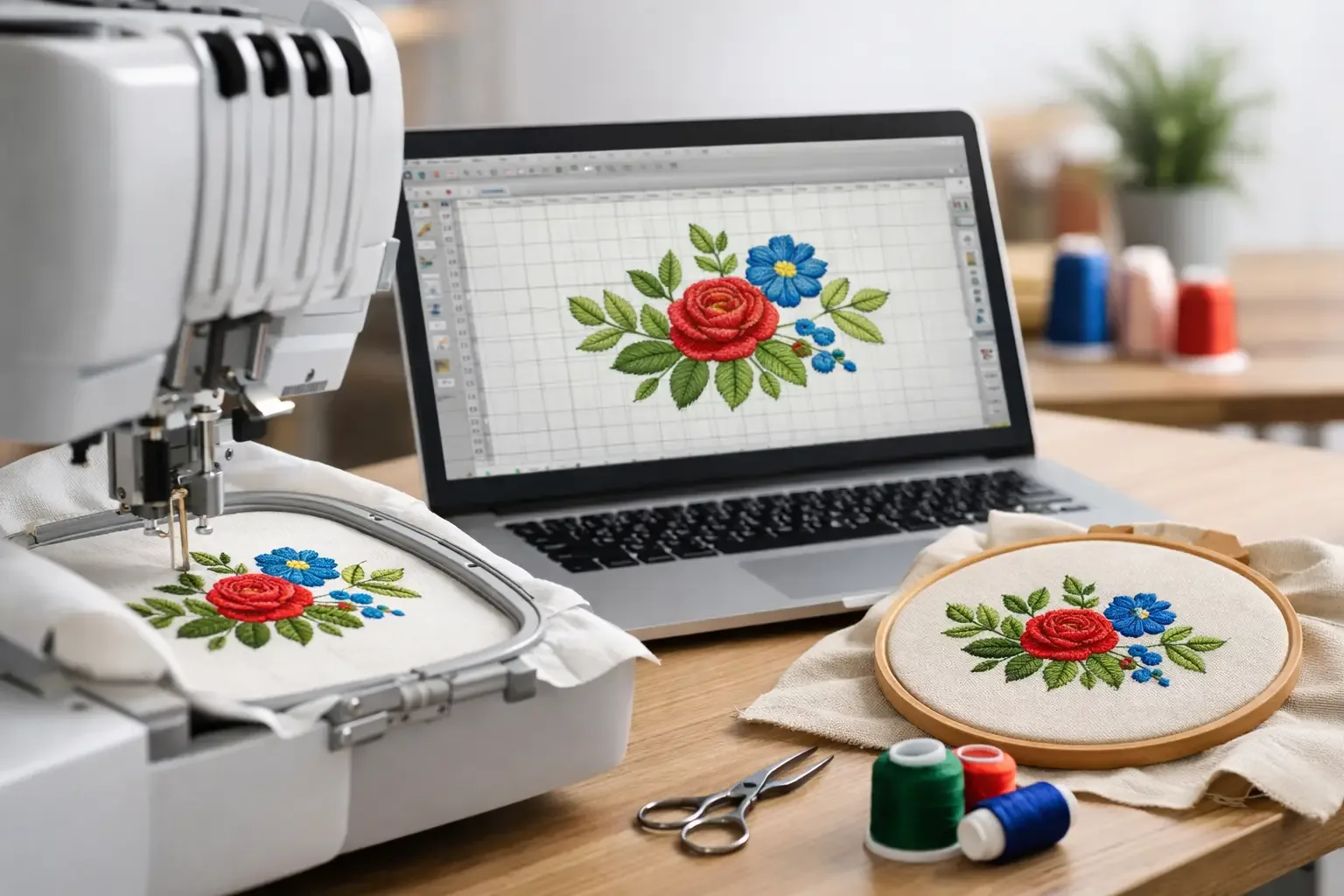
A great embroidery design can look sharp on screen and still fail the moment the machine starts stitching. That is the real challenge in learning how to make digital embroidery designs. You are not just drawing artwork. You are building a stitch file that has to run cleanly on fabric, hold its shape, and finish without puckering, gaps, or thread breaks. If you make team shirts, gift items, kidswear, boutique pieces, or fandom projects, that difference matters. A design that looks good in software but stitches badly costs time, stabilizer, thread, and blank apparel. The better approach is to build with the machine in mind from the start.
How to make digital embroidery designs from the right artwork
The first step is choosing artwork that can actually become embroidery. Clean shapes work better than fussy detail. Bold lettering, simple mascots, basic florals, sports-inspired graphics, and cartoon-style icons usually convert more successfully than shaded illustrations or highly textured photos. If you are starting with a logo-style image or clip art, simplify it before digitizing. Tiny outlines, thin gaps, and layered effects that look fine in print often become a mess in thread. Embroidery needs clear edges and enough space for stitches to sit next to each other without crowding. This is where many beginners lose time. They try to force complicated artwork into a 4x4 hoop or reduce a detailed design for a cap front or sleeve. It can be done sometimes, but not always well. If the design is too detailed for the size, the smartest move is editing the art, not fighting the machine.
Pick software based on what you actually make
There is no single best embroidery software for everyone. If you mostly personalize gifts and shirts at home, you may only need basic digitizing and lettering tools. If you sell finished items, work with multiple machine brands, or build custom files often, you may want stronger control over stitch types, density, pull compensation, and file export. What matters most is whether the program lets you manually control the stitch path. Auto-digitizing can save time, but it rarely gives the best result on its own. You want the ability to decide where fills start and stop, how satin columns run, where underlay is placed, and how the sequence flows. File support matters too. Before spending time creating a design, make sure you can export the format your machine reads, whether that is PES, DST, JEF, EXP, VP3, or another common type. If you stitch for customers with different machines, format flexibility becomes even more useful.
Build the design with stitch logic, not just visual logic
Embroidery files need structure. A shape is not enough. You need to decide what stitch type fits each area and how those areas should be sewn. Large sections often use fill stitches. Narrow columns and clean borders usually call for satin stitches. Small details may need running stitches, but only when they are large enough to stay visible on the chosen fabric. Every choice affects how the finished design looks and how long it takes to stitch. Sequence is just as important. In most cases, you want to sew from the center outward and from background elements to top details. That helps reduce shifting and keeps the design more stable. You also want to minimize unnecessary trims and jumps because every stop adds time and creates cleanup. Underlay is not optional just because you cannot see it in the final design. It supports top stitching, improves edge definition, and helps control fabric movement. Skipping it may save a few seconds in the machine, but it often creates weak, uneven results.
Size changes everything
One of the biggest lessons in how to make digital embroidery designs is that size is not just a scaling issue. A design made for a jacket back cannot simply be shrunk for a baby bodysuit or hat side and expected to stitch the same way. When you reduce a file too far, satin columns become too narrow, fill areas get too dense, and text may close up. When you enlarge a file too much, coverage can look thin and the stitch pattern may lose its balance. That is why serious embroiderers often create separate versions for different hoop sizes and placements. For example, a chest logo version, cap version, and full-back version may all start from the same art but need different stitch treatment. Lettering size, border thickness, and detail level should all be adjusted for the final use.
Test on the actual fabric whenever possible
A design that runs well on twill may behave differently on fleece, denim, terry cloth, or a stretchy performance knit. Fabric choice changes everything from density tolerance to edge sharpness. If the file is meant for sweatshirts, test on sweatshirt material. If it is for appliques on baby blankets, test on something with similar loft and softness. The same file can succeed on one substrate and struggle on another because thread sinks differently and the fabric reacts differently to needle penetration. Stabilizer also affects results. Cut-away, tear-away, and wash-away all support stitches in different ways. There is no universal setup that works for every project. It depends on the fabric, stitch count, and design style. This is why stitch-outs matter more than screen previews. Software can show you a polished simulation, but only a real sample shows if the edges are clean, the lettering reads clearly, and the design keeps its shape after sewing.
Common mistakes when making digital embroidery designs
Most poor stitch files come back to a few repeated problems. Density is often too high because beginners want full coverage and assume more thread means better quality. In reality, too much density can cause thread breaks, stiffness, and puckering. Another issue is using tiny detail that cannot hold up in thread. Fine whiskers, thin outlines, or very small script may look attractive in art form but disappear or distort in stitching. Simplifying usually gives a better finished product. Bad pathing is another common problem. If the machine jumps all over the design, production slows down and the back becomes messy. A cleaner sequence saves time and usually improves registration too. Ignoring pull compensation is also costly. Stitches pull inward as they form, so shapes that look accurate in software may stitch smaller than expected. Compensation helps keep satin borders, columns, and letters looking balanced.
When to create your own file and when to buy one
Not every project needs custom digitizing from scratch. If you need a popular sports-inspired theme, cartoon-style design, floral motif, font set, or holiday pattern, buying a ready-to-stitch file is often faster and more affordable than building it yourself. That is especially true for hobbyists, Etsy-style sellers, and small apparel decorators trying to move quickly. If the design already exists in the right format and hoop size, instant download saves hours. You get straight to production instead of spending time cleaning artwork, testing density, and troubleshooting sequence issues. Custom creation makes more sense when you need a very specific name, business logo, event design, or placement variation that is not already available. In those cases, learning digitizing gives you flexibility. But even then, many makers combine both approaches. They buy everyday designs and reserve custom work for projects that truly require it. For many customers, a large marketplace with niche categories is the practical middle ground. If you can quickly find kids' themes, anime-inspired files, sports looks, seasonal art, transportation, florals, or machine embroidery fonts in one place, you spend less time searching and more time stitching.
How to improve faster without wasting blanks
The fastest way to get better is not making more random designs. It is comparing what you digitized to what the machine actually did. After each test, look for where edges pulled in, where fills pushed out, where the design got stiff, and where the sequence could be cleaner. Keep your first projects simple. Lettering, basic monograms, mascot-style shapes, and clean applique layouts teach more than overcomplicated artwork. Once you can make those stitch neatly on different fabrics, you will have a much stronger base for logos, layered graphics, and more detailed themed files. It also helps to build a personal standard for what counts as finished. If the back is messy, trims are excessive, and outlines do not register well, the file is not ready yet. Good embroidery designs are not just attractive. They are usable, repeatable, and efficient.
A practical mindset for better embroidery files
The best digital embroidery designs are not always the most detailed. They are the ones that stitch cleanly, suit the fabric, and match the project size. That could mean a bold team-style chest design, a simple kids' applique, or a clean name file for gifts and boutique items. If you are learning how to make digital embroidery designs, think like a stitcher first and a designer second. Start with art that fits embroidery, control the path manually, test on the right material, and simplify whenever the file starts fighting the fabric. That mindset will save supplies, shorten production time, and help you create designs people actually want to run again. A World of Intricate Embroidery Awaits, but the files that earn repeat use are usually the ones built with clarity, not complexity.