

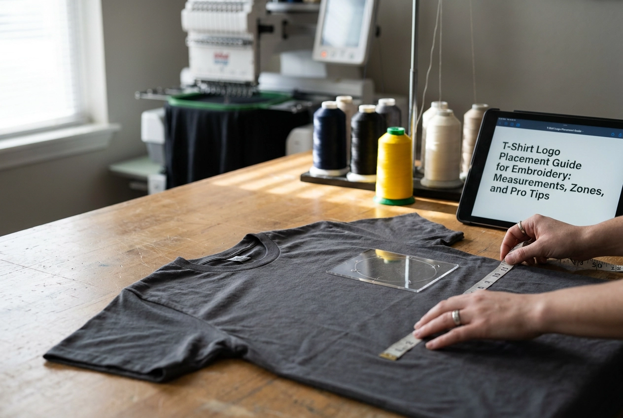
Ever ruined a shirt by placing a logo just slightly too high, too low, or completely off-center? You are definitely not alone. Getting logo placement right is one of those things that looks simple until you are actually standing there with an embroidery hoop in your hand, second-guessing every measurement.
The good news is that there are tried-and-true guidelines that professional embroiderers use every single day, and they are not complicated once someone walks you through them. That is exactly what this t-shirt logo placement guide is here to do.
Whether you are personalizing a single shirt for a gift or building out a batch of uniforms for a small business, this tutorial will cover everything you need to feel confident before you stitch a single thread. We will talk about exact measurements, the most common placement zones on a t-shirt, and a handful of pro tips that will save you from making rookie mistakes. By the end, you will know how to position a logo like you have been doing this for years. Let's get into it!
How Embroidery Placement Differs from Screen Printing
If you have ever tried to follow a standard t-shirt placement guide and ended up with a crooked embroidered logo, you are not alone. The problem is that most placement guides available online are written entirely for screen printing and DTG workflows. They assume you are working with ink, a flat platen, and no physical size ceiling. Embroidery does not work that way, and using print logic for machine embroidery is one of the most common beginner mistakes out there.
The biggest difference starts before you even touch your machine: hoop size is a hard physical constraint. A screen printer can theoretically scale a design to fill a 12-inch-wide chest panel. Your embroidery machine cannot. Your usable stitch area is locked to whatever hoop you own, whether that is a 4x4, a 5x7, or a 6x10. Placement decisions have to start with what your hoop can actually hold, not with where something looks good aesthetically. Guides like The Definitive T-Shirt Design Placement Guide are genuinely useful resources, but they are built around print assumptions that simply do not apply here.
Stabilizer choice and fabric behavior add another layer of complexity that print workflows never have to think about. When you hoop a jersey knit t-shirt without the right cut-away stabilizer, the fabric can shift under tension during stitching. That shift pulls your design away from the center point you carefully measured. A screen printer holds a garment flat on a platen while ink is applied in one smooth pass. Your needle is punching through fabric thousands of times, and each stitch creates cumulative pull.
That cumulative pull is exactly why fabric distortion matters so much in embroidery. A misalignment as small as a quarter-inch before hooping can compound stitch by stitch into a finished logo that looks visibly off-center or crooked. This risk simply does not exist in printing.
That is why mock-positioning your design before hooping is non-negotiable. Use a fabric-safe marker or painter's tape to mark your center point on the garment before you load it into the hoop. Print workflows skip this step because mechanical press registration handles alignment automatically. In embroidery, you are your own registration system.
Resources like the Logo Placement Guide from RushOrderTees cover eight placement locations thoroughly, but they address none of these embroidery-specific considerations. Use print guides for general inspiration on where to place a design, but rely on embroidery-specific resources for the how.
The Standard T-Shirt Placement Zones for Embroidery
Before you hoop a single stitch, it helps to know that a standard t-shirt has seven recognized placement zones: left chest, right chest, center chest, back yoke, full back, sleeve, and the collar or neckline area. Each zone behaves differently under an embroidery needle, and each one calls for a specific hoop size, a specific set of measurements, and a design sized to match. Skipping this step is the most common mistake beginners make, and it usually shows up as a design that looks too small for a large open space or too crowded for a subtle placement area.
The left chest is the most familiar zone, typically sitting about 7 to 9 inches below the shoulder seam and 3 to 4 inches from center front. A 4x4 inch hoop covers most left chest work comfortably, with designs running 3.5 to 4 inches wide. The center chest and full back zones need significantly more real estate, often requiring a 6x10 or larger hoop. Sleeve placement adds a fun design detail but demands careful hooping since the fabric wraps around a curved surface.
According to a comprehensive t-shirt design placement guide from Bolt Printing, every zone has a visual anchor point that keeps designs from drifting too high or too low. The sections ahead cover each zone with exact measurements so you can match your downloaded file to the right placement every time.
Left Chest Placement
If you only learn one placement zone from this entire guide, make it this one. The left chest is the gold standard for logo embroidery across just about every apparel category you can think of, from corporate polos and team uniforms to casual tees and personalized gifts. When someone pictures a logo on a shirt, this is almost always the spot they are imagining.
Getting the position right comes down to two simple measurements. Using a fabric marker or a small piece of tape to mark your spot before hooping, measure approximately 7 to 9 inches down from the shoulder seam and 3 to 4 inches in from the center front of the garment. That intersection lands your design right over the natural breast pocket area, which is exactly where the eye expects to find a logo. Taking 30 seconds to measure this way can save you from re-hooping an entire project.
The good news for home machine owners is that the standard embroidered left chest size, typically 3.5 by 3.5 inches up to 4 by 4 inches, fits perfectly within the 4x4 hoop that comes standard with most entry-level and mid-range machines. You do not need to upgrade your equipment to nail this placement.
This zone is tailor-made for designs that pack strong identity into a compact space. Think monograms, sports team emblems, school and university logos, and small character or fandom badges. Browsing sports logo embroidery files or embroidery font and monogram collections is a great starting point when you are building a project around this placement. Designs with heavy detail or long text blocks tend to lose legibility at this size, so keeping things bold and clean works best here.
Right Chest Placement
Think of the right chest as the left chest's teammate. It follows the exact same measurement logic, just flipped to the opposite side of the garment's center front. You'll drop the same 7 to 9 inches from the shoulder seam and position the design the same 3 to 4 inches away from center, simply mirrored to the wearer's right side. The sizing stays consistent too, with a sweet spot of 3.5 to 4 inches square, fitting comfortably inside a 4x4 hoop for simpler artwork or a 5x7 hoop when your design includes text or more detail.
Where right chest placement really shines is as a secondary location paired with a left chest logo. Rather than competing for attention, the two placements work together to layer information cleanly across the front of the shirt. A company logo sits on the left while an employee name, job title, or player number occupies the right. This dual-chest approach is especially popular for staff uniforms, restaurant hospitality shirts, team jerseys, and personalized event apparel like charity walks or group retreats, where individual identity matters just as much as group branding.
If you're stitching out sports designs or fan apparel, this guide to shirt logo placement for brand impact breaks down the visual balance logic beautifully. The key takeaway is that both chest zones carry equal sizing authority, so there's no guesswork when setting up your second hoop position.
Center Chest and Full Front Placement
Now we are stepping into the placement zones where big, bold designs truly get to show off. Center chest and full front are the go-to choices whenever visual impact is the whole point of the garment.
Center chest placement works by positioning your design at the horizontal midpoint of the shirt front, dropping roughly 7 to 9 inches down from the collar seam. This gives the design a balanced, symmetrical look that reads cleanly from a distance. Designs in this zone typically run between 6 and 8 inches wide, which means you have real room to work with compared to the more compact left chest zone. A standard 5x7 or 6x10 hoop handles most center chest embroidery comfortably, depending on your design dimensions.
Full front placement goes even bigger. Here you are working with designs that span roughly 10 to 14 inches wide across the shirt front, starting a couple of inches below the collar and expanding downward. This zone demands a large hoop, with a 6x10 being the practical minimum for most full front work. Getting your stabilizer selection right matters even more at this scale, because a large embroidered design on a stretchy knit fabric has more opportunity to distort if the garment is not properly secured before hooping.
This is the placement zone built for statement-making apparel. Team graphics, sports logos, character art, and anime designs were all composed to be seen at scale, which is exactly why they look so strong here. A bold NFL-inspired graphic or a detailed character design from a well-stocked embroidery catalog simply commands attention when it fills the front of a shirt the way it was meant to.
One important production note: designs intended for full front placement should be digitized at the actual output size you plan to stitch. Scaling a digitized file up or down after the fact degrades stitch density and registration accuracy, which shows up as uneven fill sections or fuzzy outlines on the finished piece. Always run a sample on a similar fabric before committing to a full production run, especially if you are decorating a batch of team shirts or fan apparel where consistency across every piece matters.
Back Yoke Placement
The back yoke is the upper center back of your shirt, sitting roughly 2 to 4 inches below the collar seam. Think of it as the back of the garment's equivalent to the left chest: a compact, purposeful spot for a secondary logo or accent design. It never tries to steal the show. Instead, it adds a finished, professional touch that makes a garment feel intentional and complete.
Size-wise, you are working in the same range as your left chest placement. Keep your design 3.5 to 4 inches wide, which puts you firmly in 4x4 hoop territory. That is great news for home machine owners, since most standard hoops handle this size without any special setup. You can browse designs sized specifically for this range and find plenty of ready-to-stitch options that drop right into this zone without resizing.
This placement is especially popular for team apparel, school spirit shirts, and coordinated uniform sets. When you want a logo on both the front and back without overwhelming the garment, the yoke delivers that second touchpoint cleanly. Per Rodriguez Embroidery's placement guide, accent placements like the back yoke follow the same compact sizing conventions as chest logos, keeping everything proportional and polished.
Hooping here requires a little extra care. Use the center back seam as your vertical reference point to keep the design perfectly centered. Misalignment near the collar is immediately noticeable, so take a moment to mark your position with a fabric pen before you hoop.
Full Back Placement
Full back placement is the heavyweight champion of apparel embroidery, and it earns that title every time you see a jersey, fan tee, or event shirt walking through a crowd. This is your go-to placement for designs that need to make a statement from across the room. Team uniforms, college athletics shirts, fan apparel, and group event tees all lean heavily on the full back because the real estate is simply too good to leave blank.
For sizing, you are working with designs that typically run 10 to 14 inches wide and up to 12 inches tall on a standard adult shirt. That scale means you will likely need a large hoop, sometimes the biggest your machine supports, and in some cases you may need to split the design into multiple hoopings. Check your machine's maximum hoop size before you commit to a full back file, because running out of hoop mid-design is a frustrating and avoidable problem.
For placement, center the design horizontally across the shirt back and anchor the top edge of your design approximately 3 to 4 inches below the collar seam. This keeps the design visually weighted toward the upper back, which reads better on a moving body than centering it on the full panel. Use a fabric marker or painter's tape to mock the position before you hoop.
Sports franchise graphics, college athletics logos, and large-scale anime or character artwork are all natural fits here, and they genuinely shine when the underlying digitized file is clean and high-resolution. Designs with heavy stitch counts demand proper t-shirt design placement knowledge and solid stabilization. On knit t-shirts especially, that much thread pulling across a large area can distort the fabric, so reach for a cut-away or tear-away stabilizer paired with a topping on textured fabrics. Heavier cotton blanks handle full back embroidery significantly better than thin, stretchy blends.
Sleeve Placement
Sleeve placement has been quietly having its moment, and if you work on any kind of sports apparel, team gear, or fan wear, it is absolutely worth adding to your embroidery toolkit. More decorators are pairing a sleeve logo with a chest logo rather than stopping at just one location, and the combination looks polished and intentional in a way that a single chest badge simply cannot achieve on its own.
The key constraint to understand upfront is size. The upper sleeve and cap sleeve area can comfortably hold a design that is 2.5 to 3 inches wide, and that is genuinely the ceiling before distortion becomes a real problem. You also cannot hoop a sleeve the same way you hoop a flat chest panel. Because the sleeve is a closed fabric tube, you need a small or specialty tubular hoop to isolate just the outer layer of fabric without accidentally catching the inner layer. This is one of the reasons sleeve logo placement in team apparel comes with specific technical guidelines that chest placement simply does not require.
For positioning, drop your design center point 1 to 2 inches below the shoulder seam, centered on the outer upper arm. That anchor point works across most adult garment styles and keeps the logo visible when the arm is at rest.
Design choice matters a lot here. Compact logo marks, small flag emblems, number patches, and simple character icons hold up well at 2 to 3 inches. Complex wordmarks or busy multi-element compositions tend to lose legibility at this scale, so simpler is genuinely better.
Before you stitch on a finished shirt, practice hooping on scrap fabric cut into a tube shape. Getting the sleeve hoop technique down on disposable material first will save you from ruining a garment you cannot replace.
Collar and Neckline Placement
Collar and neckline placement is one of the most understated zones on any garment, and when it's done well, it adds a polished, intentional touch that really elevates a finished piece. This zone refers to small accent designs stitched just below the neckline, typically sitting 1 to 1.5 inches below the collar seam. Because you are working in such a tight, narrow strip of fabric, precision matters far more here than in any other placement zone.
Design size is intentionally small in this area, usually somewhere between 1.5 and 2.5 inches wide. That compact footprint means you will likely need a small hoop insert or a specialized frame to get the fabric secured properly without pulling the neckline out of shape. Standard hoops are simply too large for this zone, so having the right equipment before you start is genuinely important.
This placement works beautifully for subtle details rather than complex, multi-color artwork. Think small monogram initials, a single nationality flag icon, a minimalist fandom symbol, or a tiny brand identifier. Simple, clean designs stitch cleanly and read well in this spot without overwhelming the garment.
The biggest technical challenge here is stabilizer selection. Because the neckline ribbing is both curved and stretchy, the wrong stabilizer will cause puckering or distortion that pulls the collar out of shape permanently. A cut-away stabilizer combined with a water-soluble topping is a popular choice for this zone. Always test on a scrap piece of matching ribbing fabric before committing to your final garment. For more general sizing context, resources like The Definitive T-Shirt Design Placement Guide offer helpful benchmarks for working near seam boundaries.
Scaling Placement for Different Garment Sizes
Here is something that trips up even experienced embroiderers: the measurements that work perfectly on an adult large or XL do not automatically translate to a youth medium, and they definitely do not work on a toddler tee. Applying adult anchor points to smaller garments is one of the most common and costly mistakes in embroidery, and it almost always results in a design that looks too large, too low, or just plain off. The proportions that feel natural on a full-sized shirt become awkward and overwhelming on a smaller canvas, so every size tier needs its own approach.
For youth sizes, pull your shoulder seam anchor up to approximately 5 to 6 inches down from the shoulder, rather than the 7 to 9 inches you would use on an adult garment. Scale the design itself down to 2.5 to 3 inches wide. A youth chest is simply shorter and narrower, so that standard adult left chest logo will crowd the design and push it too close to the hem if you do not adjust both the anchor and the size together.
For toddler and infant garments, the adjustments go even further. Design width should drop to somewhere between 1.5 and 2.5 inches, and your placement anchor should sit just 3 to 4 inches below the shoulder seam, depending on how short the garment's total body length is. Infant bodysuits and 2T tees have surprisingly little real estate between the neckline and the hem, so positioning closer to the top keeps the design visible and proportional rather than buried.
A simple trick that saves a lot of frustration is the paper template method. Cut a piece of paper to your intended design size, pin it onto the actual garment, and take a step back to look at it before you mark anything or hoop. This low-tech visual check catches proportion problems immediately, and it costs nothing to fix at that stage. For reference on how print dimensions scale across size categories, this complete logo sizing guide is a helpful companion resource.
The good news is that children's apparel is one of the most popular embroidery categories, and the designs that fit these smaller dimensions are everywhere in the catalog. Cartoon characters, youth sports motifs, and school-themed files are all well suited to the 2 to 3 inch range that youth and toddler garments require. Just confirm your design's stitch-out dimensions before you load the hoop, and resize within your embroidery software if needed before the first stitch drops.
Matching Your Placement to Your Design Type
Now that you have explored every placement zone on the map, the next step is learning how to match your specific design to the right zone. This is where a lot of beginners get stuck, and it usually comes down to one simple mistake: trying to fit every design into the left chest just because it feels like the safe default.
The left chest is genuinely the right call for certain designs. Think compact, high-recognition artwork that communicates identity at a glance. Monograms, sports team crests, university logos, and country flag emblems are perfect examples. These designs are built to work at a small scale because their visual message is immediate. A football team's crest does not need to be huge to be recognizable; it just needs to land in the right spot with clean stitching. That is exactly what the left chest delivers.
Character art, anime graphics, and fandom designs with rich visual narratives are a completely different story. A detailed anime illustration stitched at three or four inches loses most of what makes it compelling in the first place. The expression on a character's face, the layered background details, the color blocking that gives the composition its energy, all of that disappears at left chest scale. Designs like these need full front or full back real estate where their detail and composition can actually be appreciated by anyone looking at the garment from a normal distance.
Sports and team apparel follows its own internal logic as a complete system. Jersey numbers live at full front or full back in large format. Player name text runs across the upper back, just below where the yoke sits. A sleeve logo rounds out the look as an accent identifier. Each element has a job, and each one occupies the zone where it performs that job best.
On the trend side, 2026 is seeing strong momentum toward oversized and off-center placement in streetwear and fashion-forward apparel. Large designs shifted toward one hip or pushed high toward the shoulder create a contemporary asymmetric look that reads immediately as intentional rather than accidental. If you want a deeper look at how sizing and positioning intersect with current trends, this 2026 placement breakdown is a helpful reference.
The simplest framework to carry with you is this: think about visual weight and read distance together. A dense, detail-rich design loses legibility when it is small, but commands real attention at full front scale. Match the zone to what your design actually needs, and the placement will feel obvious.
How to Position Your Design Before Hooping
Before your shirt ever touches your hoop, take five minutes to physically mark where your design is going to live on the fabric. The single most reliable way to avoid a costly re-stitch is the mock-position technique: use a water-soluble fabric pen or a strip of painter's tape to mark your anchor point directly on the garment. That anchor point is simply the center of where your design will stitch out. Water-soluble marks rinse clean after the project is done, and painter's tape peels away without leaving residue, so neither option damages your shirt. This one small step saves you from the frustration of pulling a finished piece out of the hoop only to find the logo sitting two inches off from where you intended.
Finding your anchor point starts with a fold. Lay the shirt flat on a table, then fold it in half vertically along the center front so the left and right edges of the shirt line up evenly. Press lightly along the fold to create a faint center crease running straight down the front of the garment. That crease is your true center reference line. From there, measure horizontally out to your target placement zone using the benchmarks from earlier sections of this guide, and mark your anchor point clearly with your fabric pen.
Once your anchor point is marked, hold a printed paper template or a saved test stitch-out cut to the correct finished size directly over that mark. This lets you see the actual footprint of the design on the garment before you commit to anything. It is a quick visual check that catches sizing and proportion issues while there is still nothing to undo.
When you are ready to hoop, match the center registration marks on your hoop's inner ring exactly to the anchor point on the fabric. Smooth the garment outward in all directions from that center point, removing any wrinkles or pulls, then tighten the outer ring firmly but not aggressively. Over-tightening is one of the most common beginner mistakes, especially on knit or jersey fabrics, because excessive tension distorts the weave and causes the finished embroidery to pucker or warp. Two other mistakes worth watching for are hooping at even a slight angle, which creates diagonal drift across the entire design, and failing to check whether a nearby seam or pocket is pulling the fabric off-grain before you tighten down. A quick reference like this logo placement on t-shirt expert guide reinforces how much the pre-hooping stage determines the quality of your final result.
Placement Tips by Design Category
Think of this section as your quick-reference cheat sheet for matching the designs in your library to their ideal home on a garment. Different design categories have natural placement homes, and once you understand the logic behind each pairing, placement decisions start to feel much more instinctive.
Sports and Team Logo Designs
NFL franchise graphics, college athletics emblems, and university crests follow a simple dual-placement rule that mirrors how real team apparel is actually worn. For individual fan wear, a left chest placement keeps the team mark readable and purposeful, functioning exactly the way a brand identifier should on a casual shirt. For uniform-style team shirts where you want impact at a distance, full back is the move. The generous 11 to 14 inch width of a full back design means the graphic fills the canvas confidently and reads clearly across a field, gym, or bleacher section.
Embroidery Fonts and Monogram Designs
Monograms and embroidery font files are practically built for the left chest zone. The 3.5 to 4 inch sweet spot fits cleanly within a standard hoop, keeps stitch counts manageable, and produces a crisp, professional result on adult garments. Right chest works equally well if you want a secondary placement or a mirrored companion to a left chest logo. Sleeve placement is a strong third option for text and monogram files, though keep the design under 3 inches so the detail stays clean on that narrower surface.
Character and Anime Designs
Detail-rich character art and anime designs need room to breathe. At full front or full back scale, the composition reads the way the original artwork intended, and the higher stitch count is genuinely justified by the visual payoff. Trying to shrink a complex character design down to left chest dimensions usually results in lost detail and muddy stitching. Give these files the full canvas they deserve.
Children's Designs
Cartoon characters, school mascots, and holiday motifs for kids follow the same placement logic as adult designs but at reduced dimensions scaled to the smaller garment canvas. Refer back to the garment sizing section for the specific youth and toddler measurements, since adult specs should never be applied directly to smaller sizes without adjustment.
Seasonal and Nature Motifs
Floral patterns, botanical motifs, and seasonal designs are some of the most placement-flexible files in any embroidery library. Simpler compositions work beautifully as left chest accents, while more complex arrangements can fill a back yoke zone with real elegance. This flexibility makes seasonal and nature files genuinely versatile across both adult and youth garments throughout the year.
Quick-Reference Placement Chart for T-Shirt Embroidery
Everything covered in this guide comes together in one place right here. Save this table, print it out, laminate it if you want, and keep it next to your machine for every project.
Placement Zone | Measurement Anchor | Design Width | Minimum Hoop | Best-Fit Design Types |
|---|---|---|---|---|
Left Chest | 7 to 9 inches below shoulder seam; 3 to 4 inches from center front | 3.5 to 4 inches | 4x4 | Logos, monograms, small text, insignia |
Center Chest / Full Front | 7 to 9 inches below collar, centered horizontally | Up to 14 inches | 6x10 or larger | Bold graphics, team names, statement typography |
Full Back | 3 to 4 inches below collar seam, centered | 10 to 14 inches | Large frame or multiple hoopings | Team graphics, org names, event designs |
Sleeve | 1 to 2 inches below shoulder seam, outer arm | 2 to 2.5 inches | Small specialty hoop | Secondary logos, flags, number patches |
Back Yoke | 2 to 4 inches below collar, centered | 3.5 to 4 inches | 4x4 | Brand tags, small logos, collegiate insignia |
These numbers give you a reliable starting point for nearly every adult t-shirt project you will tackle. For a deeper look at industry-standard layout conventions, the t-shirt design placement guide from Screenprinting.com and the Printful placement guide are both worth bookmarking alongside this one. Remember to scale these measurements down for youth and children's sizes, since the same numbers that work on an adult large will overpower a smaller garment. Your placement decisions drive everything downstream, from hoop selection to stabilizer choice, so getting comfortable with this chart early will save you real time and real thread.
Start Stitching with Confidence
You have everything you need to stitch beautifully placed embroidery from your very first project. The three habits that will save you the most time and frustration are simple: measure your anchor point before you hoop, scale your design to match the actual garment size in front of you, and always mock-position with a fabric marker or removable tape before committing to the stitch. These steps take just a few extra minutes and they are the difference between a polished finished piece and a re-do you did not see coming.
Just as importantly, resist the reflex to default to left chest for every single design. Character artwork, fandom graphics, and bold illustrated motifs earn their full visual impact at full front or full back scale. Placing them small over the heart undercuts everything that makes them exciting.
Bookmark the reference chart earlier in this guide and return to it for every new project. Then browse the sports logo, monogram font, character, and children's design categories at Embroidery n Sewing to find ready-to-stitch files already sized and optimized for the zones covered here. Your next great project is one good placement decision away.
Conclusion
Logo placement does not have to be a guessing game anymore. With the right measurements in hand, a clear understanding of the standard placement zones, and a few pro habits built into your process, you can approach every project with confidence instead of anxiety.
To recap the big ideas: always measure from the collar down, center your design horizontally using the shirt's natural midpoint, choose your placement zone based on the garment type and design size, and use placement tools or templates to eliminate human error before you hoop anything.
Now it is time to put this knowledge to work. Grab a shirt, pull out your measuring tape, and test your placement on a practice piece before committing to your final garment. The more you practice these steps, the faster they become second nature. Consistent, professional results are closer than you think.