- The historical reality of the Bavarian colors versus the 1929 propeller myth.
- Precise Hex and Pantone codes for the four official brand colors.
- Specific techniques for digitizing the circular lettering and quadrants for a professional finish.
What if the story you've heard about the bmw logo representing a spinning propeller is actually a 95-year-old marketing myth? It's a common belief that started with a 1929 magazine advertisement, but the reality is rooted deeply in Bavarian heritage. You've likely spent hours searching for the exact shade of blue for your next project, only to find conflicting hex codes and blurry references. I'll provide the exact design specifications to stop the guesswork and save your thread budget. You'll discover the authentic history of the roundel and gain the technical data needed to translate this automotive icon into a high-quality embroidery design. This guide covers everything from the 1917 original design to modern digitizing tips for perfect circular stitching.
- Uncover the truth behind the famous propeller myth and see how the bmw logo has evolved through a century of design. - Discover the hidden meaning behind the iconic M stripes and how to correctly represent the blue, violet, and red palette in your projects.
- Master the technical challenges of digitizing circular designs and selecting the perfect stitches for crisp, professional lettering.
- Get expert advice on choosing the right stabilizers and fabrics to ensure your automotive embroidery remains pucker-free and high-quality.
Table of Contents
- What is the BMW Logo? Meaning, Origins, and Executive Summary
- Debunking the Propeller Myth and Evolution Through 2026
- The BMW M Logo: Understanding the Three Stripes
- How to Digitize the BMW Logo for Embroidery
- Stitching Success: Best Practices for BMW Projects
What is the BMW Logo? Meaning, Origins, and Executive Summary
The BMW logo is widely known as the Roundel. It serves as the primary visual identity for Bayerische Motoren Werke, a company that grew from humble beginnings into a global luxury powerhouse. While it's one of the most prestigious symbols on the road, its history is often misunderstood by casual enthusiasts. This guide breaks down the factual timeline to clear up common misconceptions about its design. Before diving into the deep history, let's look at the core facts that define this iconic emblem.
- Registration: The logo was officially entered into the trademark register on October 5, 1917.
- Color Palette: It features blue and white, the official colors of the Free State of Bavaria. The colors are inverted from the state flag because local laws at the time prohibited the use of national symbols in commercial trademarks.
- The Propeller Myth: The idea that the logo represents a spinning aircraft propeller is a marketing myth created by a 1929 advertisement. While BMW did build aircraft engines, the logo's design predates the propeller interpretation by 12 years.
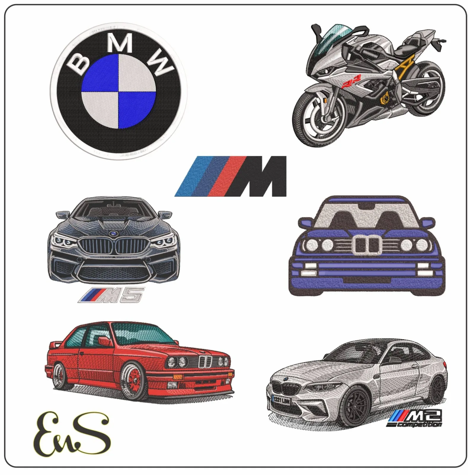
The bmw logo ranks among the most recognizable symbols in global history. It survived world wars and corporate shifts while maintaining its core identity for over 100 years. Its circular shape and clean quadrants make it a favorite project for those exploring machine embroidery sewing. The high contrast between the black ring and the inner quadrants ensures that digital stitching remains sharp on jackets, hats, or upholstery.
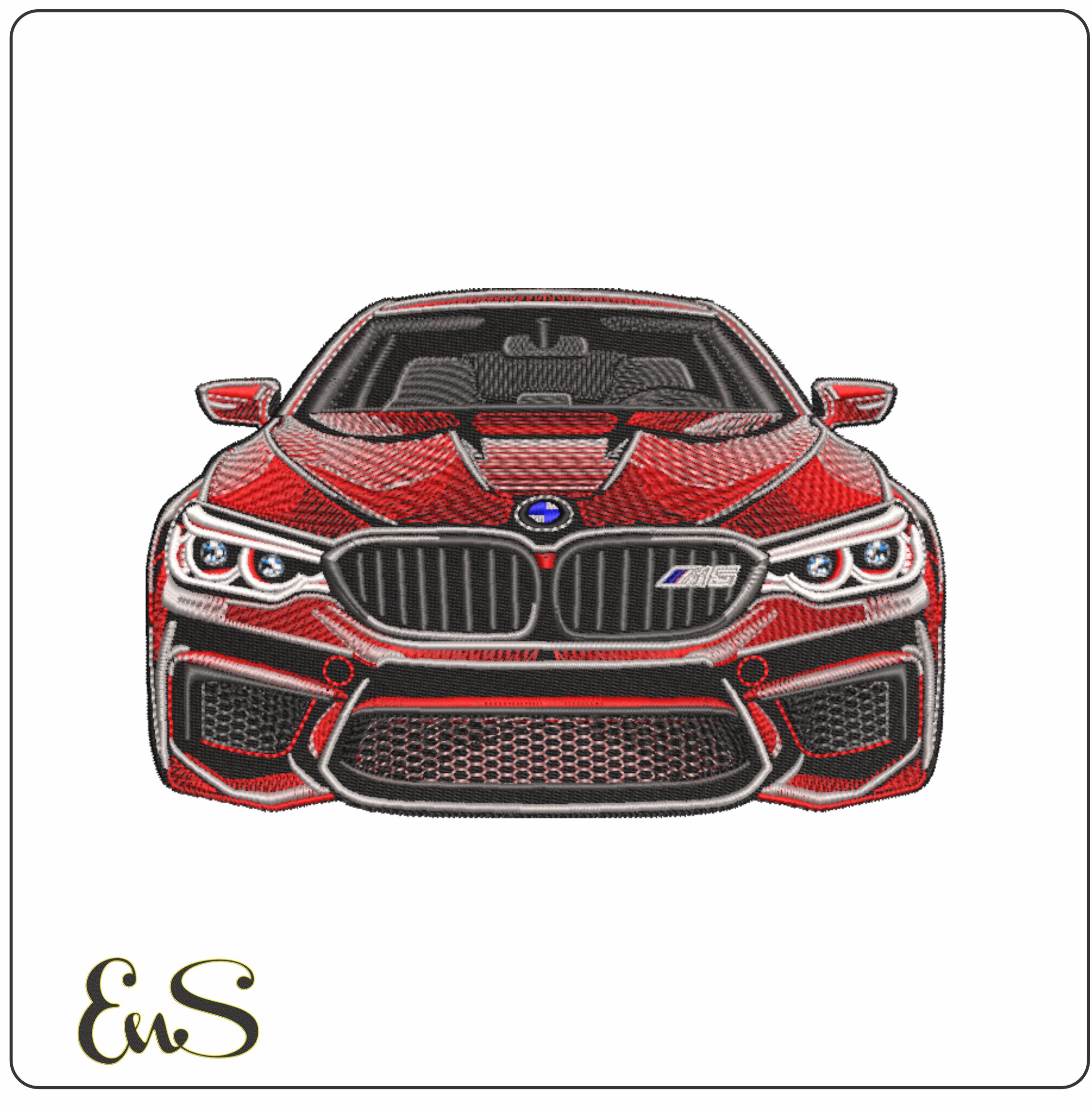 Embroidery designBMW M5- Elegant embroidery design file - instant downloadView this design →
BMW didn't appear out of thin air. It evolved from Rapp Motorenwerke, an aircraft engine manufacturer founded by Karl Rapp in 1913. When the company name changed in 1917, the designers didn't start from scratch. They kept the thick black outer ring from the original Rapp logo. This continuity helped establish authority in the engineering sector during a period of massive industrial transition.
The transition marked the move from making heavy plane engines to the first BMW-badged products. By keeping the circular frame, the company maintained a sense of heritage while looking toward the future of transport. The 1917 design replaced the central horse icon used by Rapp with the now-famous Bavarian quadrants. This change signaled a shift in regional identity, grounding the brand in its Munich roots.
Diagram: The 1917 Design Evolution
- Rapp Motorenwerke Logo (1913): Features a thick black outer circle with a central silhouette of a horse head.
- Original BMW Logo (1917): Retains the black ring and gold lettering but replaces the horse with the blue and white Bavarian quadrants.
Because the bmw logo relies on basic geometric shapes, it's an excellent starting point for digitizing embroidery patterns. The clear boundaries between the black ring and the inner segments prevent thread bleed. This simplicity allows hobbyists to achieve professional results without needing complex shading or gradient fills.
Debunking the Propeller Myth and Evolution Through 2026
- The propeller origin story is a marketing myth created by a 1929 advertisement, not the original design intent.
- The logo's blue and white quadrants actually represent the official state colors of Bavaria.
- Visual styles transitioned from 1917 gold-lined luxury to the 2020 flat, transparent digital aesthetic.
- BMW intentionally allowed the aviation myth to persist for 90 years to bolster its reputation as an engine pioneer.
The history of the bmw logo is often shrouded in a specific legend involving spinning aircraft propellers. While this story is romantic and connects the brand to its early aviation roots, it is technically incorrect. The true design was born from a combination of the Rapp Motorenwerke company logo and the national colors of the Free State of Bavaria. Because it was illegal to use national symbols in a commercial trademark at the time, the designers simply inverted the color order to bypass local regulations.
The 1929 Marketing Fluke
The myth began in 1929, exactly 12 years after the company first registered its trademark. BMW published a magazine advertisement featuring a stylized airplane with the bmw logo superimposed onto the spinning rotors. This visual was intended to promote a new aircraft engine the company was building under license from Pratt & Whitney. The imagery was so powerful that the public immediately assumed the logo represented a propeller against a blue sky.
Instead of correcting the public, BMW executives chose to embrace the narrative. They found that the aviation connection gave the brand an aura of precision and high-performance engineering. In 1942, the company even featured the propeller interpretation in its own "Flugmotoren-Nachrichten" publication, effectively cementing the myth into corporate history. The propeller myth stands as a classic example of successful accidental branding.
Visual Evolution: From Gold Lines to Transparency
On October 5, 1917, the first official logo featured thick gold lettering and borders. This "Gold Era" reflected the decorative styles of the early 20th century and positioned the brand as a premium manufacturer. By the 1950s, the gold was stripped away in favor of a cleaner, white and blue modernist look. This version featured a more legible serif typeface that lasted through the 1990s, when a 3D "bubble" effect was added to match the design trends of the early internet era.
The most significant shift occurred on March 3, 2020, when BMW introduced a flat, transparent design. This version removed the black outer ring for the first time in over a century. The transparent ring allows the color of the vehicle or a digital background to shine through, making the logo more versatile for mobile apps and social media interfaces. If you want to recreate these iconic shifts in your own craft projects, you can find detailed BMW logo embroidery designs that highlight the transition from the classic 1917 gold borders to the modern 2020 flat aesthetic.

The BMW M Logo: Understanding the Three Stripes
Executive Summary
- BMW M (Motorsport) was established in 1972 to consolidate the company's racing programs under Jochen Neerpasch.
- The iconic three-stripe palette combines blue, red, and violet to symbolize the union of BMW and its racing partners.
- The stripes are slanted at a 15-degree angle to communicate speed and forward momentum.
- A new design shift for 2026 focuses on a flat, 2D minimalist aesthetic to improve digital visibility.
BMW's M sub-brand is frequently called the most powerful letter in the world. It isn't just a performance badge; it's a high-octane extension that changed the bmw logo narrative for enthusiasts across the globe. When the division launched in May 1972, it started with a small team of only 35 specialists. Their goal was to create a unified identity for BMW's racing efforts, which led to the creation of one of the most recognizable symbols in automotive history.
Jochen Neerpasch, the first head of BMW Motorsport GmbH, collaborated with exterior designer Wolfgang Seehaus to develop the color scheme. They didn't just choose colors that looked good; they chose colors that told a story of partnership. By the time the BMW M1 debuted in 1978, the three stripes had become inseparable from the brand's high-performance identity, signaling a bridge between the road and the racetrack.
This commitment to performance extends beyond the vehicle itself, as professional drivers often focus on specialized physical conditioning to withstand the intense forces of the track; you can learn more about advanced equipment used for targeted strength and stability training.
Color Symbolism in Motorsport
Blue represents the core identity of the brand. It's a direct nod to the Bavarian flag and the primary color found in the standard bmw logo. This ensures that even at high speeds, the car is instantly identifiable as a product of the Munich-based manufacturer.
Red originally served as a tribute to Texaco. During the early 1970s, BMW was in deep negotiations with the American oil giant for a racing sponsorship. While the formal partnership eventually faded, the red remained as a permanent fixture to represent the heat and passion of the racing world.
Violet functions as the literal and symbolic bridge between the other two shades. By mixing blue and red, designers created a transition color that represents the synergy between the manufacturer and the track. In recent years, BMW has occasionally updated this middle stripe to a darker navy blue for modern branding, but the "violet" heritage remains its historical root.
The Evolution of the M Badge
Original badges on the 1978 M1 featured the stripes wrapped around a circular emblem, but the design quickly moved toward the standalone "M" we see today. The most critical design element is the "leaning" orientation. Each stripe is slanted at approximately 15 degrees to the right. This specific angle isn't accidental; it creates an optical illusion of forward motion even when the vehicle is stationary.
Modern updates are pushing the badge toward a sleek, 2D future. While the 1980s and 1990s favored heavy chrome and 3D effects, the 2026 design language removes these gradients. This minimalist approach ensures the logo remains legible on high-resolution digital screens and dashboard interfaces. It's a shift from physical depth to digital clarity, reflecting the brand's move toward electrification.
[DIAGRAM: THE M STRIPE GEOMETRY]
- Alignment: 15-degree right-leaning slant.
- Stripe Ratio: 1:1:1 equal width for all three colors.
- Typography: The "M" is customized with a matching italicized slant to maintain visual harmony with the stripes.
- Spacing: Minimal gap between the "M" and the stripe cluster to signify unity.
[ILLUSTRATION: COLOR TIMELINE]
- 1972: Introduction of Blue, Violet, and Red on the 3.0 CSL.
- 1978: First official integration with the "M" letter on the M1 supercar.
- 2020: Transition to a transparent, flat 2D version for corporate communications.
- 2026: Planned rollout of the ultra-minimalist, high-contrast M badge for the Neue Klasse era.
How to Digitize the BMW Logo for Embroidery
- Precision Geometry: Perfect circles require 0.3mm to 0.5mm of pull compensation to prevent oval distortion.
- Stitch Selection: Using the correct embroidery stitches for the "BMW" lettering ensures readability at small scales.
- Angle Management: Opposing 45-degree angles in the blue and white quadrants create a dynamic, light-reflecting finish.
- Color Accuracy: Matching Bavarian Blue requires specific thread codes like Madeira 1134 for brand consistency.
Digitizing the bmw logo is a rite of passage for many machine embroiderers. While it looks simple, the circular roundel is notoriously difficult for beginners. Fabric is a flexible medium; as the needle penetrates the material, it pulls the fabric inward. If you digitize a perfect circle in your software without adjustments, the finished result often looks like an egg. You must account for this by slightly over-extending the height of your columns in the software. This technique, known as pull compensation, is the difference between a professional badge and a DIY mistake.
Step-by-Step Digitizing Framework
Following a structured path ensures the bmw logo remains crisp on everything from hats to jackets. Here is the technical workflow:
- Step 1: Import a high-resolution 300 DPI PNG of the 2026 transparent or classic logo. Low-quality images lead to jagged edges during the auto-tracing phase.
- Step 2: Path the outer black circle using a high-density satin stitch. Set your density to 0.40mm and ensure the underlay is a "center run" to stabilize the curve.
- Step 3: Create the quadrants using a fill stitch. Set the top-left and bottom-right white sections to a 45-degree angle. Set the blue sections to a 135-degree angle. This contrast mimics the way light hits the original metal emblem.
- Step 4: Digitize the BMW text. Use a clean, sans-serif font setting. If the letters are smaller than 5mm, use a 60-weight thread and a smaller needle to keep the "B" and "M" from closing up.
Thread Color Matching Guide
Color choice is where many projects fail. The iconic "Bavarian Blue" isn't a standard navy; it's a vibrant, medium-toned royal blue. For the most accurate results, use Madeira Classic 1134 or Isacord 3622. These shades capture the 1917 heritage perfectly. When choosing between metallic gold or yellow thread for older vintage variations, remember that lighting changes everything. Yellow thread stays consistent under office lights, but metallic gold (like Madeira 7007) can look dark or "muddy" if the stitch direction isn't uniform. Always test your gold stitch-outs under 5000K daylight bulbs to ensure the shine is even.
Don't forget to overlap your fills. If your blue quadrants don't overlap the black outer ring by at least 1.0mm, the fabric will peek through as the garment moves. This "gapping" is the most common error in logo embroidery. You'll want to check your "push" settings as well, especially on pique polo shirts where the knit is loose.
Ready to start your next project? Explore our digitizing services for professional-grade results.
Stitching Success: Best Practices for BMW Projects
- Fabric Choice: Use 1.2mm genuine leather or 12oz heavy cotton canvas to support high stitch counts.
- Stabilization: Apply a minimum of 2.5oz cut-away stabilizer to prevent the roundel from puckering.
- Needle Specs: Select a 75/11 sharp needle to maintain 1.5mm clarity on the "BMW" lettering.
- Design Precision: Download verified embroidery patterns to ensure the four quadrants align at the exact center point.
- Machine Speed: Reduce speed to 600 stitches per minute (SPM) for the final satin stitch border.
Stitching the bmw logo requires more than just a standard setup because the circular geometry is unforgiving. If your alignment is off by even 0.5mm, the quadrants look skewed. You'll want to use 1.2mm genuine leather or 12oz heavy cotton canvas for the best results. These materials don't stretch under the tension of a 10,000-stitch fill. Performance mesh is an option for headliners, but it requires an extra layer of water-soluble topping to keep the stitches from sinking into the fabric.
| Setting Category | Recommended Value |
|---|---|
| Needle Type | 75/11 Sharp (Titanium coated) |
| Stabilizer | 2.5oz Cut-away (2 layers) |
| Thread Tension | 3.2 to 3.8 (Medium-Tight) |
| Stitch Speed | 600 - 650 SPM |
Stabilizer and Needle Selection
A cut-away stabilizer is essential for dense logos like the BMW roundel. Tear-away options often fail during the heavy fill of the blue and white sections, leading to "registration shift" where the black border doesn't line up. Use a 75/11 sharp needle. Don't use a ballpoint needle; it won't provide the crisp edges needed for the 1.5mm tall lettering. When hooping, ensure the fabric is drum-tight. Any slack will cause the circular shape to become an oval during the 10,000-stitch process.
Project Inspiration: Beyond the Polo Shirt
Customizing car headrests with the M logo is a popular upgrade for enthusiasts. You can also create vintage-style BMW patches for flight jackets by stitching onto heavy felt and trimming the edges. If you're looking for a shop display, recreating the bmw logo on a large scale using applique designs for garage banners works perfectly. This method uses fabric layers for the main colors, which reduces the overall stitch count and prevents the banner from becoming too heavy or stiff. For enthusiasts who enjoy the precision of technical crafts, you can learn more about other skill-based hobbies that utilize specialized tools for mechanical challenges.
Master Your Next BMW Embroidery Project
The bmw logo stands as a symbol of precision that has evolved through five major iterations since 1917. You've learned that the iconic blue and white quadrants represent Bavaria, debunking the 1929 aircraft propeller myth once and for all. From the classic roundel to the high-performance M-series stripes, these designs require specific digitizing techniques to maintain their sharp edges on fabric. Hobbyists in 50+ countries already use our professional-grade files to avoid common mistakes like puckering or thread breaks.
It's time to transform your favorite apparel with a design that reflects a century of automotive excellence. You can browse our high-quality digital embroidery designs for your next project and receive instant downloads in PES, DST, and JEF formats. We've handled the complex technical work so you can focus on the creative process. Grab your stabilizer, pick your thread colors, and get ready to create something impressive today.
Frequently Asked Questions
- The propeller origin is a 1929 marketing myth, not the original design intent.
- Official colors represent the Bavarian state flag in a specific inverted pattern.
- Embroidery files are available for personal use but carry strict commercial restrictions.
- The 2026 design shift focuses on 2D transparency for the Neue Klasse vehicle lineup.
- Satin stitching remains the industry standard for achieving crisp, professional lettering.
Does the BMW logo actually represent a propeller?
No, the logo doesn't represent a spinning propeller. While a 1929 advertisement depicted the logo inside an aircraft engine, the design actually predates that ad by 12 years. It originated in October 1917 as an evolution of the Rapp Motorenwerke emblem. The company simply used the colors of the Bavarian state flag in its quarters to honor its Munich roots.
What are the official colors of the BMW logo?
The official colors are blue and white. Specifically, the brand uses specific shades that mirror the Free State of Bavaria's heraldic identity. These colors appear in the four quadrants of the inner circle, while the outer ring is traditionally black with silver or white lettering. The 2020 redesign introduced a transparent version for communication, but the blue and white core remains unchanged.
Can I buy a BMW logo embroidery file for personal use?
You can find digital files on various digitizing marketplaces for personal projects. Many independent designers sell these files for small fees on specialized embroidery sites. However, you can't use the bmw logo for commercial products without a license. Always check the file compatibility with your specific machine brand before you hit the download button.
Why is the BMW logo blue and white?
The bmw logo uses blue and white because they're the official colors of the Free State of Bavaria. Since the company was founded in Munich, the creators wanted to honor their local heritage. Interestingly, the colors appear in reverse order compared to the official state seal. This happened because local trademark laws in 1917 prohibited using state symbols for commercial branding purposes.
How has the BMW logo changed for 2026?
By 2026, the brand will fully integrate the transparent 2D design across its "Neue Klasse" vehicle lineup. This change, first introduced in March 2020, removes the traditional black outer ring for digital and print communications. The goal is to create a more open, minimalist aesthetic. It's a design meant to work better on modern screens and illuminated car grilles in the electric era.
What is the best stitch for the BMW lettering?
A satin stitch is the best choice for the lettering on the emblem. This stitch creates a smooth, high-gloss finish that mimics the polished chrome of the physical car badge. For letters smaller than 5 millimeters, you should use a 60-weight thread. This prevents the characters from looking "blobby" or distorted, ensuring the text stays legible on your fabric.
What does the M stand for in the BMW M logo?
The M in the logo stands for "Motorsport." BMW M GmbH was originally created in May 1972 with only 35 employees to facilitate the company's racing program. Over the last 52 years, it's evolved into a high-performance division. The three stripes represent the partnership between the brand (blue), the racing world (red), and the connection between those two worlds (purple).
Is the BMW logo trademarked for embroidery?
Yes, the logo is a registered trademark protected by international intellectual property laws. BMW AG actively monitors the market to prevent unauthorized commercial use of its identity. If you're digitizing the design for a one-off personal gift, you're usually safe. However, selling hats or shirts featuring the logo without a formal licensing agreement violates trademark regulations and can lead to legal action.


