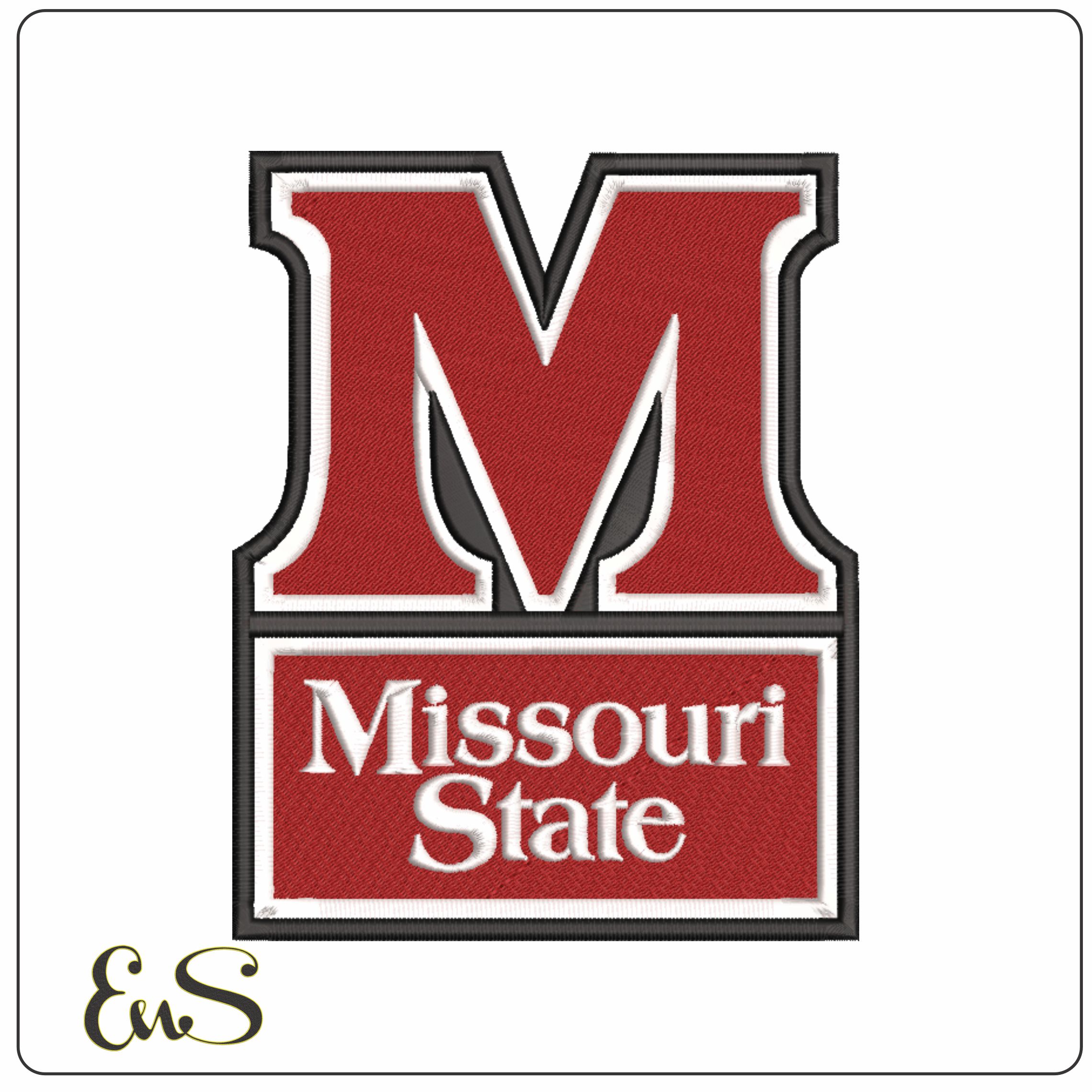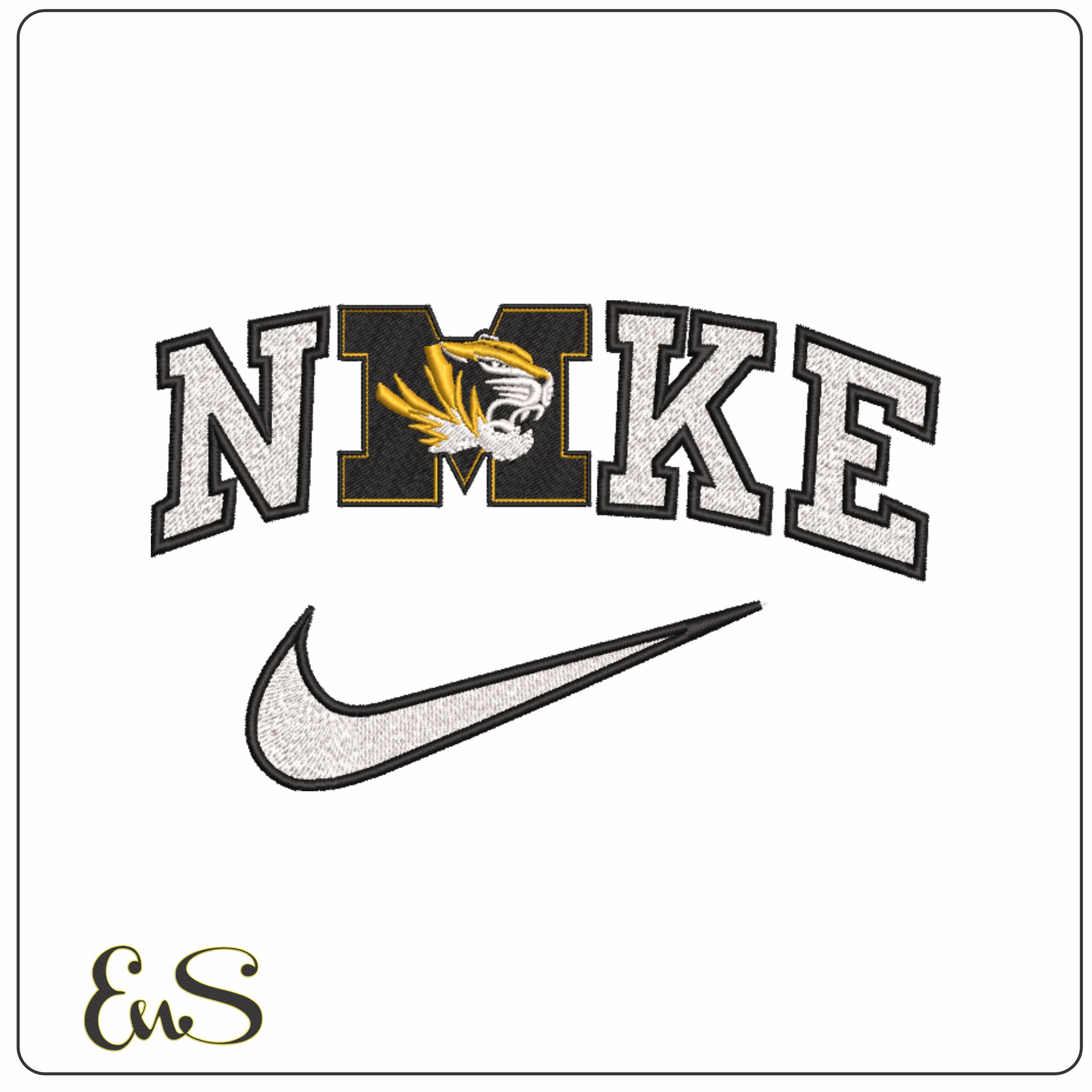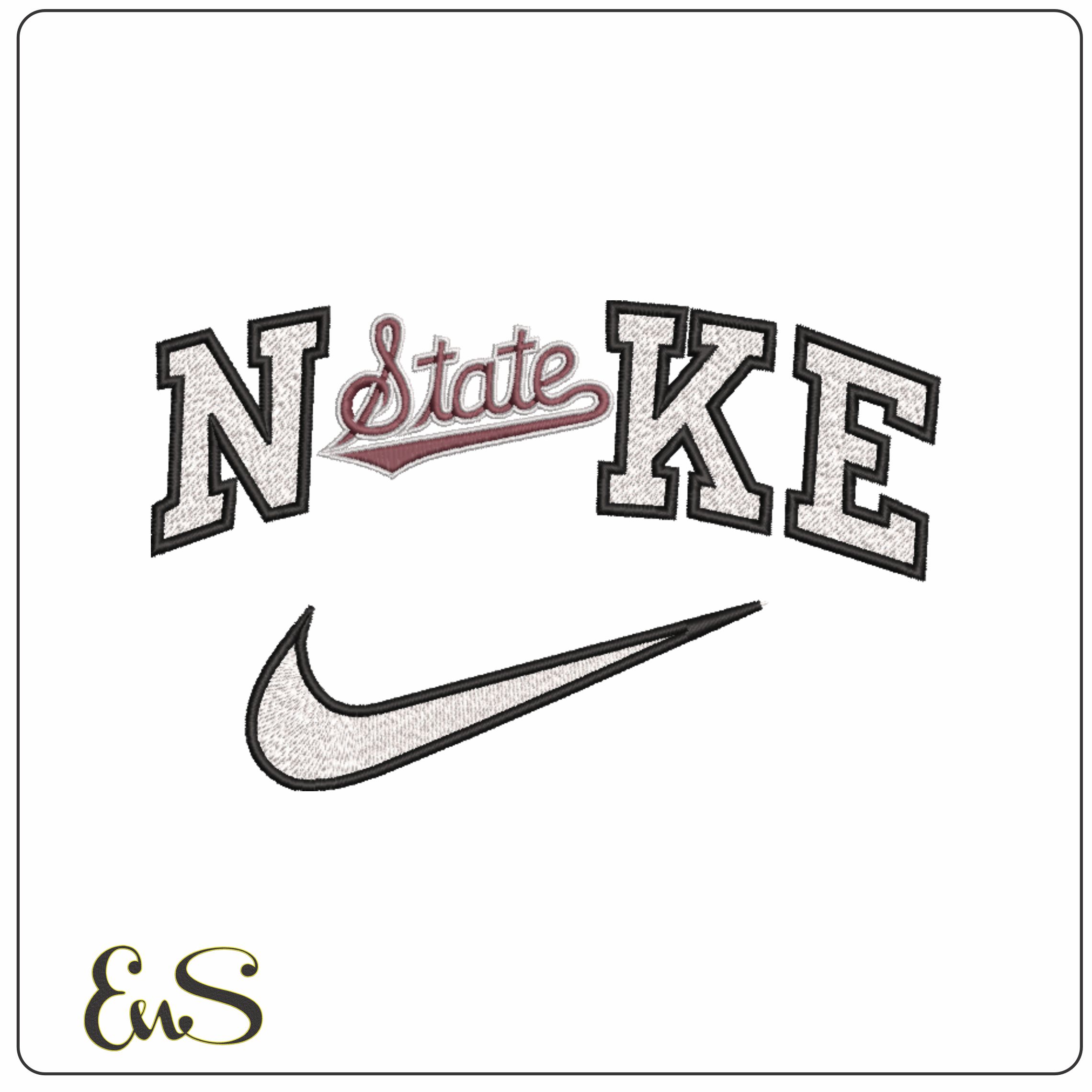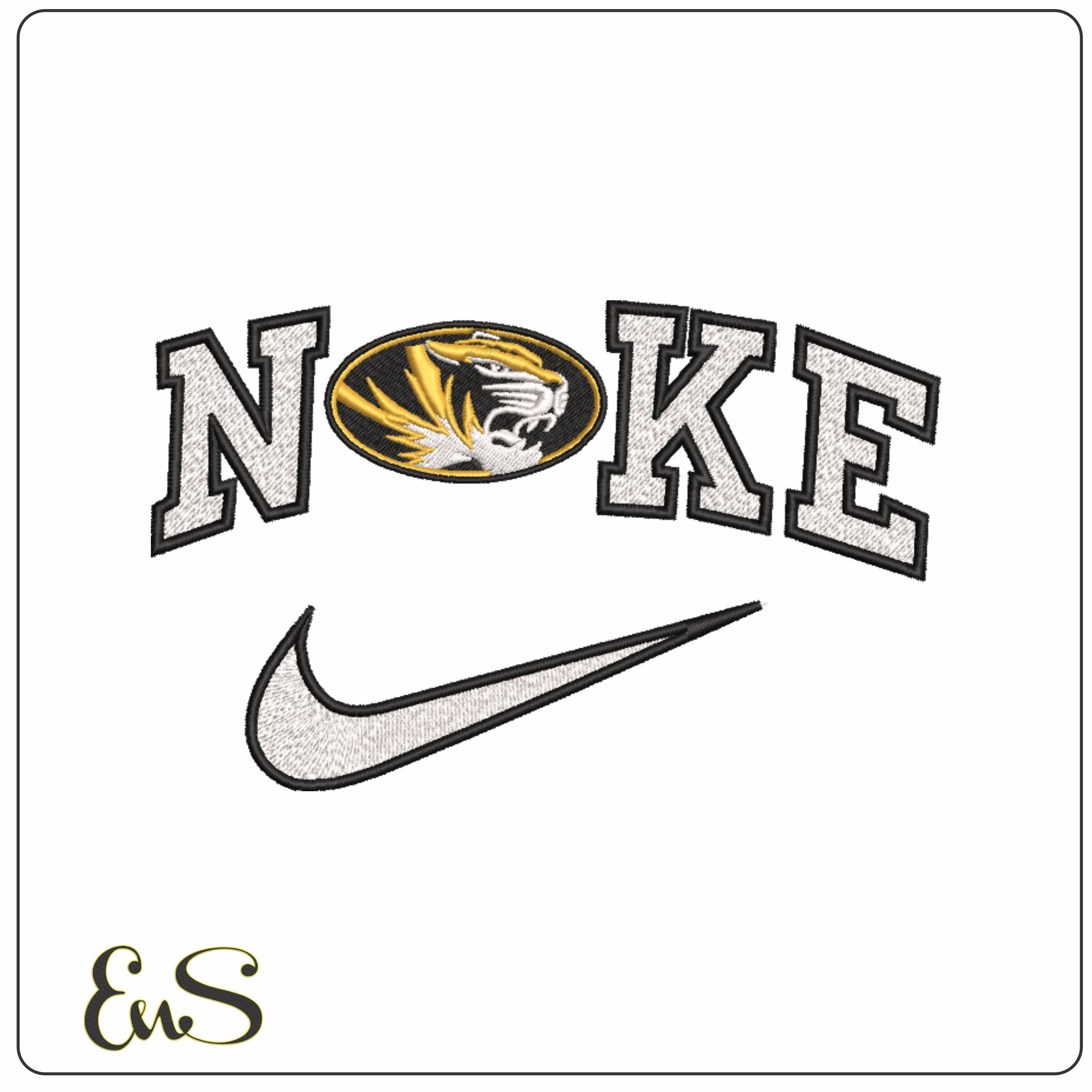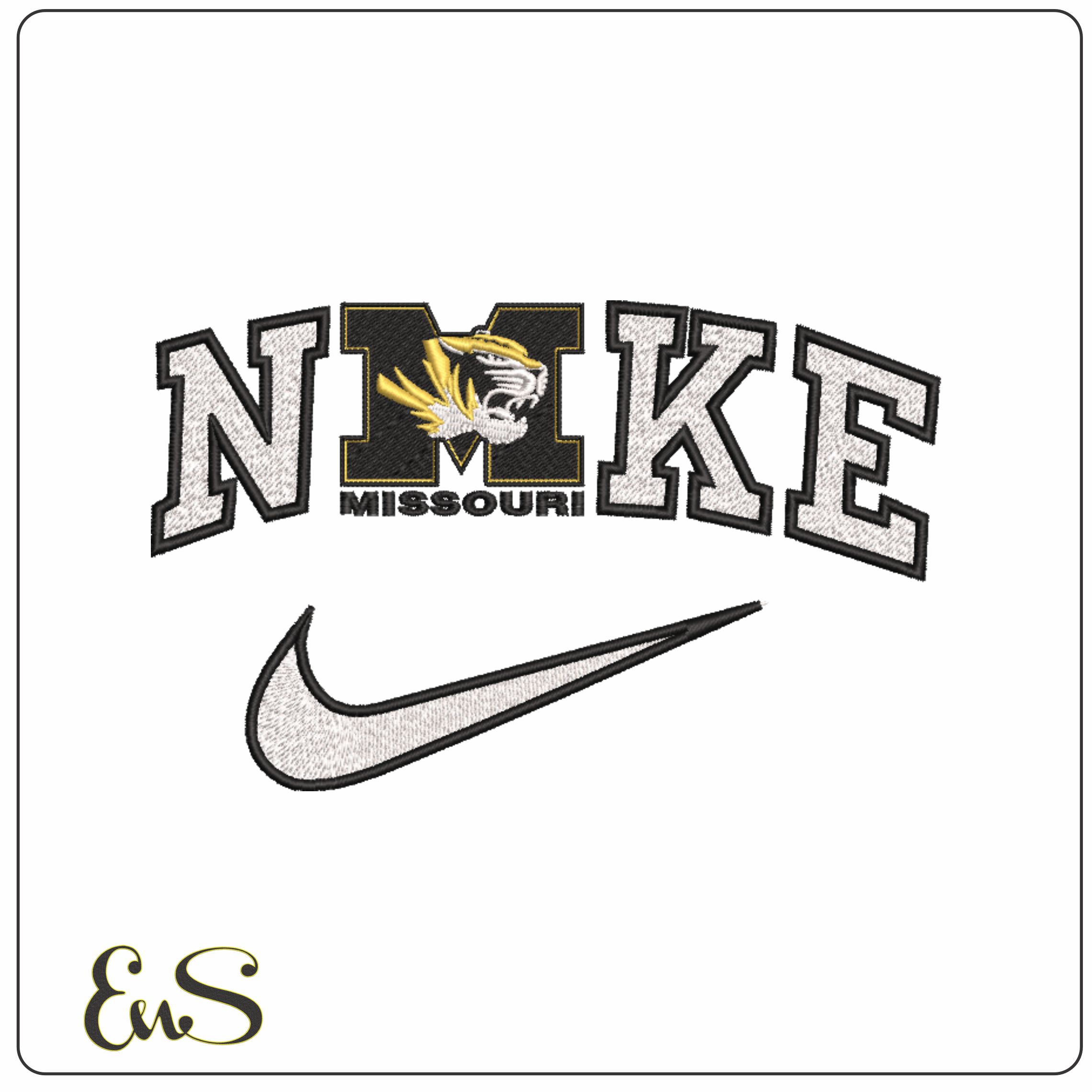

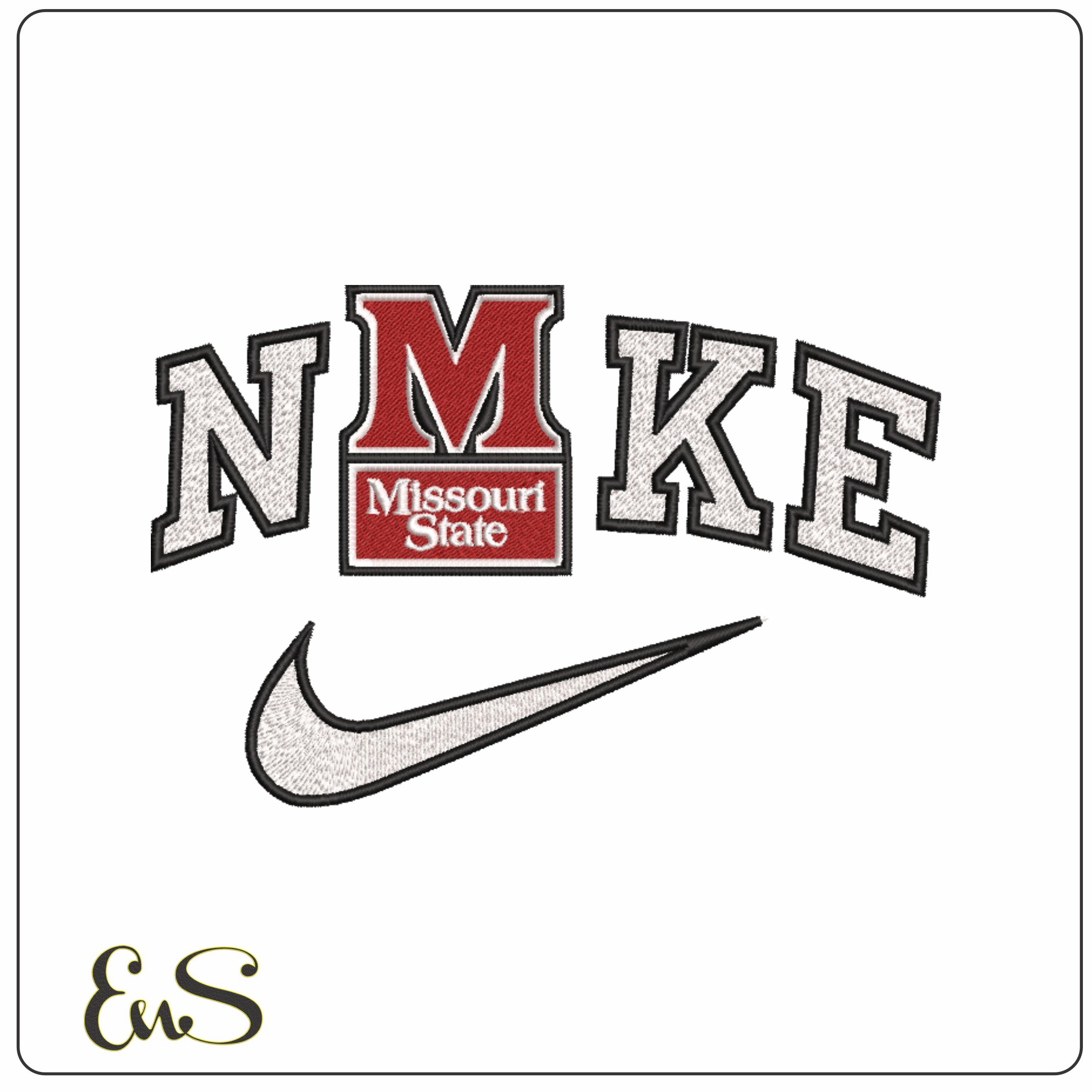
This design reworks the Nike-style wordmark into "NMKE", with a red varsity-style M at the centre to give it a clear Missouri State feel. The outlined collegiate lettering, small panel detail inside the M, and swoosh underneath keep it rooted in campus sports style without looking busy. It suits Missouri State supporters who want something recognisable and sporty for day-to-day stitching.
It would look especially good on sweatshirts, hoodies, team jackets, tote bags and sturdy cotton tees, where the white, red, black and grey palette can read crisply against darker fabrics. With just 3 thread colours and a moderately dense build, it has enough presence for larger placements while still keeping the shapes clean and legible. If you want a university-inspired design that feels closer to classic athletics branding than a mascot graphic, this one does that neatly.