
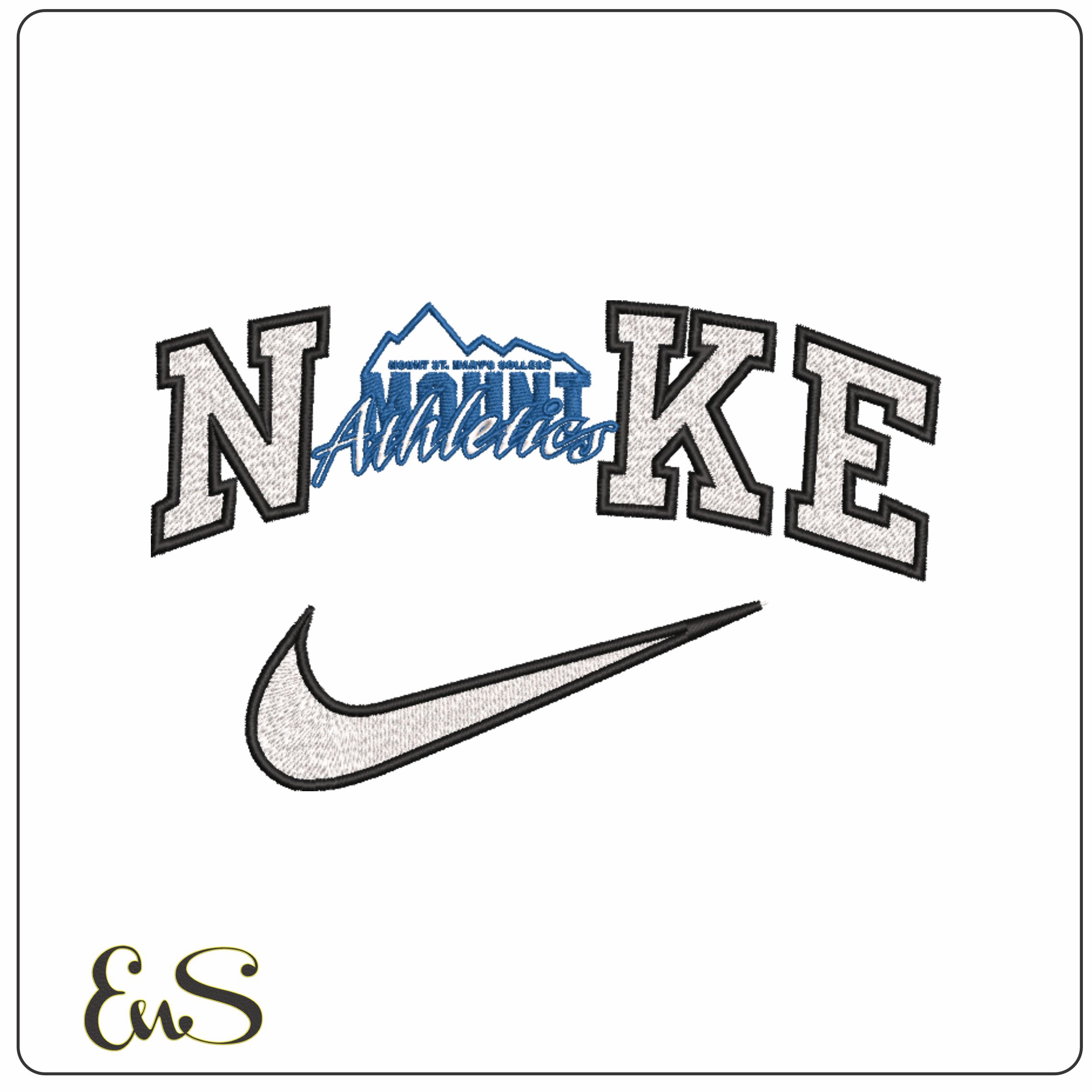
This design leans into a classic 1990 to 1996 collegiate sports look, built around a stacked MOUNT wordmark with a Nike swoosh, block varsity lettering and a mountain silhouette worked into the layout. The mix of white, black and blue gives it that crisp athletic contrast, while the script-style Athletics overlay stops it feeling flat or overly plain. It suits Mount St. Mary's fans, alumni and college sports collectors who want that unmistakable campus-gym aesthetic rather than a fussy, decorative crest.
Because it uses only three thread colours, the finish stays clean and readable on hoodies, sweatshirt fronts, varsity jackets and heavier cotton tees. The moderately dense build gives the large letters and swoosh good presence, especially on stable fabrics like fleece, twill and canvas, and it also works well on tote bags or duffel panels where bold collegiate shapes really show up. If you want a university sports design that looks strong from a distance and still has layered detail up close, this one does that very well.