
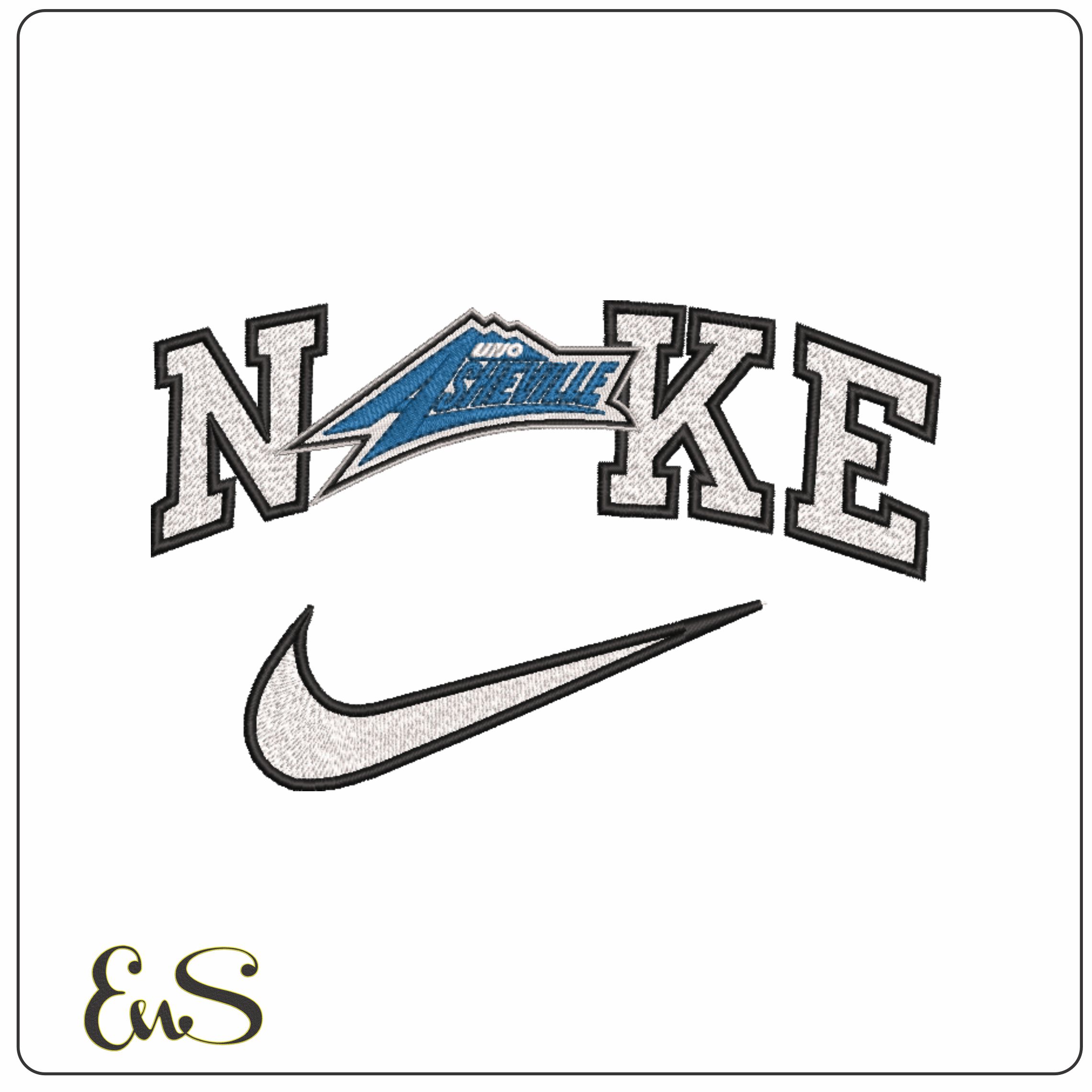
Bold college styling gives this Nike design a distinctive edge, with chunky white letters outlined in black, a crisp swoosh, and that striking blue angular shape cutting through the wordmark. It has the feel of early-2000s campus sports branding, making it a strong pick for University of North Carolina Asheville Bulldogs supporters, collectors of college-era logos, or anyone building out athletic-themed embroidery. The limited five-colour palette keeps the look graphic and readable rather than fussy.
This is the kind of design that suits varsity jackets, hoodies, heavyweight sweatshirts and sports holdalls, where the broad lettering can really do the work. Because it is moderately dense, it will sit best on stable fabrics that can support the solid blocks of stitching and keep the edges looking sharp. With sizes running from small chest placements up to large back or bag panels, it gives you plenty of room to use that blue detail as the focal point.