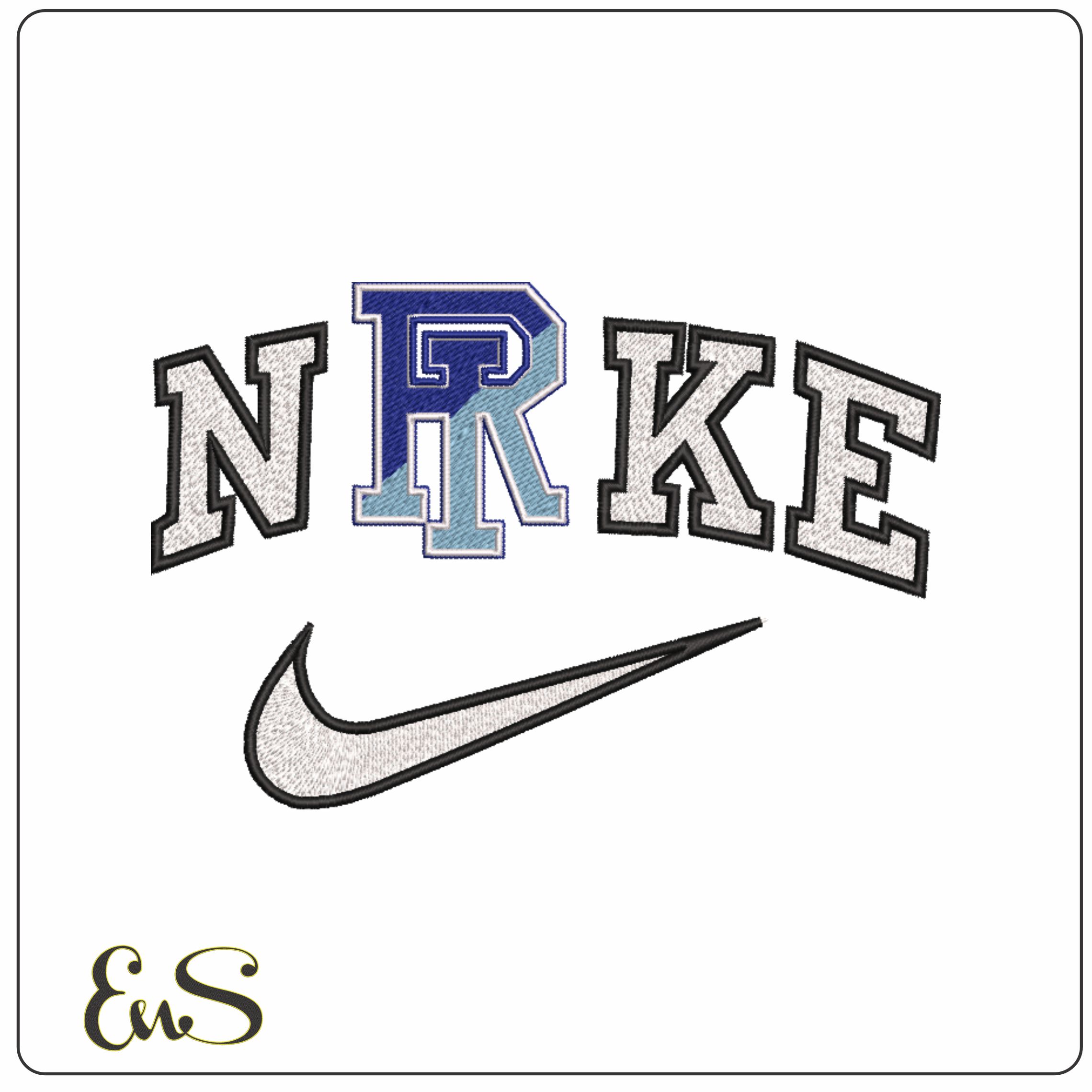

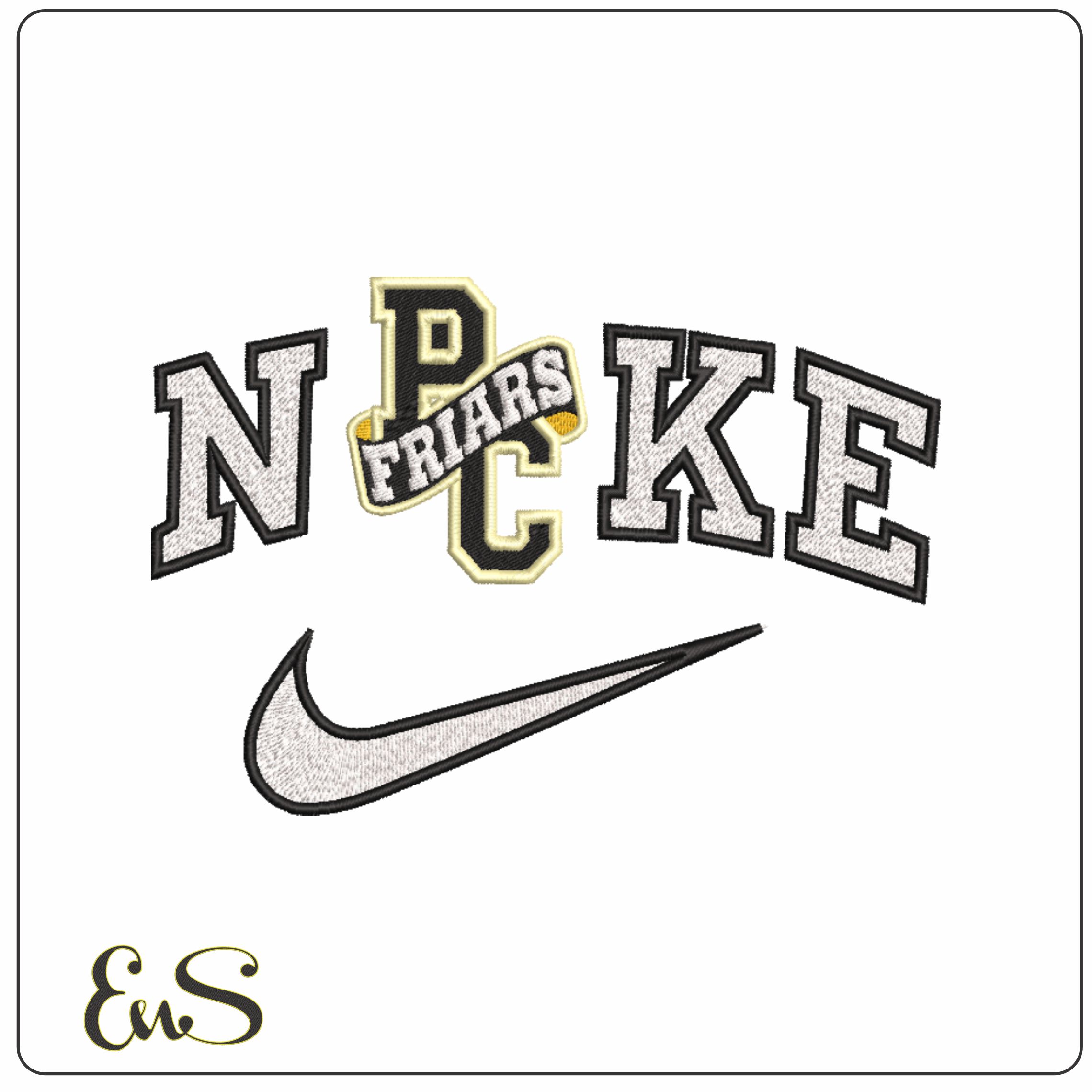
Bring throwback varsity style to your stitching with this Nike Providence Friars 1996 to 2002-inspired mashup, built around oversized block lettering, a swoosh-led wordmark feel, and the interlocking P and C monogram crossed by a diagonal banner. The white, black and gold palette gives it that sharp collegiate contrast, while the arched arrangement keeps the whole design feeling like a true sports-era badge rather than a flat text treatment. It suits Providence fans, alumni and collectors of classic campus athletics graphics who want a cleaner, bolder logo look.
This is a strong choice for sweatshirt fronts, jacket backs, gym bags and sturdy cotton tees where the varsity shapes have room to read properly. With 4 thread colours and a moderately dense build, it should give solid coverage and a crisp edge on medium to heavier fabrics such as fleece, twill and denim. The chunky letterforms and monogram details are what make it work so well on practical fanwear that gets seen from a distance.