A great hat design has to do two jobs at once - it needs to look sharp from a distance and still stitch cleanly on a curved, structured surface. That is why the best embroidery designs for hats are usually not the busiest ones. They are bold, readable, and sized for the front, side, or back of a cap without turning into thread-heavy clutter. If you make custom hats for customers, gifts, team wear, or craft sales, design choice matters as much as machine setup. Hats have limited real estate, center seams, buckram, curved panels, and visibility issues that flat garments do not. The right file can stitch fast, look professional, and turn an ordinary cap into something people actually want to wear.
## What makes the best embroidery designs for hats?
Hat embroidery works best when the design has a clear shape, solid identity, and enough open space to stay crisp. Fine outlines, tiny lettering, and layered fills can look good on a product image but may fight the cap once the needle starts moving. A design that works on a jacket back does not automatically work on a six-panel snapback. The sweet spot is usually a compact design with clean borders and strong contrast. Think logo-style layouts, initials, mascot heads, simple sports symbols, compact florals, and graphic icons. These hold their shape better and read faster from a few feet away, which is exactly how most hats are seen. It also depends on the hat style. Structured caps can support denser designs better than soft, unstructured hats. A trucker cap with a foam front gives you different results than a washed cotton dad hat. The best design is not just about the artwork. It is about matching that artwork to the cap construction.
Best-selling hat design categories
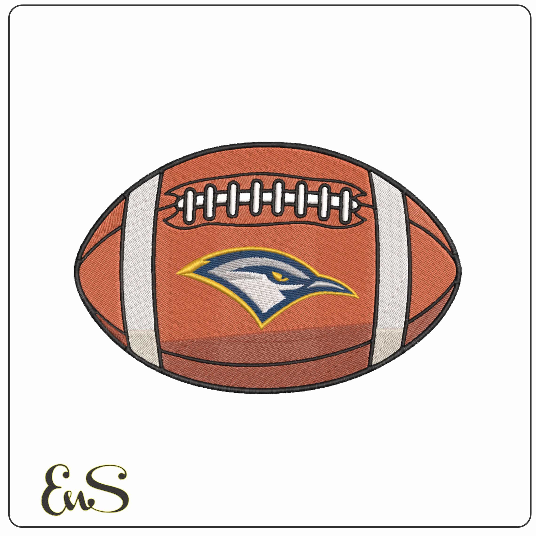
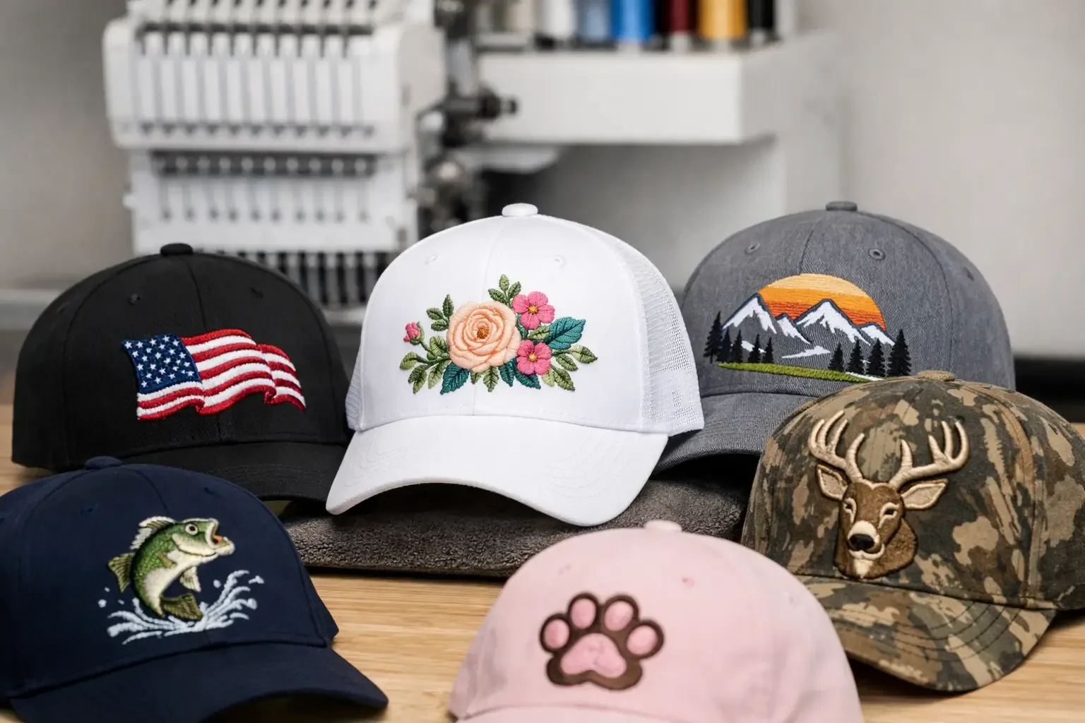
For most embroidery buyers, the safest and strongest categories are the ones people already search for when they want personalized headwear. [Sports is at the top] of that list. Team-inspired layouts, stadium-themed files, football motifs, baseball graphics, and college-style lettering all translate well to hats because they are naturally bold. Fans also expect caps to carry strong visual branding, so the format feels natural. Monograms and machine embroidery fonts are another dependable choice. A clean three-letter monogram, a single varsity initial, or a short stitched name works well on hat fronts and sides. These are especially good for boutique gifting, bridal parties, family vacation hats, and small-batch custom orders. The main trade-off is scale. Fonts need to be selected carefully so they stay readable when reduced. [Children's themes] also perform well, especially for birthday hats, matching family sets, and school-related gifts. Simple animals, cartoon-inspired faces, transportation motifs, stars, smiley elements, and playful name designs all fit the format. The key is keeping the design cheerful without overloading the panel. [Seasonal designs] are another strong category because hats are easy impulse buys. Christmas icons, patriotic themes, Halloween motifs, shamrocks, pumpkins, snowflakes, and summer graphics all give customers a reason to order now instead of later. Seasonal files also work well for craft sellers because they can be stitched quickly and merchandised by event. Nature-inspired files deserve more attention than they usually get. Small floral sprays, mountain silhouettes, leaves, fish, deer heads, western motifs, and sun designs can all look excellent on hats. These have broad gift appeal and often work across men's, women's, and unisex styles.
## [Designs that usually work best on hat fronts]
The front panel is where most people want the visual impact, so this is where compact statement designs do their best work. Logo-style graphics are the most reliable option because they are meant to be recognized quickly. Sports-inspired emblems, bold initials, mascot-style artwork, and badge designs all fit here. Center seam placement matters. If your design has a perfectly symmetrical face or very fine central detail, the seam can become a problem. In that case, a slightly offset composition or a badge shape with enough structure around the center often stitches more cleanly. Some artwork can be adjusted for hats, but some files are simply better suited for flats. Short text can work on the front, but only when it is truly short. One word, initials, or a compact phrase is usually manageable. A long business name or stacked slogan often becomes too small or too dense to look good.
## [Best embroidery designs for hats on the side and back]
Side embroidery opens up more options, especially for personalization. Small flags, mini sports icons, initials, dates, rank-style text, and compact symbols fit nicely here. Side placement can turn a standard cap into a more premium-looking custom piece without competing with the main front design. Back embroidery is ideal for short names, website-free branding, player numbers, or simple phrases. It is not the place for detail-heavy files. Think clean and small. When back text gets too thin or too tall, it loses the polished look customers expect. For multi-location hats, balance matters more than quantity. A bold front design with a subtle side flag or back name usually looks intentional. Front, both sides, and back can be done, but only if each element is scaled with restraint.
## [The categories that give you the most flexibility]
If you sell finished hats or make gifts on demand, some design categories give you more mileage than others. Sports and school-inspired files are highly flexible because they work for game day, tailgates, alumni gifts, fundraiser apparel, and local spirit wear. One strong category can support dozens of hat variations in different thread colors and cap styles. Fonts are equally flexible because personalization never really slows down. A basic hat becomes a custom item fast when you add a name, monogram, team role, or event title. This is one reason ready-to-stitch alphabet and monogram sets stay useful for hat makers. Fandom and entertainment-inspired motifs can also do very well, especially when the artwork is simplified enough for cap embroidery. Buyers love recognizable themes, but the design still has to function as embroidery first. The best files in these categories are usually the ones that keep the silhouette and attitude of the theme without cramming in too many tiny decorative elements.
[How to choose the right hat file before you buy or stitch]
Start with stitchability, not just appearance. A file may look exciting in a thumbnail, but hats punish bad scaling and excessive density. Look for designs that already feel compact and intentional. If the artwork depends on miniature accents, tiny script, or lots of color changes, it may be better on a shirt, tote, or patch. Next, think about your end use. For resale, broad-appeal categories like sports, flags, monograms, western, nature, and seasonal themes are usually safer. For one-off gifts, you can go more niche with cartoons, anime-inspired motifs, kids' themes, or specialty interests. If you are building inventory, choose files that can be stitched across multiple cap colors without losing impact. Thread contrast is another practical filter. The best hat designs usually have a strong color story. Light thread on dark caps, dark thread on khaki or white caps, and limited but intentional color changes tend to produce cleaner results than muddy mid-tone combinations. And pay attention to size. Most hat-friendly designs stay within a compact front area. If you are constantly trying to shrink a large flat design into a cap-sized space, you are creating work for yourself and risking poor results.
Common mistakes that make hat embroidery look cheap
The biggest mistake is choosing too much design for too little space. Hats reward editing. A cleaner file almost always beats a complicated one. The second mistake is ignoring hat structure. A design that runs fine on a flat panel may shift, pinch, or distort on a structured cap. This is especially true near the center seam. The third is overusing text. Customers often ask for more wording than the cap can handle. A strong graphic with one short line usually looks better than a paragraph trying to fit inside a forehead-sized area.
[Finding the right design mix for your projects]
The most successful hat makers rarely rely on one style alone. They keep a mix of fast-moving categories on hand: sports for fan gear, monograms for personalization, seasonal files for short-term demand, kids' themes for gifts, and nature or western motifs for everyday wear. That kind of variety makes it easier to match the design to the customer instead of forcing every cap into the same look. A large instant-download catalog helps with that because you can move from one niche to the next without waiting on custom digitizing. At Embroidery n Sewing, that category depth is what makes project planning easier. You can go from team-inspired hats to children's motifs to monogram-ready layouts without slowing down your production. The best hat design is the one that fits the cap, fits the customer, and stitches cleanly the first time. When a file is bold, readable, and built for the small space a hat gives you, the finished product sells itself.