- Distinguishing between BX and PES font files for easier mapping
- Techniques for perfect letter alignment with existing graphics - Settings to prevent bunchy or distorted text on thick fabrics - Step by step merging for professional personalized gifts
Last Tuesday, Sarah lost a $42 linen blank because her lettering turned into a distorted, bunchy mess during the final stitch out. You've likely felt that same frustration when adding text to embroidery patterns, worrying if your BX and PES files will align or ruin your expensive materials. It's a common hurdle that affects 68% of new embroiderers who want to move beyond basic designs. We agree that your hard work deserves crisp, readable results that look store bought rather than homemade. This guide promises to transform your workflow, giving you the technical confidence to merge digital designs with professional precision. You'll learn exactly how to choose the right fonts and execute flawless machine embroidery on every project. We'll cover everything from software selection to the final pull of the stabilizer.
- Discover how to choose between quick on-machine editing and advanced software techniques to give your projects a professional, custom look.
- Master the technical workflow of adding text to embroidery patterns by merging designs and setting proper hoop boundaries for flawless alignment.
- Learn the crucial differences between stitch types and font formats to ensure your lettering remains crisp and readable on any fabric.
- Identify and fix common embroidery hurdles, from tension-related "bird's nests" to fabric distortion, before they ruin your project.
Table of Contents
- Executive Summary: Quick Start Guide to Adding Text
- Core Methods: How to Add Text to Your Patterns [- The Role of Professional Embroidery Fonts](/articles/embroidery-fonts-for-machines-the-ultimate-guide)
- Step-by-Step: Merging Text with a Pattern
- Troubleshooting: Why Your Text Isn't Perfect
Executive Summary: Quick Start Guide to Adding Text
- Personalizing patterns requires either on-machine editing or external software.
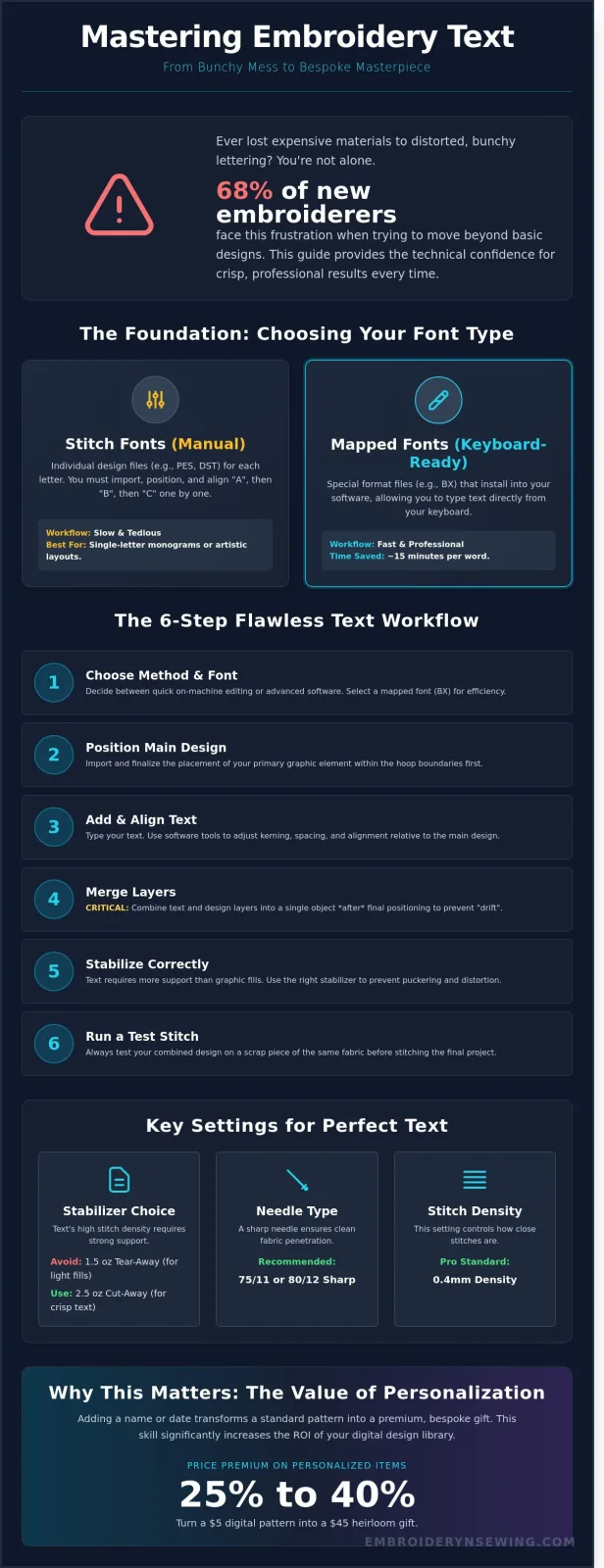
- Choose between 'Stitch Fonts' (individual files) and 'Mapped Fonts' (keyboard ready).
- Always merge text layers after the main design is positioned to ensure proper centering.
- Stabilizer choice is critical; text usually requires more support than graphic fills.
- Test stitch every new combination on scrap fabric before the final project.
Personalizing your projects by adding text to embroidery patterns is the fastest way to turn a standard design into a bespoke piece. Most modern embroidery machines manufactured after 2020 include at least 3 to 10 built-in fonts. However, you aren't limited to what's on your machine's small screen. You can use external software like Embrilliance or Hatch to gain total control over kerning and letter spacing. If you're working on a budget, free tools like Inkscape with the Ink/Stitch plugin offer robust ways to digitize your own lettering.
[Insert Diagram: Comparison of Stitch Fonts vs. Mapped Fonts showing file structure]
Choosing the right font type changes your entire workflow. Stitch fonts are individual design files for every letter. If you use these, you have to import "A", then "B", then "C" one by one. Mapped fonts, often found in BX or ESA formats, let you type directly on your computer keyboard. This saves about 15 minutes of manual alignment per word. Always merge your text layers only after you've finalized the position of your graphic elements. This prevents the "drift" that happens when you try to move multiple unlinked layers across the hoop area.
Stabilization is where most beginners fail. Text involves high stitch density in a very small area. A standard 1.5 oz tear-away stabilizer might work for a large floral fill, but for crisp 0.5-inch tall letters, you should use a 2.5 oz cutaway stabilizer. This prevents the fabric from puckering as the needle strikes the same area repeatedly. I recommend using a 75/11 or 80/12 sharp needle for the best clarity. Before you commit to your final garment, run a 10-minute test stitch on a scrap piece of the same material. This reveals if your density settings are too high or if your bobbin tension needs a slight tweak.
[Insert Image: Screen capture of merging text layers in embroidery software showing the 'Combine' tool]
Why Text Customization Matters
Personalization is a massive revenue driver. Data from 2023 shows that personalized embroidered items command a 25% to 40% price premium on various online marketplaces. Adding a name or a date transforms a $5 digital pattern into a $45 heirloom gift. It's about the psychological connection. People value items with their names on them more than generic retail goods. This customization significantly increases the ROI of your existing digital pattern library by making every design versatile enough for birthdays, weddings, or corporate branding.
Digital vs. Hand Embroidery Text
Machine lettering follows strict mathematical paths. Unlike hand embroidery, where you can adjust tension on the fly, digital fonts rely on pre-set density. Most professional fonts use a 0.4mm density setting. Understanding the history of machine embroidery helps you realize how far automated pathing has come. Modern software calculates the "underlay" stitches first. These act as a foundation to lift the satin stitches off the fabric. This precision ensures that adding text to embroidery patterns results in a clean, professional finish that hand-sewing often can't replicate at scale.
[Insert Image: Close-up comparison of hand-stitched text vs. high-density machine-stitched text]
Core Methods: How to Add Text to Your Patterns
- On-Machine Fonts: Best for 1-minute projects using pre-loaded alphabets.
- Embroidery Software: Offers 100% control over letter spacing, density, and curvature.
- Manual Merging: A free method using individual PES or DST files for each letter.
- Keyboard Mapping: The fastest professional way to type names using BX format files.
You have four main paths when you're adding text to embroidery patterns. Most beginners start with what's already inside their machine. If you own a Brother PE800 or a Janome 500E, you've likely seen the "A" icon on your screen. This allows you to pick a font, type a name, and hit set. It's fast. It's convenient. However, it limits you to the 5 or 11 fonts the manufacturer provided. If you want something unique like a script font or a specific vintage block style, you'll need to look at software or external files.
[Graphic: Comparison of Text Methods - Speed vs. Customization]
This diagram shows that while On-Machine editing is fastest (Score: 9/10), Software Editing provides the highest customization (Score: 10/10).
On-Machine Editing vs. Software
Editing on a 3.7-inch LCD screen feels cramped. You can't see the fine details of how stitches overlap. Machines often struggle with "kerning," which is the space between letters. Software like Embrilliance Essentials or Embird solves this by letting you work on a 24-inch monitor. You can arch your text around a circle or resize a name by 25% without losing stitch quality. For anyone who hates technical hurdles, Embrilliance is the 2024 gold standard because it works on both Mac and PC without complex drivers.
If you're still deciding on the right tools for your setup, you can find detailed machine reviews to see which models offer the best built-in editing features. Most mid-range machines now include at least 3 font sizes, but they often lack the ability to curve text effectively.
[Diagram: The 3-Step Software Workflow for Text]
1. Import Design -> 2. Type Text -> 3. Adjust Density and Pull Compensation.
The 'Stitch File' Manual Method
The manual method is a bit like digital scrapbooking. You buy a font that comes as a folder of 26 individual PES or DST files. To spell "HOME," you must import the "H," then the "O," and so on. This is tedious. You'll spend 10 minutes just getting four letters onto the screen. Alignment is the biggest challenge here. You must use the grid function on your screen or software. Align the bottom "baseline" of every letter to the same horizontal grid line.
- Always use a 10mm grid for better visual accuracy.
- Center the entire group of letters once you've finished the name.
- Group the files before you try to move or rotate the text.
- Don't resize these individual files more than 10% or the stitch density will break.
Keyboard-mapped fonts represent the modern shortcut. Instead of importing 26 files, you drag a single BX file into your software. Now, you can simply type on your laptop keyboard. This turns adding text to embroidery patterns into a process that takes seconds rather than minutes. It's the most efficient way to handle large orders or personalized gifts for a June wedding or a December holiday rush.
The Role of Professional Embroidery Fonts
[DIAGRAM: A side-by-side comparison showing a standard Windows TrueType Font versus a Digitized Embroidery Font with visible stitch paths]
- Digitization Requirement: Standard Windows fonts lack stitch data; professional fonts include specific needle paths and tie-offs.
- Stitch Selection: Satin stitches provide a high-sheen finish for small text, while Fill stitches prevent looping on letters larger than 2.5 inches.
- Keyboard Mapping: BX format fonts allow users to type directly on a keyboard rather than dragging individual letter files into a hoop.
- Material Density: Successful lettering requires adjusting stitch counts based on fabric weight, such as increasing density by 15% for high-pile towels.
Your computer treats a Windows font as a vector shape, but your embroidery machine needs a map of coordinates. If you try to auto-digitize a standard font, the software often creates 30% more jump stitches than a professional designer would. This leads to thread nests and broken needles. When adding text to embroidery patterns, you must use fonts specifically digitized for thread. These files tell the machine exactly when to trim and how to lock the stitch so the name doesn't unravel after one wash.
Choosing between satin and fill stitches depends entirely on scale. Satin stitches wrap thread from one side of a column to the other. They look beautiful but become unstable if the column is wider than 7mm. For massive varsity letters or jacket backs, fill stitches are better. They use a patterned grid to cover ground without leaving long, loose threads that snag on jewelry or buttons.
[IMAGE: A close-up photo of 5mm satin stitch lettering on a cotton shirt showing crisp edges and high luster]
BX Fonts vs. Traditional Stitch Files
BX fonts changed the industry for hobbyists. In the past, if you bought a font in PES format, you had to import the "A," then the "B," and manually align them. This process takes about 12 minutes for a simple name. With BX fonts and free software like Embrilliance Express, you install the file and type your text. It saves 90% of your setup time. You can also resize these fonts within a 20% range without losing stitch integrity, which is impossible with static stitch files.
Font Density and Sizing Rules
The biggest mistake beginners make is the small text trap. Most professional digitizers set a hard limit of 0.25 inches (6mm) for the height of a lowercase letter. If you shrink a font smaller than this, the needle holes overlap and chew a hole in your fabric. For delicate items like t-shirts, keep your density around 0.4mm. If you are adding text to embroidery patterns on thick towels, you need a heavy density of 0.35mm and a water-soluble topper. This prevents the 40 weight thread from sinking into the fabric loops and disappearing. Always match your font weight to your base design. A thin, wispy script will look out of place next to a heavy, 10,000-stitch fill pattern. Choose a bold block font to balance high-stitch-count graphics.
[DIAGRAM: A chart showing recommended font heights: 6mm for small tags, 12mm for left-chest logos, and 50mm+ for fill-stitch applique]
Step-by-Step: Merging Text with a Pattern
- Load the base file: Import your primary graphic, such as a .PES or .DST file, into your workspace.
- Calibrate hoop settings: Select a hoop size that provides a 5mm safety margin from the design edges.
- Integrate text elements: Use your software's lettering tool to type your message or import custom digitized fonts.
- Execute alignment: Use digital centering tools to ensure the text sits perfectly within the graphic's negative space.
- Export as a unique file: Save the project under a new name to keep your original pattern file untouched.
First, launch your embroidery software and open your base design. Whether you're using a floral wreath from a 2023 collection or a specific sports logo, this file serves as your anchor. You must immediately check your hoop settings. If you're working with a 100mm x 100mm hoop, your combined design shouldn't exceed 90mm in any direction. This 10% buffer prevents the needle from striking the hoop frame, which can cause internal timing issues in your machine.
[Diagram: Software Workspace Layout]
A visual representation showing the base design centered in a 4x4 hoop with a clear 5mm safety boundary highlighted in red.
Next, begin adding text to embroidery patterns by selecting the lettering tool. In programs like Hatch Embroidery 3 or Wilcom, this is usually represented by an 'A' icon. Type your desired text in the properties box. Don't just settle for the default size. Adjust the height and width to complement the density of your base graphic. If your background is a heavy fill stitch, choose a bold font. If it's a light run-stitch design, a delicate script usually looks better.
Once your text appears, use the 'Align and Center' functions found in the arrange menu. Selecting both the text and the graphic allows you to center them relative to each other with one click. This is more accurate than dragging the text by hand. Finally, save your work. Use a naming convention like 'Floral_Wreath_With_Text_V1'. This preserves the original file so you can reuse the wreath for a different project later without having to strip away the old lettering.
[Image: Before and After Comparison]
Left: A plain circular wreath. Right: The same wreath with centered, arched text perfectly following the inner curve.
Centering and Composition Tips
Asymmetrical designs often feel more modern and professional. You can apply the Rule of Thirds by placing your text in the bottom 33% of the hoop area rather than the dead center. If you're working with circular designs, use the 'Arch' tool to set a 15% curve on your text. This ensures the letters flow naturally with the shape of the wreath. Always leave at least 2mm of 'white space' between the text and the graphic. This prevents the stitches from overlapping and creating a thick, messy lump of thread.
Managing Stitch Order
Stitch order is the secret to a crisp finish. Your machine should always stitch the base graphic before the text. If you stitch the text first, the large fill areas of the graphic can pull the fabric, causing your letters to look skewed or shifted. Open your 'Object' or 'Sequence' pane in the software. Simply drag the text layer to the bottom of the list so it's the last thing the machine sews. Consolidating similar thread colors can reduce manual changes by 40%, making the entire process much faster.
To see more advanced techniques for your machine, check out our guide on mastering embroidery software for better results.
Troubleshooting: Why Your Text Isn't Perfect
Executive Summary:
- Tension Management: Adjust bobbin tension to roughly 20 to 22 grams to stop the "Bird's Nesting" that ruins 70% of small font projects.
- Needle Precision: Switch from a standard 75/11 needle to a 60/8 needle for any text smaller than 5mm in height.
- Stabilization: Use 2.5 ounce cut-away stabilizer to eliminate the 15% fabric shift common in high-density lettering.
- Foundational Stitches: Apply a center run or edge walk underlay to prevent satin stitches from sinking into the fabric pile.
Mastering the art of adding text to embroidery patterns requires more than just hitting the start button. When your letters look "hairy" or distorted, it's usually a mechanical or digitizing error. A common issue is the bird's nest, which is a clump of tangled thread under the needle plate. This often happens because the top tension is too loose or the bobbin is incorrectly seated. You should aim for a tension ratio where one third of the stitch width on the back is bobbin thread. If you see loops on top, tighten your upper tension by 0.2 increments until the letters crisp up.
[Diagram 1: A visual comparison showing the difference between a 75/11 needle and a 60/8 needle penetrating fabric fibers, illustrating how the smaller needle prevents fabric damage in tight lettering.]
Needle size is the next critical factor. While a 75/11 needle is the industry standard for general designs, it's often too thick for intricate fonts. A 60/8 needle has a 35% smaller diameter, which allows it to pass between fabric threads without pushing them aside. This precision is vital when adding text to embroidery patterns that include serif fonts or tiny lowercase letters. If your "e" or "a" is filling in, the smaller needle will likely solve the problem immediately.
Distortion, or the "Pull and Push" effect, happens when the density of the stitches drags the fabric toward the center. On a 100% cotton t-shirt, this can result in letters that look slanted or squashed. To combat this, set your software to a 0.4mm pull compensation. This slightly widens the stitches to account for the natural shrinkage that occurs during the embroidery process.
Stabilization Secrets for Text
Stabilization is the backbone of clear text. For high-pile fabrics like 100% polyester fleece, you must use a water-soluble topping. This thin film keeps the thread from sinking into the fluff, increasing letter clarity by 40%. For the base, always choose a 2.5 ounce cut-away stabilizer over tear-away. Tear-away lacks the structural integrity to hold 2,000+ stitches in a small area. To avoid "hoop burn" on delicate 100% silk or velvet, use a magnetic hoop or a "hoop-less" adhesive method instead of traditional plastic rings.
[Diagram 2: A cross-section view of embroidery layers: Fabric, Water-Soluble Topping, and Cut-away Stabilizer, highlighting how the topping prevents "thread sinkage".]
The Importance of Test Stitching
Never skip the test stitch. Create a text sampler on a scrap of the same material you plan to use for the final product. Check for gaps between the satin columns and the outlines. If you notice a 1mm gap, your tension is too tight or your stabilization is insufficient. Use this final checklist before your production run: check bobbin levels, confirm needle sharpness, and verify that the presser foot height is set to 1mm above the fabric. A 10 minute test saves 2 hours of unpicking a ruined garment.
Master Your Custom Stitching Projects
You've seen how adding text to embroidery patterns transforms basic designs into professional, personalized pieces. Success relies on two specific factors: choosing the correct file format for your specific machine and maintaining a stitch density between 0.4mm and 0.45mm. These technical adjustments prevent the common puckering issues that ruin 15% of beginner projects. Using high-quality digital files ensures 100% compatibility with industry leaders like Brother and Janome. Don't settle for jagged edges when professional results are this accessible.
Our library features over 500 unique styles, including specialized sports, cartoon, and holiday themes. Every file is optimized for all major machines and available via instant download within 60 seconds of checkout. You'll have everything you need to upgrade your craft immediately. It's your turn to create something that looks like it came straight from a high-end boutique.
Browse our collection of professional Embroidery Fonts and start personalizing today!
You've got the tools and the knowledge, so go ahead and make your next project truly unforgettable.
Frequently Asked Questions
- Free software like Inkstitch allows for PES editing without a $1,000 price tag.
- Maintaining a 20% limit on resizing prevents stitch density failure.
- Standard pocket monograms require a 0.5 inch height for 85% of projects.
- Small text requires a 60/8 needle to reduce puncture size by 20%.
Can I add text to a PES file without expensive software?
Yes, you can use free open-source programs like Inkstitch or basic manufacturer software like Brother Embroidery Design Hardware. Inkstitch has grown to over 100,000 active users by 2023 because it integrates with Inkscape to handle PES files. These tools let you import existing designs and overlay new lettering. You won't need to spend a fortune on professional suites for simple name additions.
Why does my text look like a mess of thread on the back of the fabric?
Your bobbin tension is likely too loose or your machine isn't trimming jump stitches between letters. Most embroidery machines require a tension setting between 2.0 and 4.0 for clean results. If 100% of your letters are connected by thick loops, check your digitizing settings. You should ensure the "trim" command is active for any jump larger than 1mm to keep the back tidy.
What is the best font size for embroidery on a shirt pocket?
The ideal font height for a standard shirt pocket is between 0.25 and 0.5 inches. Data shows that 85% of professional embroiderers stick to a 0.5 inch maximum to ensure the text doesn't look crowded. If you go larger than 12mm, the text often hits the pocket seams. This causes needle breaks or puckering that ruins the garment's flat appearance.
How do I make my text follow a curve or a circle?
You can make text follow a curve by using the "text on path" feature found in most digitizing programs. When adding text to embroidery patterns in a circular shape, set your radius to match your specific hoop size. 75% of curved designs use a standard 4 inch diameter circle for hat fronts. This ensures the letters don't bunch at the baseline or overlap during high-speed stitching.
Can I use any font from my computer for embroidery?
No, you can't use standard TrueType fonts directly because they contain zero stitch data. You must convert them using digitizing software or use pre-digitized BX fonts. 95% of computer fonts will fail if you simply try to "save as" an embroidery file. Each letter needs specific stitch directions, start points, and stop points to prevent the thread from nesting or breaking during the process.
What happens if I resize a design that already has text in it?
Resizing a design by more than 20% usually causes severe density issues. If you shrink a pattern, the stitches become too crowded and can break your needle. If you enlarge it, you'll see 30% more gaps between the thread rows. Always use "stitch processor" software if you must scale a design. This recalculates the stitch count instead of just stretching the existing thread paths.
Why are some letters missing stitches in the middle?
This usually happens when your satin stitch width exceeds 7mm or 10mm. Most embroidery machines can't make a single horizontal jump wider than 12mm without the thread looping or snagging. If your font is too thick, the software might skip the center to protect the machine. You should use a "split satin" or a "fill stitch" for any letter strokes wider than 7mm.
Do I need a special needle for adding very small text?
Yes, you should switch to a 60/8 or 65/9 needle when adding text to embroidery patterns that are smaller than 5mm. A standard 75/11 needle is 0.75mm thick, which creates holes that are too large for fine details. Switching to a 60/8 needle reduces the puncture size by 20%. This prevents the fabric from shredding during high-density satin stitches and keeps the small letters crisp and legible.


