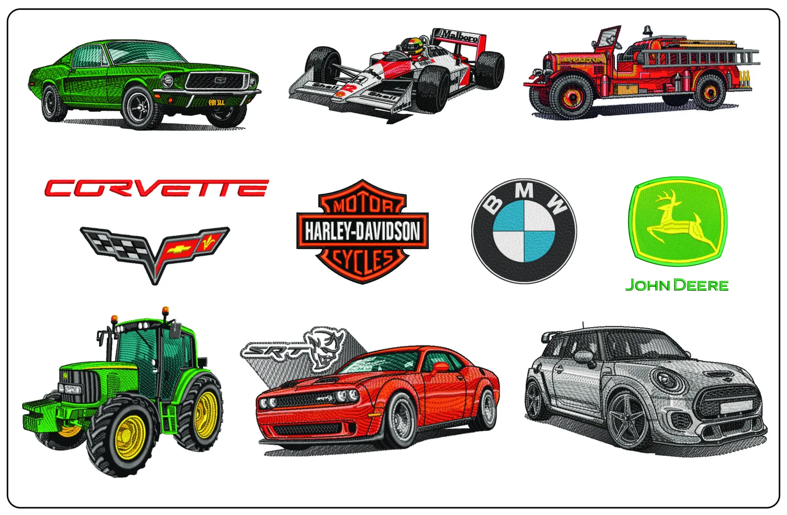
# The complete guide to Car Logo Embroidery Designs
Car logo embroidery designs are popular because they turn a familiar badge, emblem or wordmark into something wearable: a club jacket, workshop shirt, cap, seat-back cover or gift for an enthusiast. But automotive logos are also one of the categories where good digitising matters most. A clean badge on a vehicle grille can look simple at first glance, yet the embroidered version often includes tight lettering, chrome-style borders, dense fills and precise symmetry.
This guide explains what to look for before you buy or stitch a car logo embroidery design, how to choose the right size and fabric, and what legal and technical issues matter in real-world embroidery.
## What counts as a good car logo embroidery design?
A strong design is not just a recognisable shape. It also needs to run well on a machine without pulling, puckering or losing detail.
When reviewing a design, check for:
- Clear shape definition: Circular badges, shields, wings and minimalist monograms should still read cleanly when stitched.
- Sensible stitch density: Overly dense fills can cause thread breaks, fabric distortion and a raised, stiff finish.
- Underlay suited to the fabric: Caps, twill jackets and polos all need different support.
- Lettering that matches the intended size: Small automotive wordmarks can become unreadable if the design is reduced too far.
- Efficient sequencing: Good digitising reduces unnecessary trims and jump stitches.
The best car logo embroidery designs are the ones that stay legible at the size you actually plan to stitch, not just the ones that look sharp in a large preview image.
Before you buy: size matters more than most people expect
Many buyers choose a design based on the car brand they love, then only later realise that the emblem is too detailed for the placement they want.
| Placement | Typical workable size | What to avoid |
|---|---|---|
| Left chest | 7-10 cm wide | Very fine lettering or complex layered chrome effects |
| Cap front | 5-12 cm wide depending on cap style | Wide horizontal badges with tiny text |
| Jacket back | 18-28 cm wide | Overly dense fills on heavy emblems without proper compensation |
| Sleeve | 5-8 cm wide | Full brand names with narrow strokes |
If your chosen design includes a ring, crest, wings or internal text, ask yourself whether those details will still be visible after stabilising, hooping and washing.
The biggest mistake: resizing without checking stitch logic
Embroidery files are not like ordinary images. Reducing a design by 40% can make satin columns too narrow, fills too dense and lettering unusable. Enlarging can also expose weak underlay or gaps.
For car logo embroidery designs, resizing is especially risky because many badges rely on exact spacing and balanced geometry. If you need multiple sizes, it is better to buy files prepared specifically for those applications rather than scaling one file aggressively.
Fabric and placement tips for automotive logo designs
Different fabrics change how a logo looks after stitching.
Polos and T-shirts
Use cut-away stabiliser for knits. Car logos with clean satin borders usually perform better than solid, blocky fills on stretchy garments.
Caps
Structured caps can handle bolder emblem shapes, but small inner details may disappear. Centre-out sequencing is useful on cap designs because it helps keep the logo balanced.
Jackets and workwear
These are ideal for left-chest and back logos. Heavy fabrics can support larger fills, but you still need proper topping or stabiliser if the surface has texture.
Bags and seat organisers
These are good for club logos, stylised badges and simple automotive silhouettes. Dense fills are less of a problem on stable canvas than on knitwear.
Thread choices: how to make a badge read well
Automotive logos often rely on metallic, chrome or high-contrast branding in print. In embroidery, that effect has to be translated rather than copied exactly.
A few realistic approaches:
- Use high-sheen rayon or quality polyester for a polished badge look.
- Replace tiny gradients with clean colour blocking.
- Use metallic thread sparingly; it can be striking for outlines, but it is slower and more temperamental to run.
- Prioritise contrast over strict photographic realism.
A design that reads clearly from one metre away will usually look better on clothing than one crammed with tiny visual effects.
Personal use, club wear and legal considerations
This is the part buyers often overlook. Most well-known car logos, emblems and wordmarks are protected intellectual property. Owning an embroidery file does not automatically give you the right to sell finished items featuring that branding.
In practical terms:
- Personal-use stitching may be different from commercial resale depending on your location and the rights involved.
- Commissioned work for a garage, car club or event may require permission if protected logos are used.
- If you plan to sell products featuring a brand badge, get proper clearance first.
Always check usage rights before stitching branded logos for resale or public distribution.
What to look for in the file listing
Even if the design itself looks attractive, the listing should help you judge whether it suits your machine and project.
Look for:
- Supported machine formats
- Finished design dimensions
- Stitch count
- Colour changes
- Intended hoop size
- A preview that shows actual stitch structure, not only artwork
If any of those details are missing, buy cautiously.
If you like logo-style embroidery, study strong emblem construction
Even when you are shopping specifically for car logo embroidery designs, it helps to look at other logo-style files and study how they handle line weight, fills and recognisable silhouettes. For example, a bold swoosh-based file such as Nike Swoosh Taz Bite elegant embroidery design shows how a dominant central mark can carry the composition without overcrowding the stitch area.
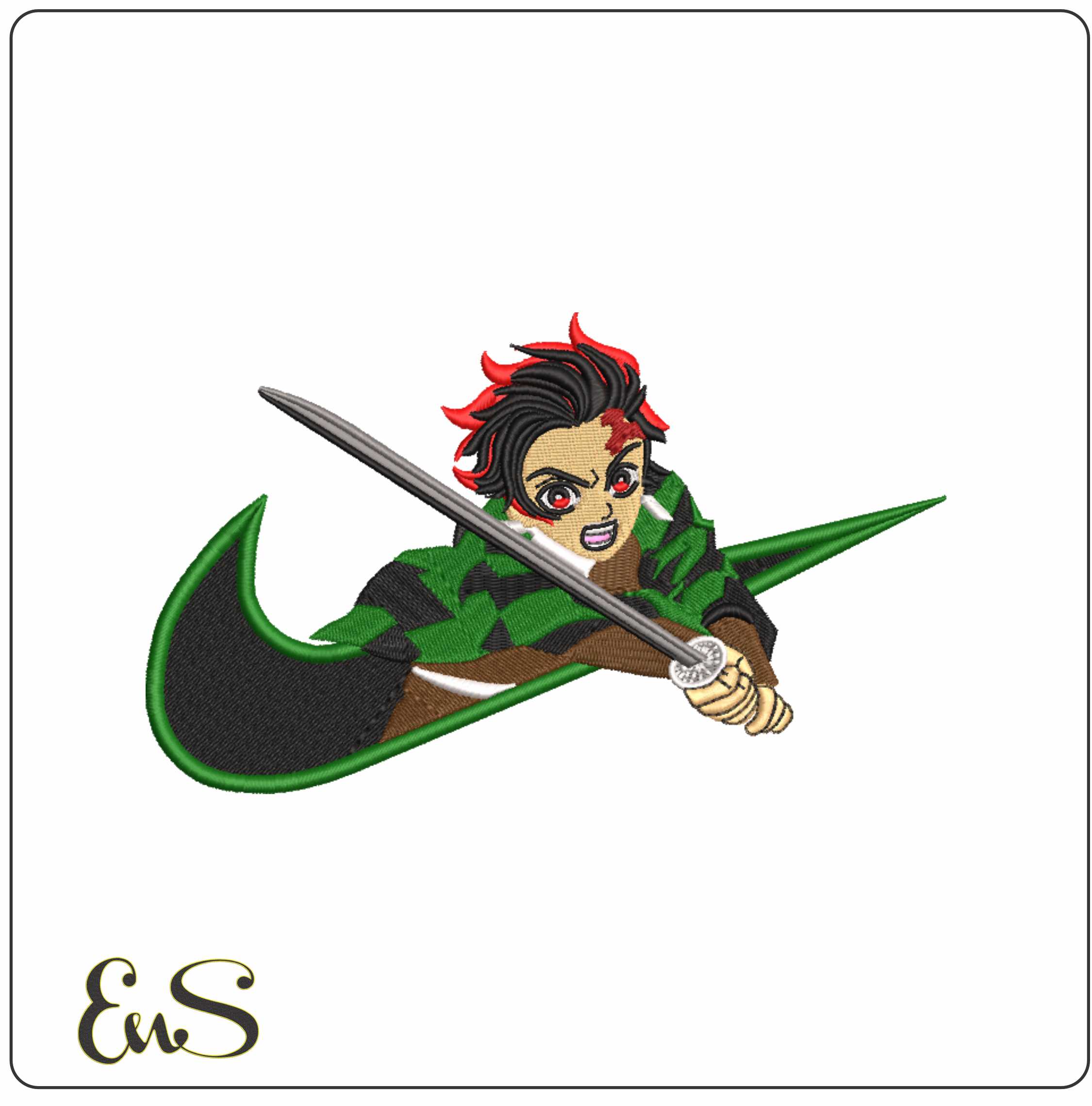
Likewise, a character-led file with a strong outline, such as Nike Swoosh Tanjiro Sword anime elegant embroidery design, is useful for understanding how movement and negative space affect readability on fabric.
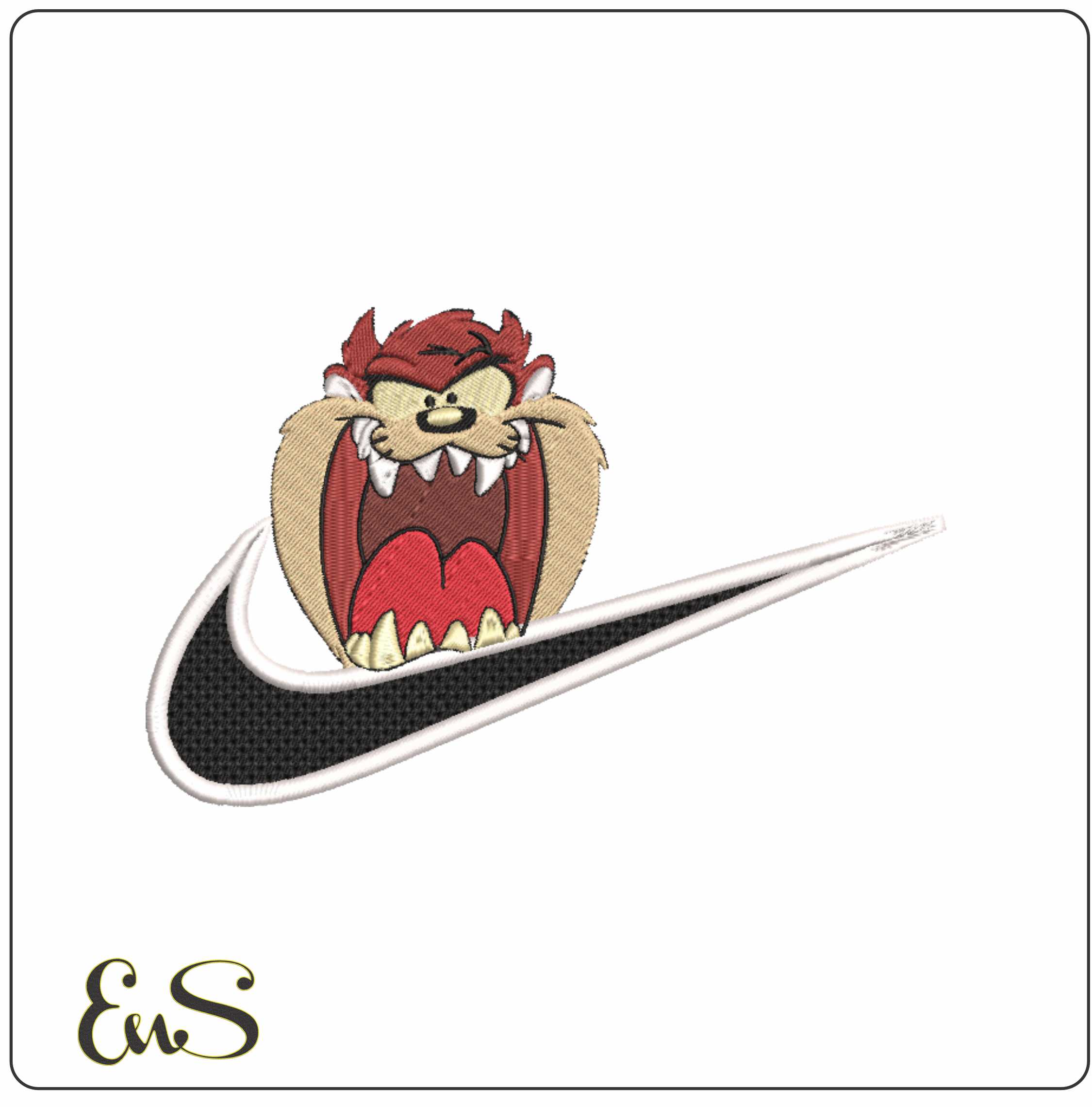
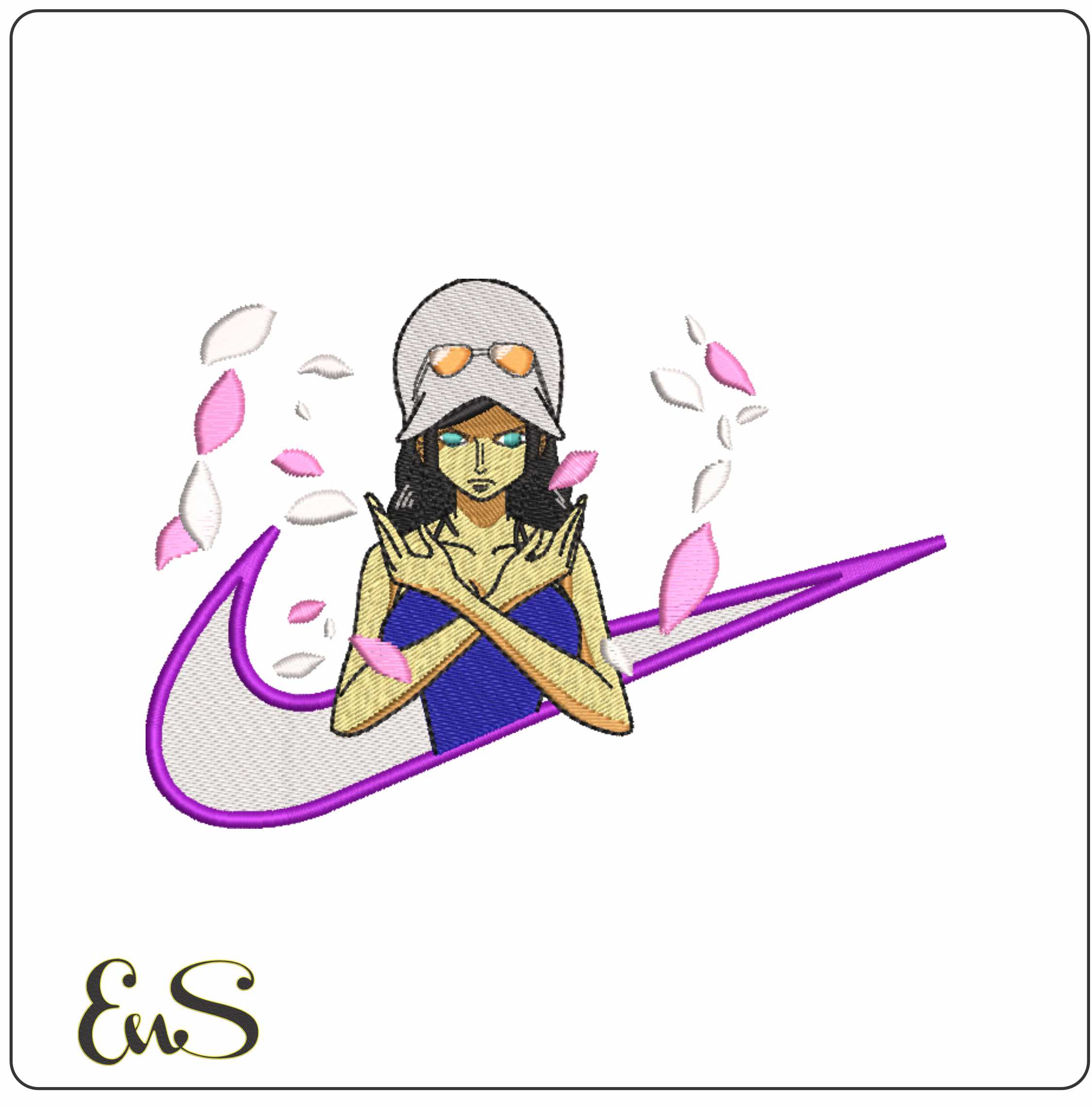
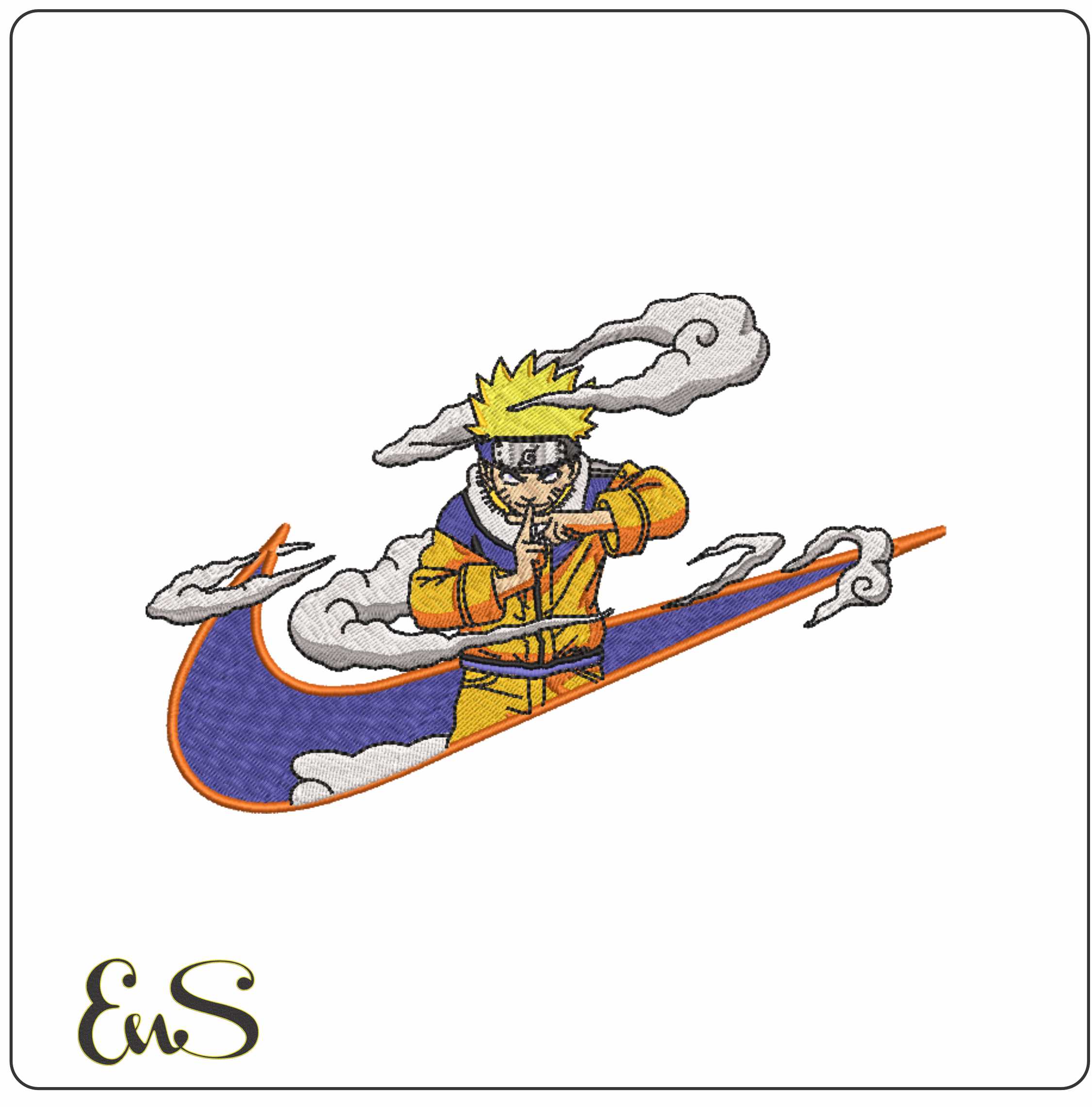
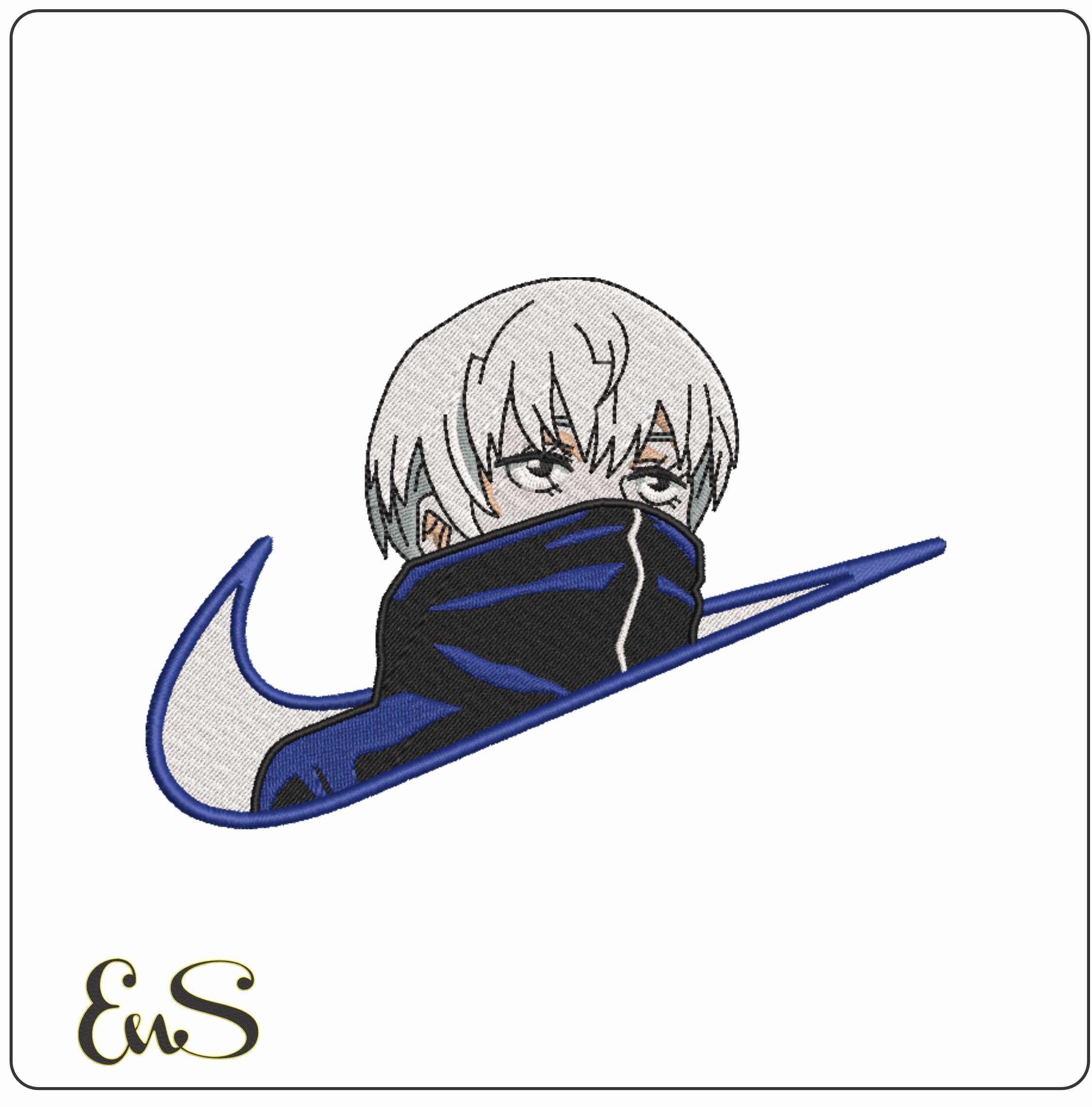
If you prefer compact, chest-friendly motifs, compare the spacing and edge definition in Nike Swoosh Sasuke Uchiha anime elegant embroidery design or Nike Swoosh Robin Flecha anime elegant embroidery design. For cleaner shapes with fewer competing details, Nike Swoosh Toge Inumaki anime elegant embroidery design and Nike Swoosh Unzumaki Naruto anime elegant embroidery design are also worth studying.
These are not car logos, but they are useful references for buyers learning to judge whether a logo-style design will stitch cleanly.
How to test a car logo file before the final stitch-out
Always run a sample first, especially if the design includes:
- Fine internal lettering
- Circular borders
- Dense fill areas
- Sharp corners or narrow satins
- Metallic thread
Your sample should use the same fabric, stabiliser and size planned for the final item. This is the only reliable way to see whether the logo holds its shape.
Choosing the right design for the project
The best buyer decisions usually start with the item, not the brand.
- For a left chest polo, choose a simple badge or monogram with limited text.
- For a cap, choose bold outlines and avoid tiny subtext.
- For a large jacket back, a fuller emblem can work well if digitised sensibly.
- For a gift, pick the cleanest version of the logo rather than the most intricate one.
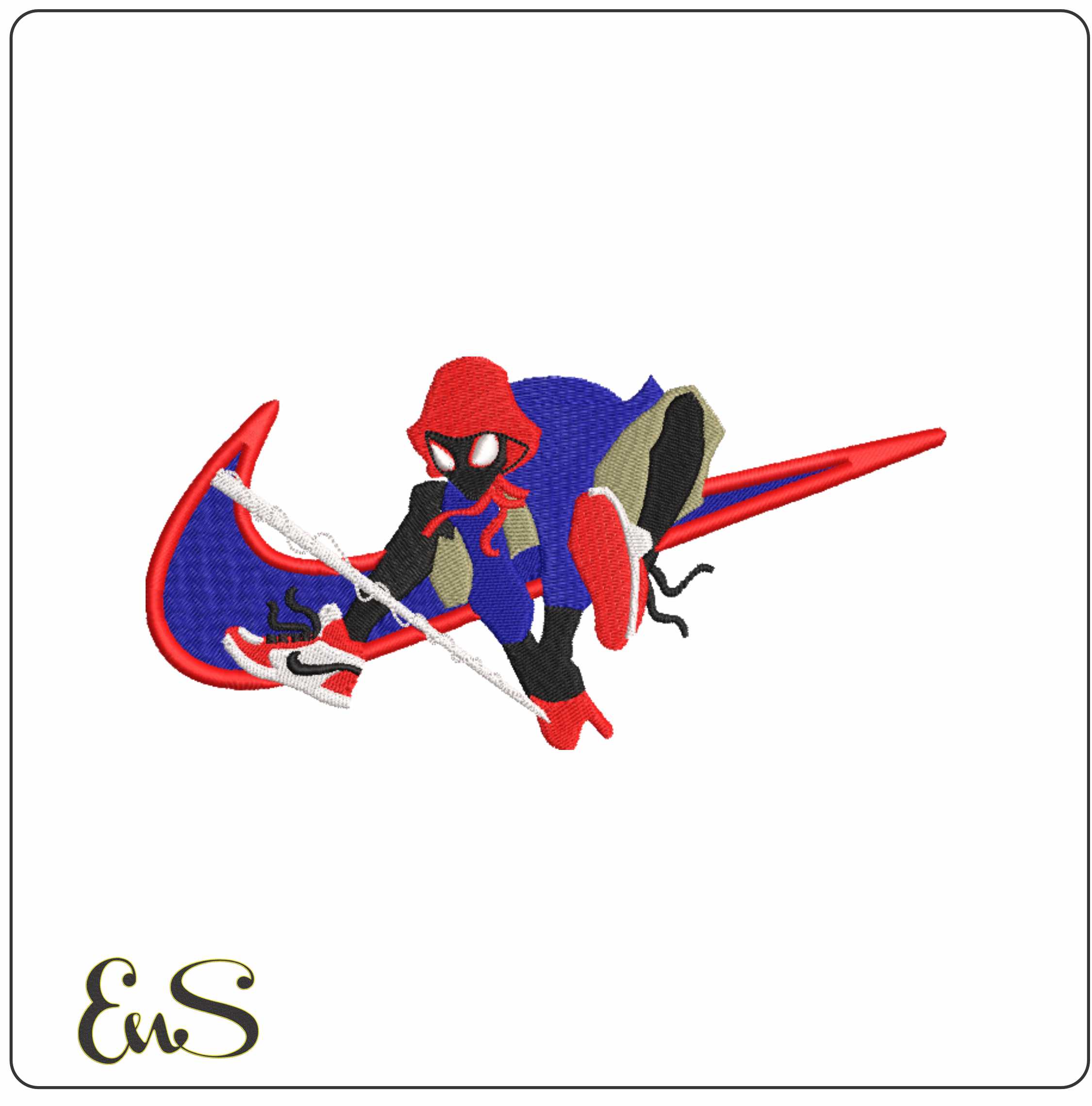
If you are still comparing styles, logo-inspired files such as Nike Swoosh Spider Man Teenager Webshot elegant embroidery design or Nike Swoosh Tanjiro Kamado Earing anime elegant embroidery design can help you recognise the balance between distinctive shape and stitchable detail.
Final thoughts
A good car logo embroidery design should do three things well: stay recognisable, suit the garment and stitch reliably. If a file is overloaded with detail, lacks clear sizing information or seems likely to distort on your chosen fabric, it is probably not the right buy.
Focus on practical embroidery outcomes: readable details, suitable density, fabric compatibility and realistic usage rights. That approach will save more time and thread than choosing a design on appearance alone.