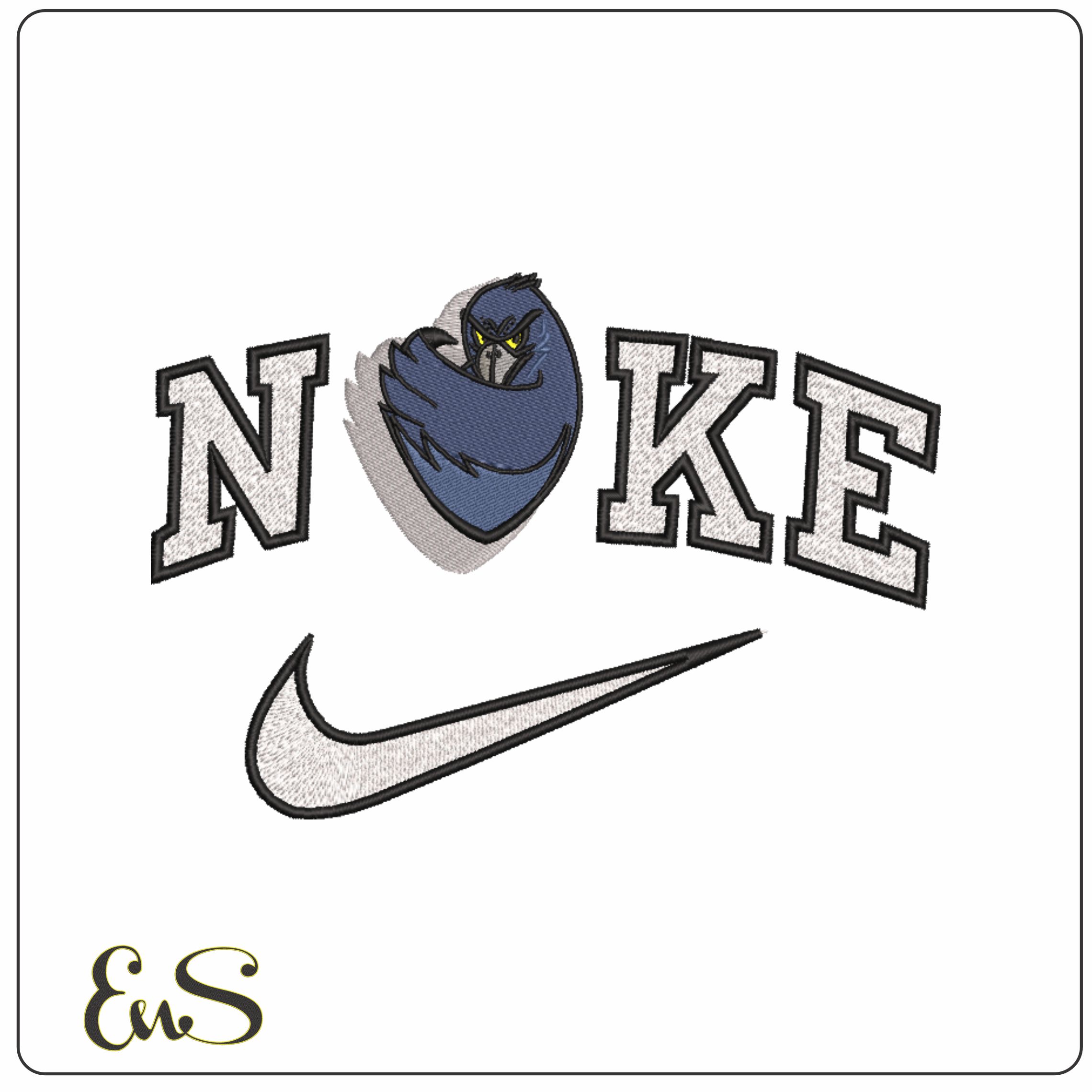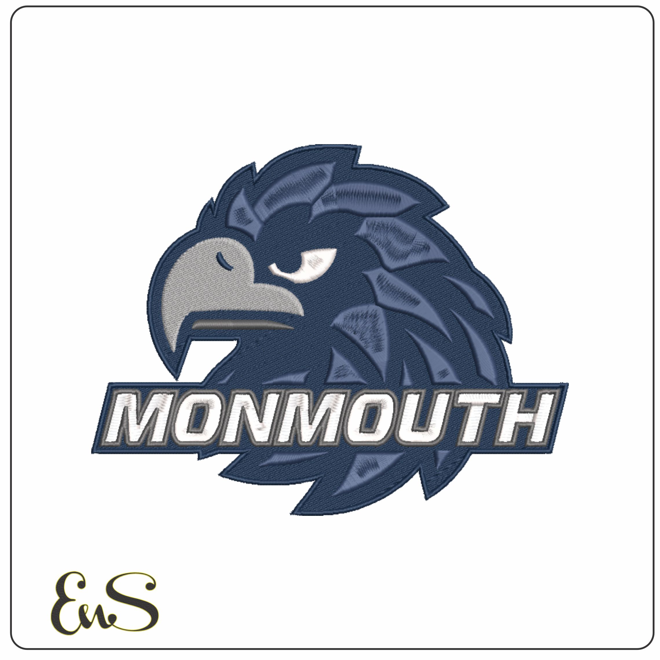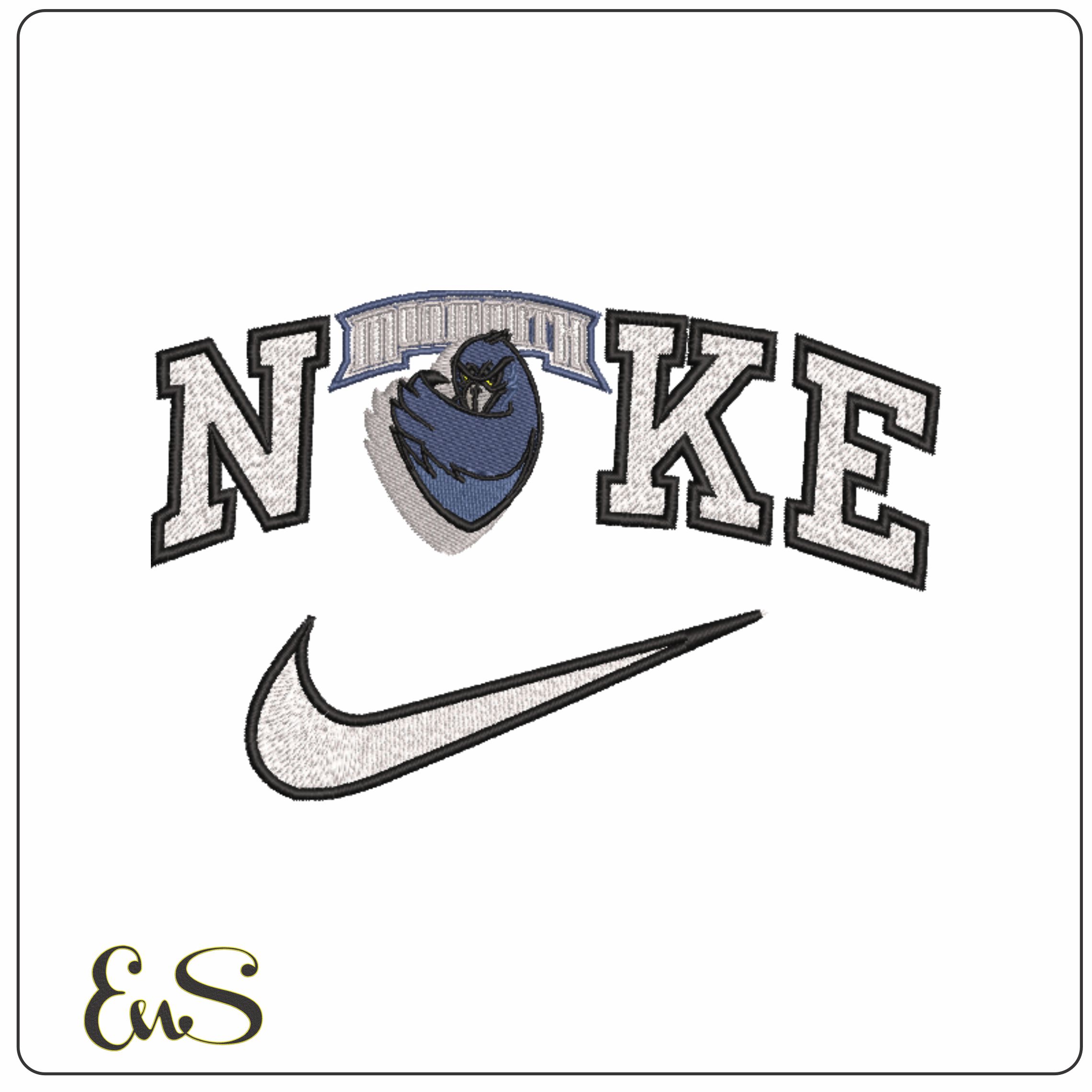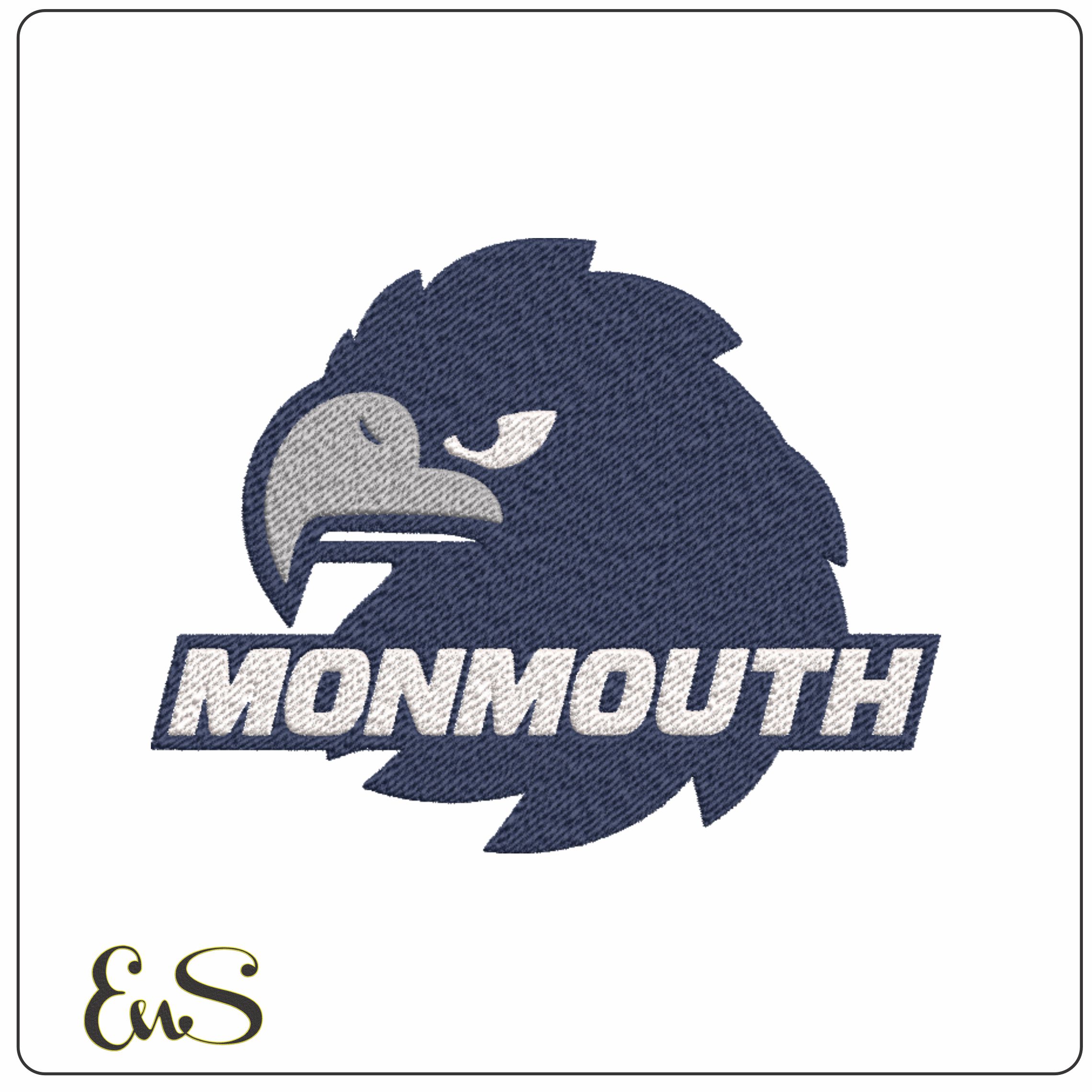
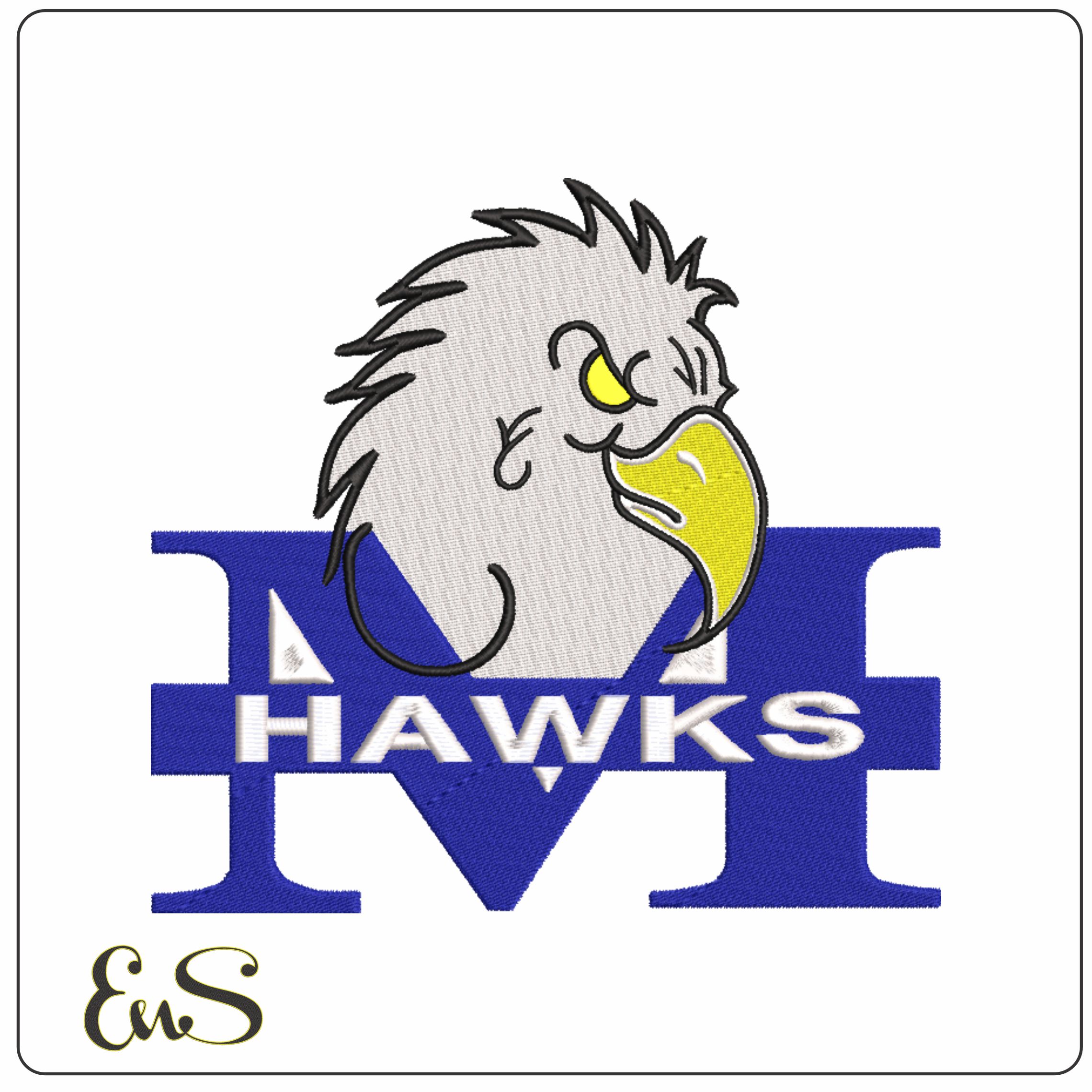
This design captures the Monmouth Hawks look from the 1993 to 2004 era, with the hawk mascot set over a bold block M and HAWKS lettering underneath. The blue, white, yellow and black palette gives it the crisp, high-contrast feel of a proper college sports logo, with the yellow beak and eye standing out nicely against the darker outline. It will appeal to Monmouth supporters, alumni and collectors of older university athletics branding who want that specific period look rather than a generic bird mascot.
With four thread colours and a moderately dense build, it suits sturdier fabrics that can hold a sports-style logo cleanly, such as hoodies, denim jackets, canvas totes and sweatshirt fleece. The strong shapes of the large M and hawk head make it read well on the back of a jacket, across a sweatshirt chest or on a kit bag panel. If you want a piece that looks rooted in college sport, this one has the right boldness without becoming visually fussy.