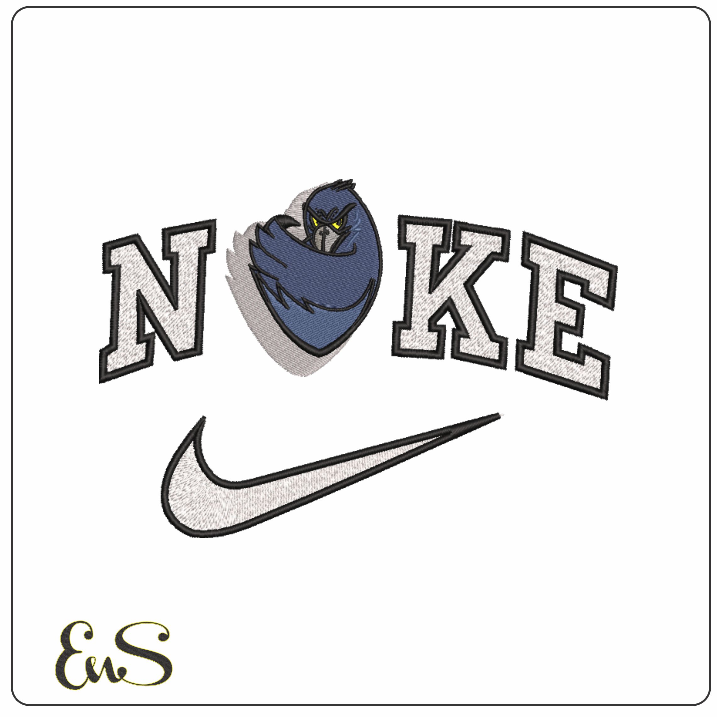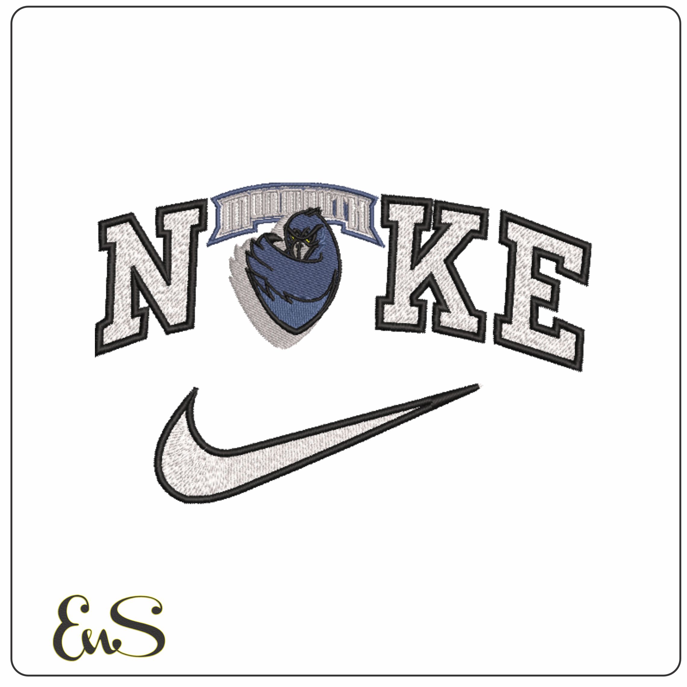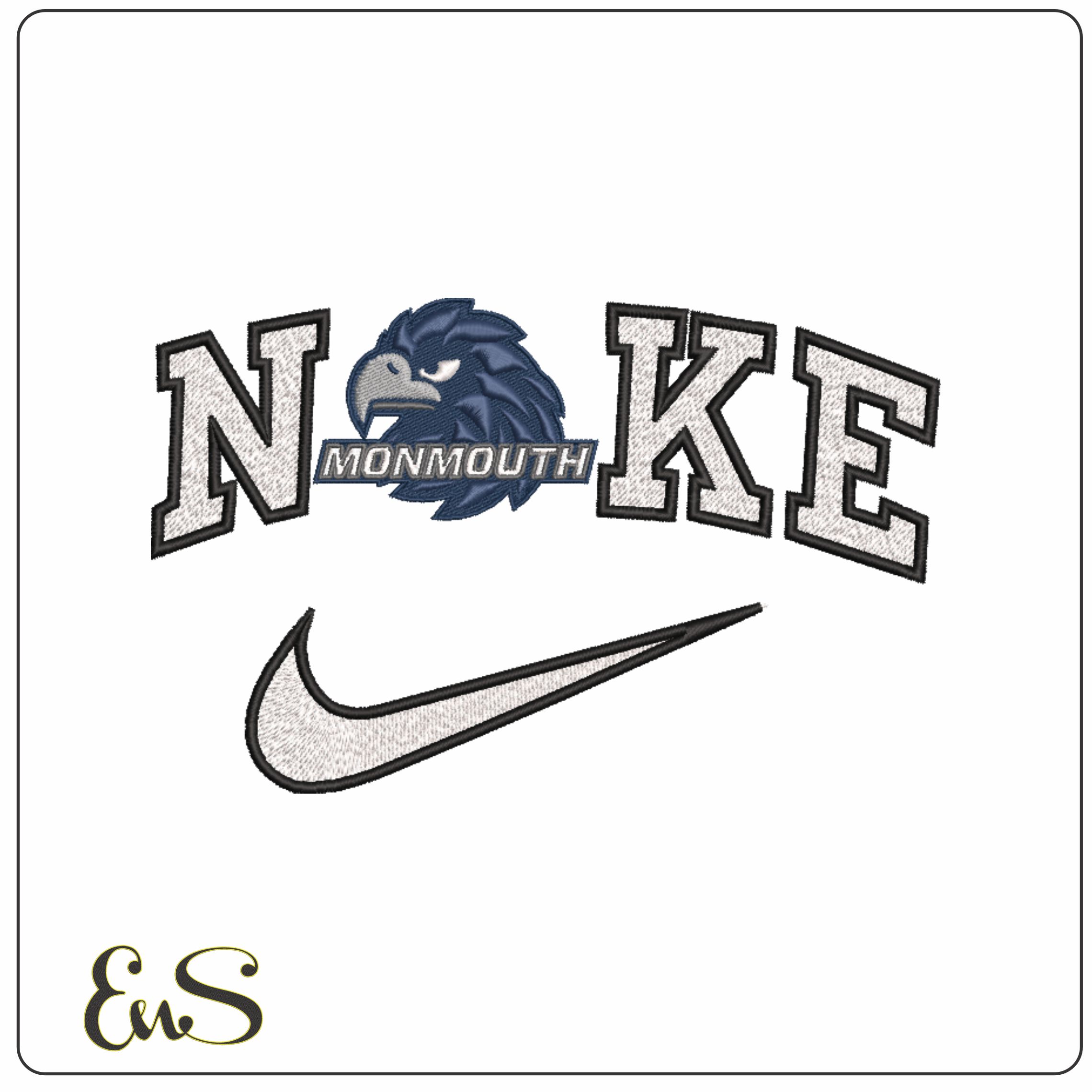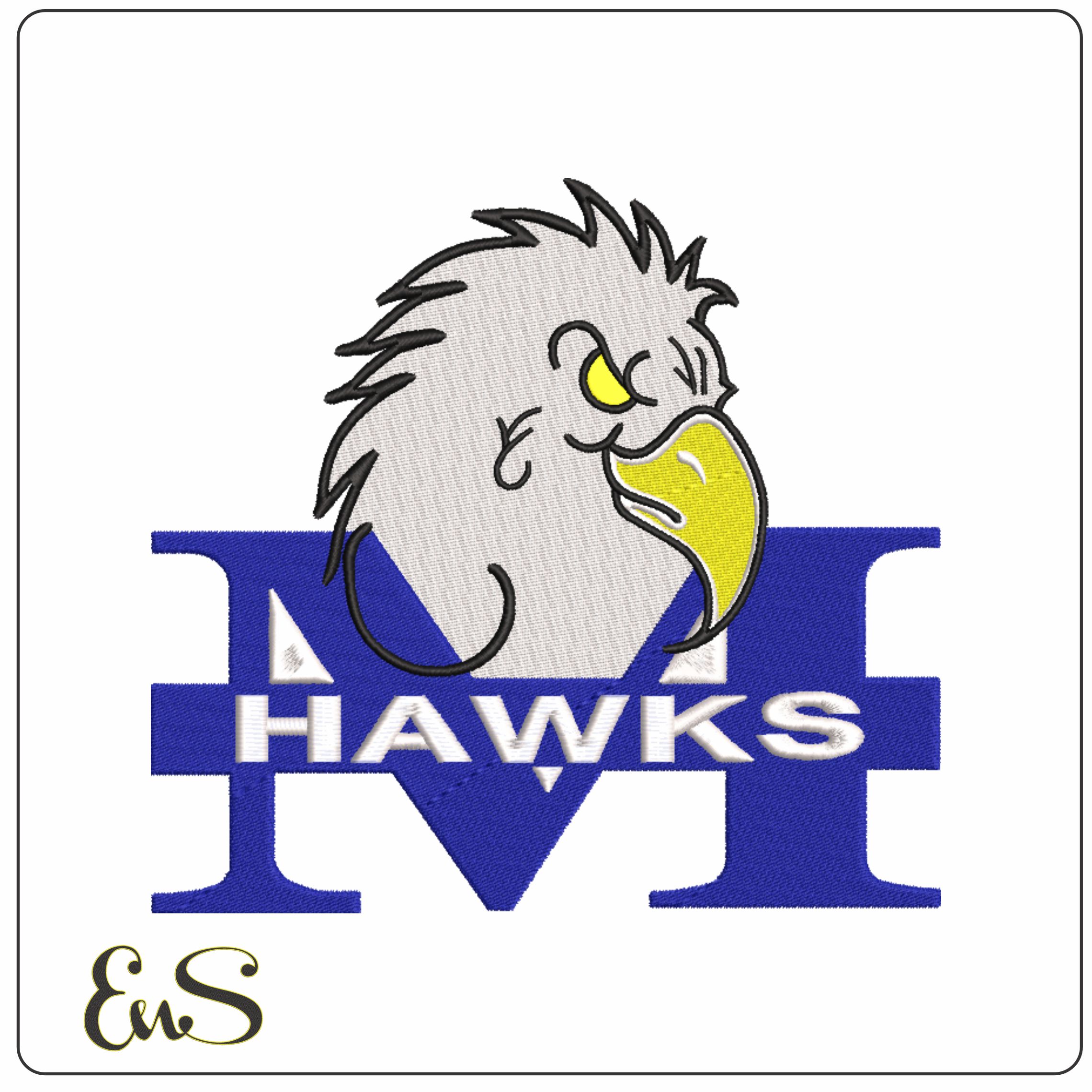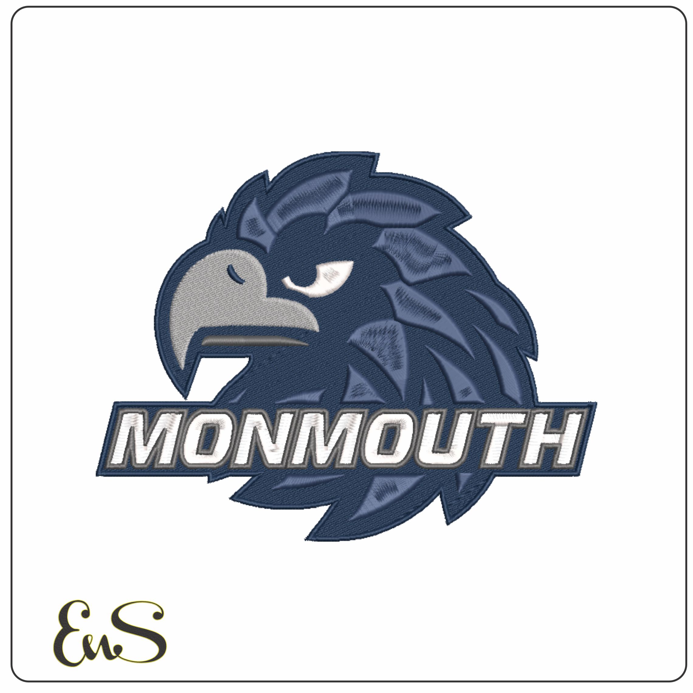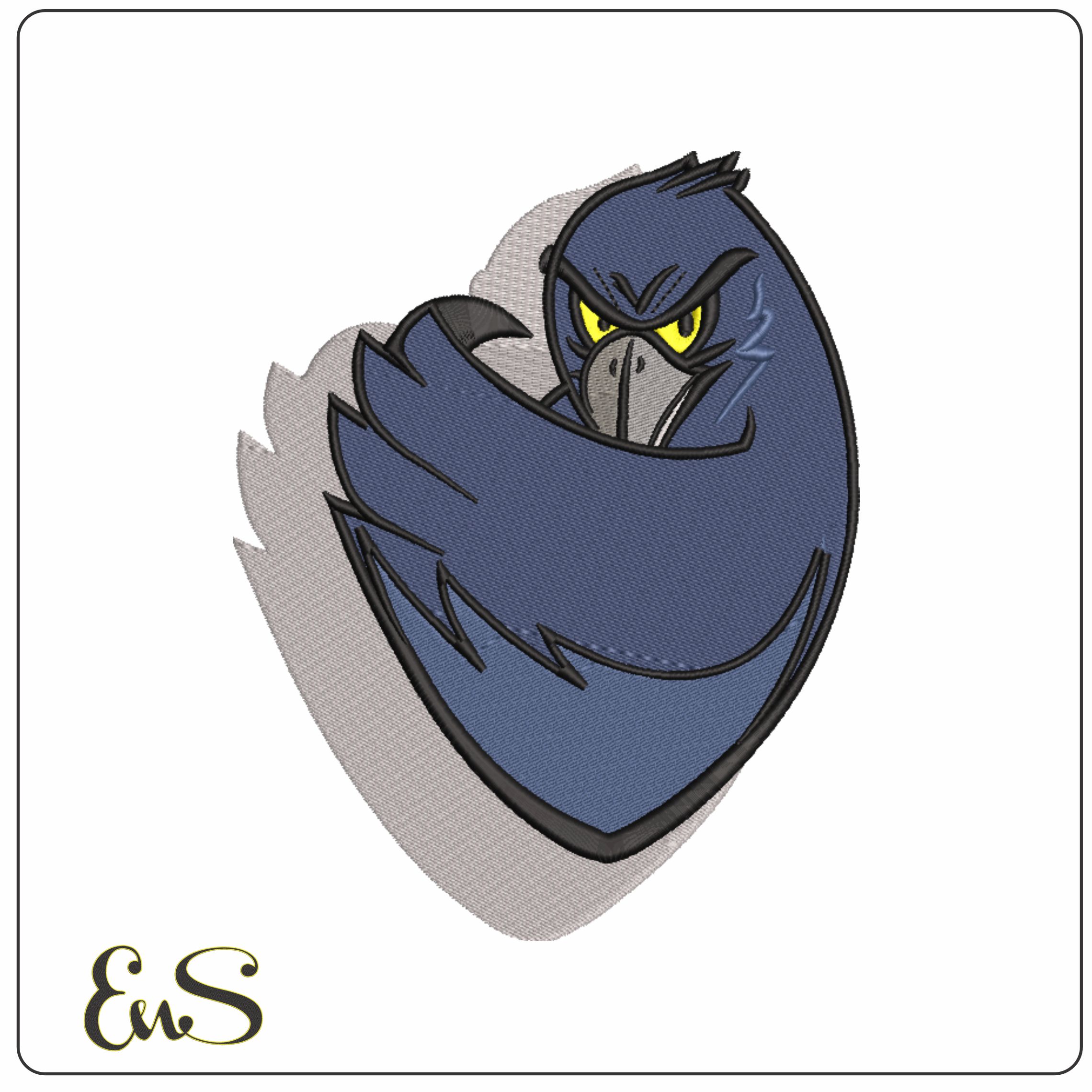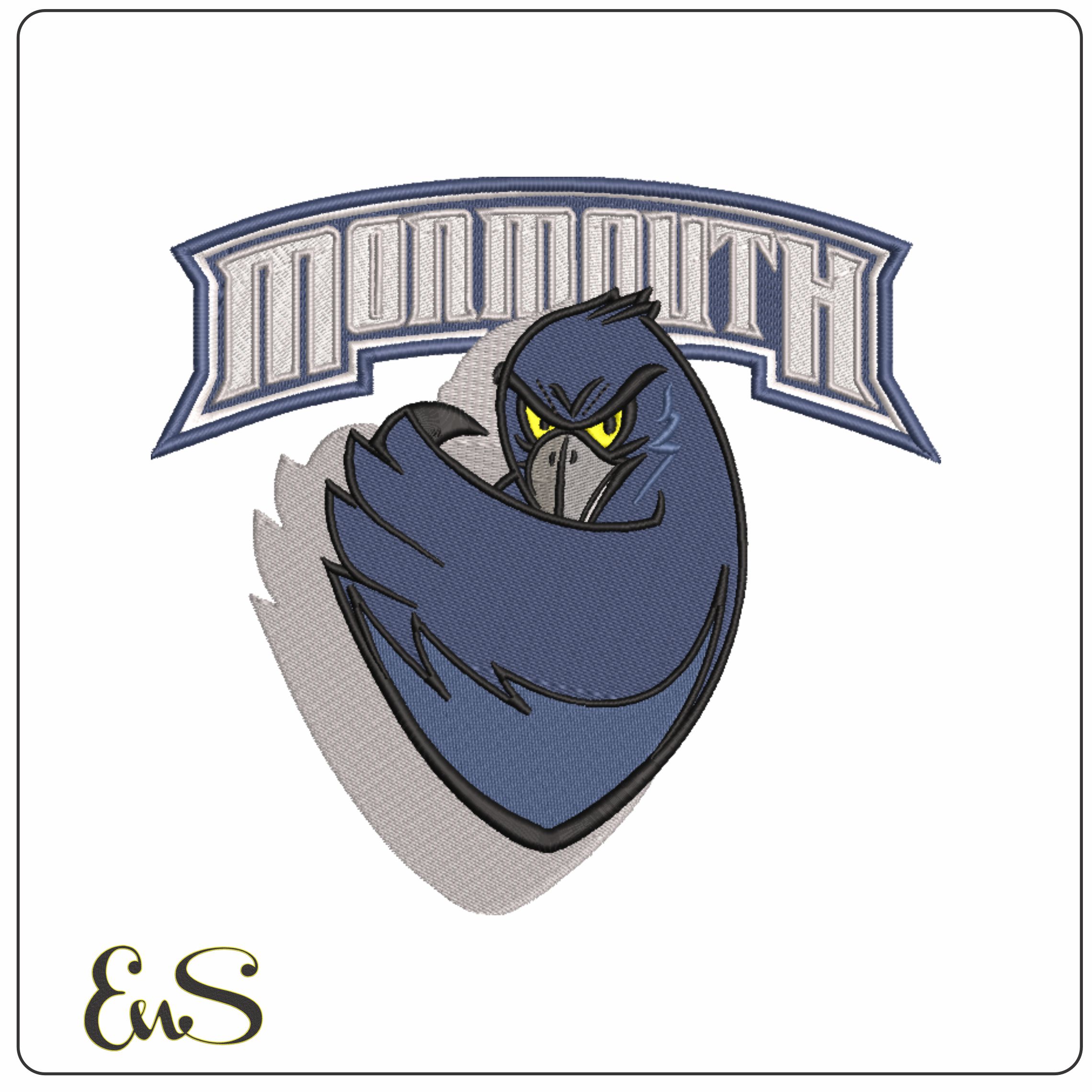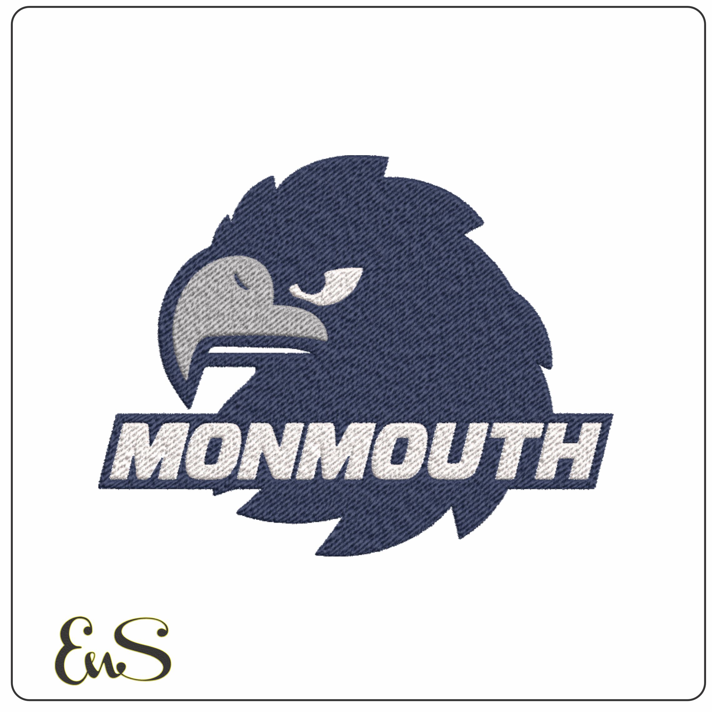

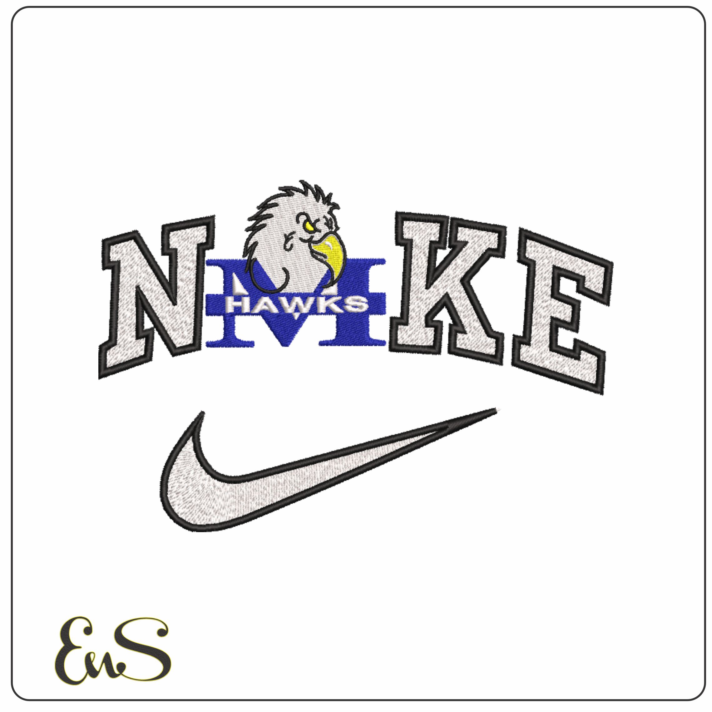
This design has the feel of an older-school college sports logo, built around a sharp hawk head, oversized block lettering, a blue capital M and a swoosh-style accent. The white, black, blue, yellow and grey palette gives it strong contrast without becoming busy, so the mascot and lettering stay readable at a glance. It suits Monmouth Hawks fans, alumni-style projects and anyone putting together custom varsity-inspired pieces with a 1993–2004 look.
I’d use it on sweatshirt fleece, hoodie fronts, denim jackets, quilted gilets or the back of a heavy cotton tee where that bold sports-mark layout has room to sit properly. With 4 thread colours and a moderately dense build, it should give a solid, filled finish that works especially well on medium to heavier fabrics. The graphic shapes in the hawk head and block letters make it a strong choice for gym bags, sleeve placements on outerwear, or chest embroidery on club-style tops.