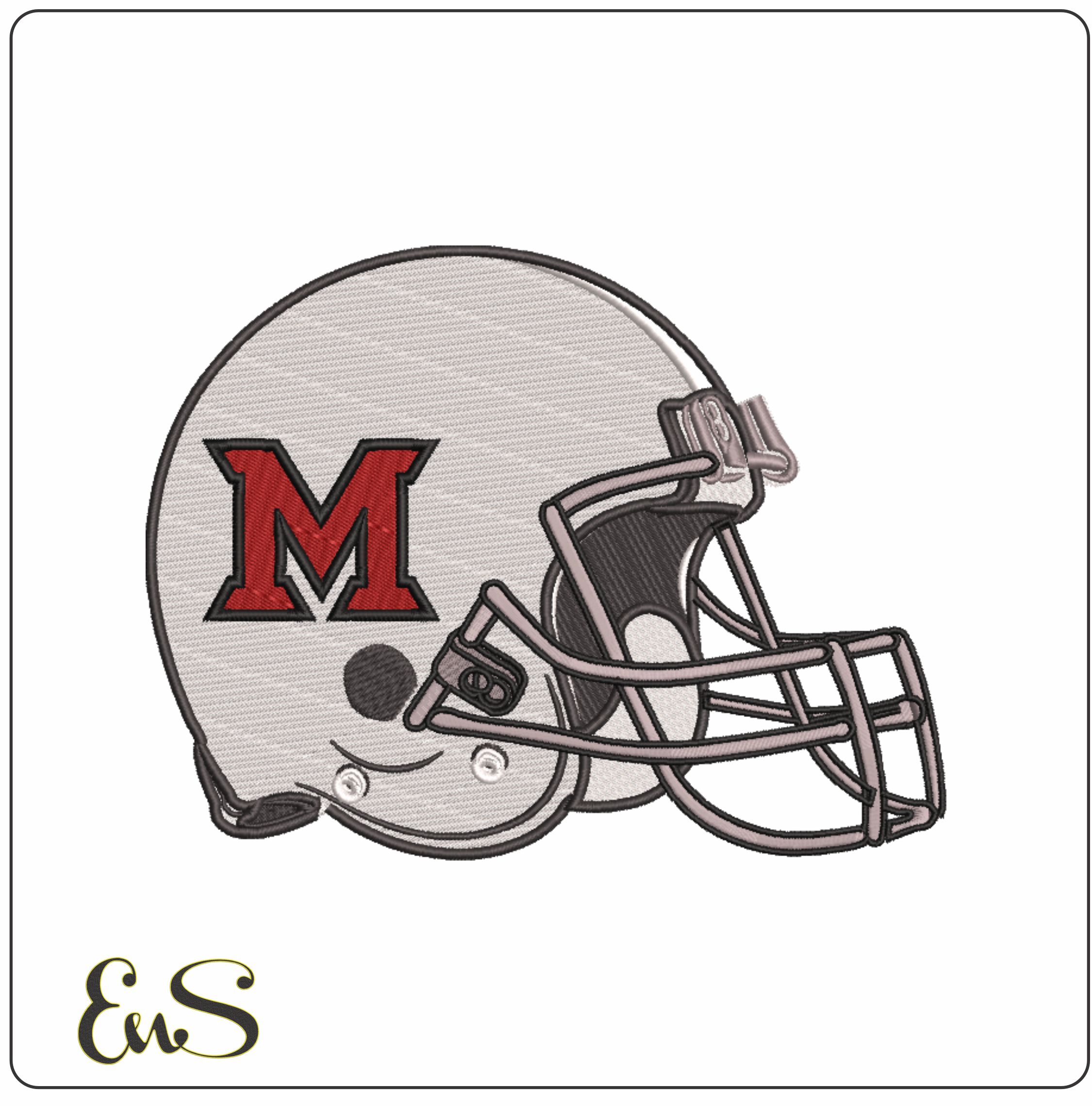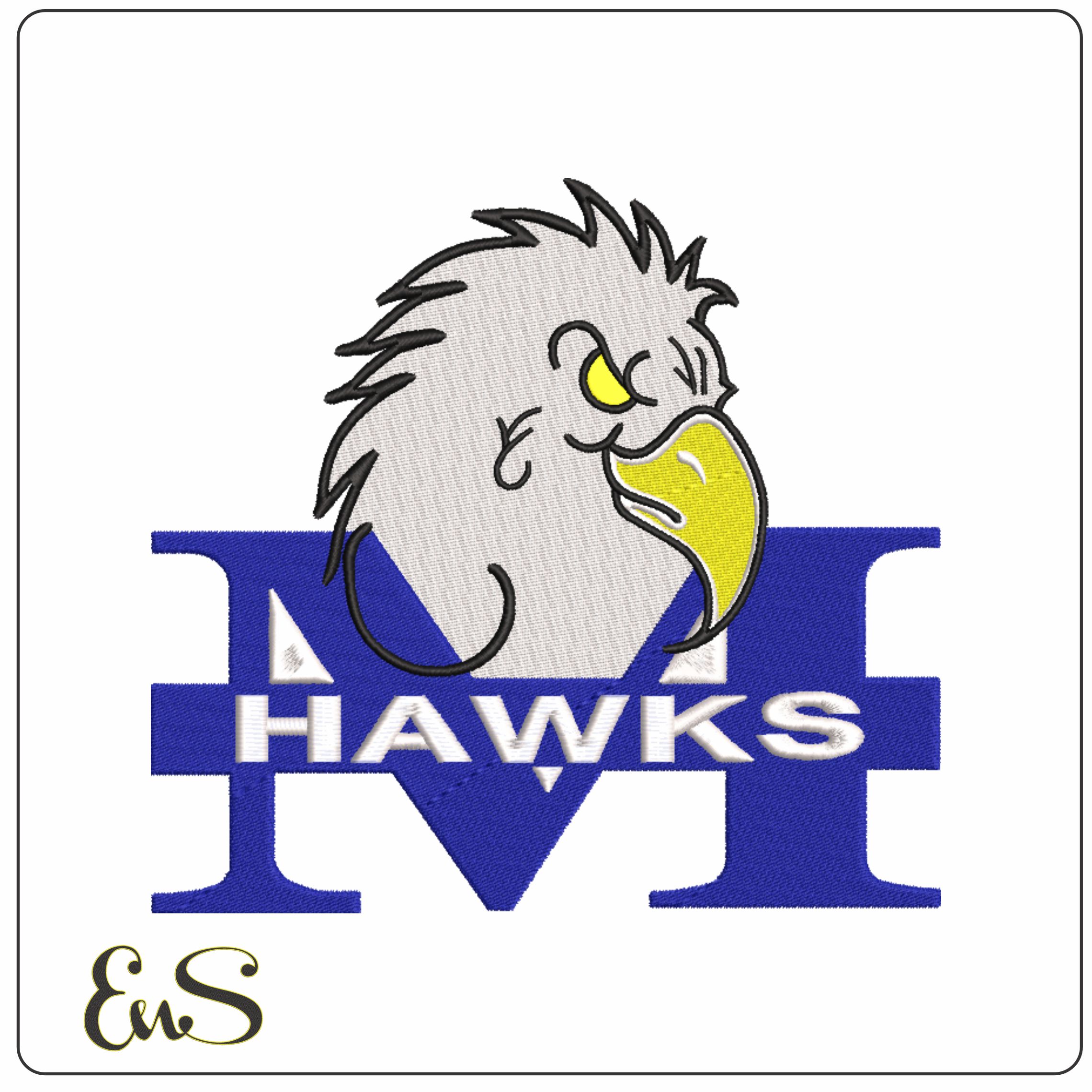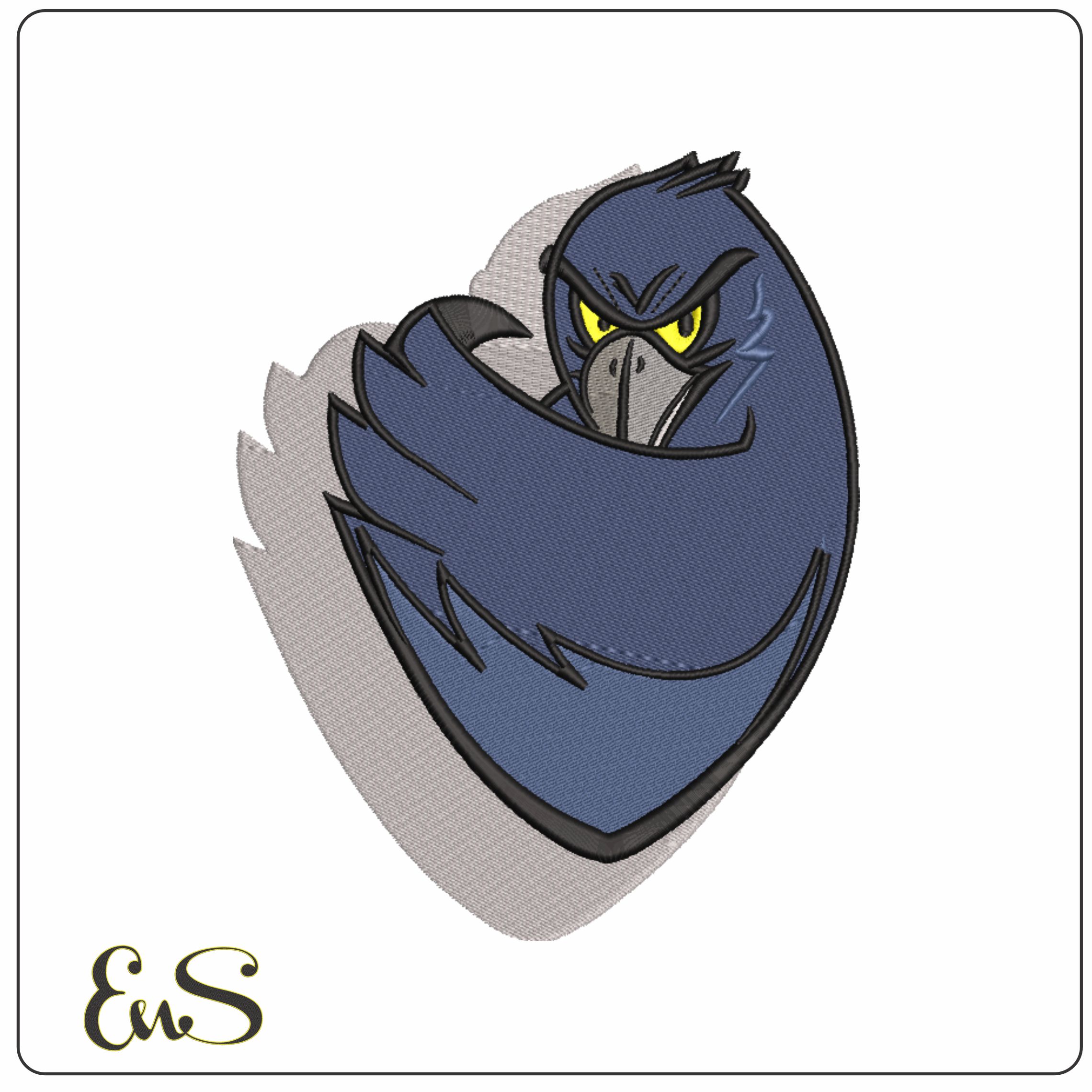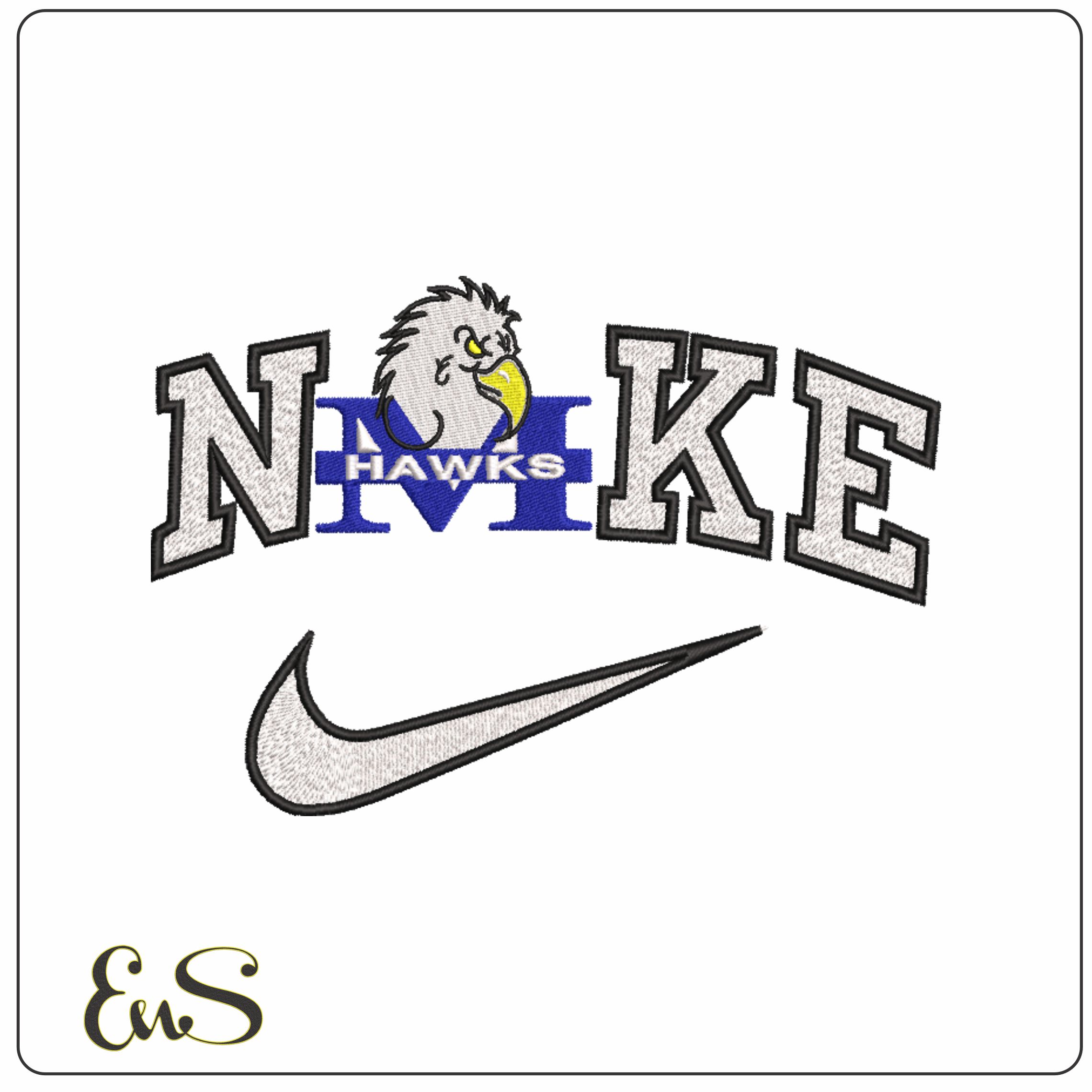

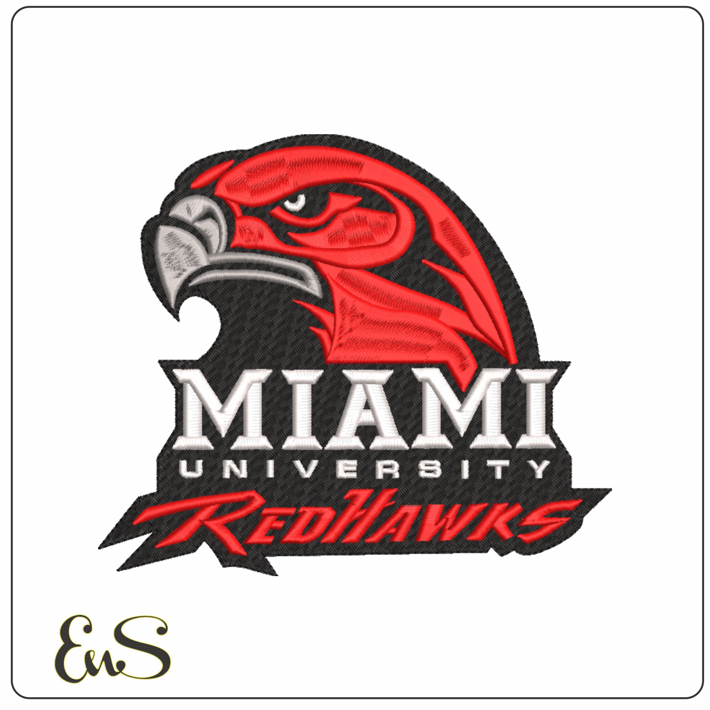
This design captures the 2010 to 2012 Miami University RedHawks look with a stylised hawk head set above the team name, combining block MIAMI UNIVERSITY lettering with the flowing RedHawks script. The red, black, white and grey palette gives it the familiar college-sports contrast that fans and alumni will recognise straight away. It is a strong choice for anyone wanting that older RedHawks identity rather than a generic bird mascot.
With four thread colours and a moderately dense build, it suits sturdier everyday fabrics where the solid logo shape can sit neatly and read clearly. It looks especially at home on hoodies, varsity-style jackets, sweatshirt fronts, kit bags and canvas totes. The broad banner-like base and bold outlines help the design hold its shape well, so the hawk eye, beak and layered lettering do not get lost at a glance.