A name on a backpack, a team phrase on a hoodie, or a monogram on a baby blanket can look polished or painfully homemade based on one thing: the lettering. Learning how to stitch embroidery fonts is less about pressing Start and more about matching the font, fabric, hooping, and settings before the first stitch runs.
Machine embroidery fonts are ready-to-stitch design files, but they still need the same attention as any detailed embroidery. Small letters can fill in, stretchy fabric can pull words out of shape, and a skipped trim can leave thread tails across your finished piece. A few practical decisions upfront will give your lettering the clean, readable finish your project deserves.
## Start With the Right Embroidery Font
The best font is not always the prettiest one on the screen. It needs to suit the item, the message, and the finished size. A chunky applique-style alphabet can look great on a youth sweatshirt but may feel too heavy on a pocket-size monogram. A delicate script may be beautiful on a framed towel, yet difficult to read on textured fleece.
Before downloading or loading a font, check the listed letter height and machine file format. Font sets are usually sized by the height of the finished capital letters, such as 1 inch, 2 inches, or 3 inches. That measurement matters more than the overall look in the product image.
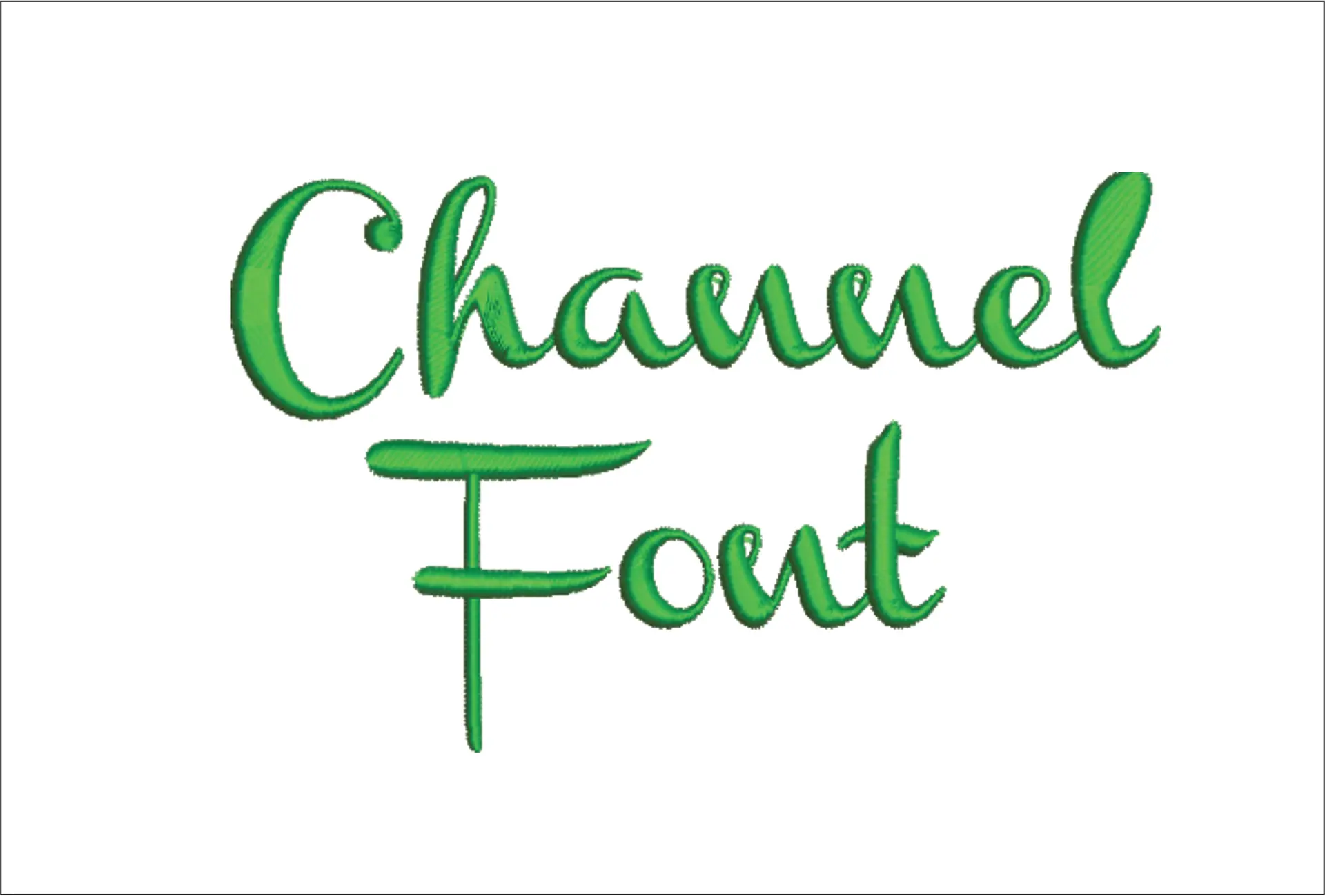
For small lettering, choose a simple block, serif, or clean satin-stitch style with open spaces inside letters. Tiny cursive letters and fine details are more likely to close up when stitched. Larger projects give you more freedom to use bold varsity lettering, playful kids' fonts, outlined alphabets, or script styles.
Also consider the message length. A long name in a wide sports font may not fit across a cap front or shirt chest. If a phrase must fit a tight space, use a narrower font, reduce the number of words, or split the text into two lines. Shrinking a design too much in machine software can change stitch density and hurt the result.
### Choose lettering that suits the project
Use the fabric and purpose as your guide. Clean block fonts work well for workwear, team gear, bags, and personalized gifts. Script and floral-inspired fonts fit bridal pieces, decorative towels, and keepsake projects. Bold athletic fonts are a natural choice for jerseys, stadium-inspired designs, and school spirit apparel.
When in doubt, pick readability over extra detail. A customer, gift recipient, or teammate should be able to read the name from a normal viewing distance.
Prepare Your File Before You Hoop
Open the font file in your embroidery machine or compatible software and confirm the stitch order. Most machine embroidery font sets are supplied as individual letter files, while some include full keyboard-style alphabets in software. Arrange each letter in the correct order before stitching, and double-check spelling. This is especially important for names, graduation years, team phrases, and personalized orders.
Keep a small margin around the lettering. Placing text too close to a seam, zipper, pocket edge, or hoop boundary can create uneven stitching or make hooping difficult. Centering tools, templates, and placement lines are worth using, particularly when lettering is the focal point of the item.
If you are combining a font with another embroidery design, think about scale and placement as a single composition. A large mascot or sports-style design may need a bold name underneath, while a small floral motif may look better with a lighter, smaller monogram. Avoid crowding letters against dense fill stitches. The fabric can become stiff, and the text may lose definition.
Stabilizer Is What Keeps Letters Clear
Lettering reveals fabric movement quickly. Even a well-digitized embroidery font can pucker or distort if the item is not stabilized correctly. Match the stabilizer to the fabric instead of relying on one choice for every project.
For stable woven fabrics such as canvas, cotton, aprons, and many tote bags, a medium tear-away stabilizer often works well. For stretch fabrics like T-shirts, performance wear, leggings, and sweatshirts, use cut-away stabilizer. It stays behind the embroidery and helps prevent letters from stretching out after repeated wear and washing.
Textured materials need extra attention. Towels, fleece, minky, and plush fabrics can swallow small lettering. Add a water-soluble topping over the fabric before stitching so the thread stays visible on the surface. For caps and structured bags, use a firm stabilizer designed to support the fabric shape.
Do not skip a test stitch when the item is expensive, stretchy, or hard to replace. Stitch the exact font size and thread color on a similar scrap with the same stabilizer combination. A five-minute test can prevent a ruined hoodie, uniform, or customer order.
How to Stitch Embroidery Fonts Cleanly
Hoop the fabric smoothly with the stabilizer beneath it. The fabric should be taut enough to stay flat, but not stretched like a drum. Overstretching can make letters look fine in the hoop, then pucker as soon as the project is removed.
Load the design, attach the correct hoop, and use the machine's trace or outline function if available. This lets you confirm that the lettering will stitch where you expect. Once placement is right, begin at a moderate speed. Slowing down is especially helpful for small satin letters, curves, and tight script details.
Watch the first few letters rather than walking away immediately. If the upper thread begins looping, the bobbin thread shows on top, or the fabric shifts, stop and correct the problem before the whole word is stitched. Common causes include incorrect threading, a dull or damaged needle, poor-quality thread, loose hooping, or the wrong stabilizer.
Use a fresh embroidery needle sized for your fabric and thread. A 75/11 embroidery needle is a common starting point for standard 40-weight thread on many garments and blanks. Heavier materials may need a larger needle, while fine fabrics can benefit from a smaller size. Your machine manual and the design recommendations should always guide the final choice.
Thread color affects readability
High contrast makes lettering easy to see, but the strongest color contrast is not always the best design choice. White thread on a dark team bag is crisp and practical. Tone-on-tone embroidery can look premium on a polo or monogrammed blanket, but it needs enough texture and lighting to remain visible.
For small fonts, avoid thread colors that are too close to the fabric if readability matters. Metallic and specialty threads can add impact, though they may require slower stitching and careful tension. For everyday names and phrases, quality polyester or rayon embroidery thread gives dependable results.
Trim, Press, and Finish the Back
When the stitching is complete, remove the hoop carefully. Trim jump threads and tails close to the embroidery without cutting the fabric or pulling at stitches. Tear away excess stabilizer from the back when appropriate, leaving enough around the lettering to support it. Cut-away stabilizer should be trimmed close, not removed completely.
If you used water-soluble topping, tear or rinse it away according to the product instructions. Do not aggressively tug topping from small letters, as that can catch stitches. Press the item from the back or use a pressing cloth on the front. Direct heat on embroidery thread can flatten raised stitches or leave shine on certain fabrics.
For apparel, turn the item inside out before washing when possible. Gentle laundering helps preserve the thread color and shape of dense lettering. If you are making items to sell, include simple care instructions so personalized names, sports designs, and monograms stay sharp after use.
Fix Common Font Stitching Problems
If small letters look thick or the centers of letters such as A, B, D, O, P, and R are closing up, the font may be too small for the fabric or the material needs stronger stabilization. Try a larger letter size or a simpler alphabet. Dense fonts need more room than their on-screen preview suggests.
If the word looks wavy or puckered, check hooping first. Then consider whether the stabilizer is too light for the fabric. Stretch fabrics nearly always need cut-away support. If letters are uneven only in one area, the item may have shifted inside the hoop.
Thread breaks can come from a burr on the needle, incorrect threading, old thread, tension issues, or stitching too quickly. Replace the needle, rethread the machine with the presser foot raised, and test again. When letters are misaligned, do not assume the font file is the problem. Placement, hoop movement, and fabric shifting are more common causes.
A well-chosen embroidery font turns an ordinary blank into a personalized product people want to keep, wear, or gift. Build a small library of clean block, script, athletic, and kids' font styles, then test them on the fabrics you use most. With instant-download font files and a reliable stitching routine, you can move from a simple name to polished custom projects without waiting for custom digitizing.